Sub Category
Latest Blogs
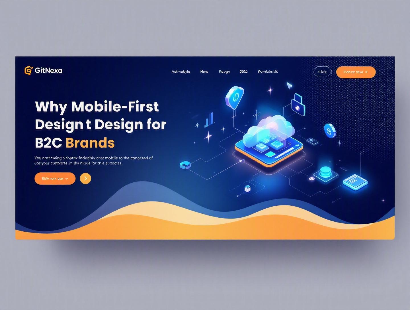
The Essential Guide to Mobile-First Design for B2C Brands
Introduction
In 2025, over 62% of global web traffic comes from mobile devices, according to Statista. In some B2C sectors like fashion, food delivery, and travel, that number climbs past 75%. Yet, many consumer brands still design their digital experiences for desktop first—and then "shrink" them down for mobile. The result? Slow load times, cluttered interfaces, frustrated users, and abandoned carts.
Mobile-first design for B2C brands isn’t a trend. It’s the default expectation. Customers discover products on Instagram, compare prices in-store, complete purchases in-app, and expect support via chat—all from a device that fits in their pocket. If your experience breaks at 375px width, you’re not just losing usability—you’re losing revenue.
In this comprehensive guide, we’ll break down what mobile-first design really means, why it matters more than ever in 2026, and how B2C companies can implement it effectively. We’ll explore real-world examples, performance metrics, UI/UX patterns, architecture considerations, and practical workflows. You’ll also learn how GitNexa approaches mobile-first strategy for consumer brands and what mistakes to avoid along the way.
If you’re a CTO, product manager, founder, or digital lead looking to increase engagement, retention, and conversion rates, this is your blueprint.
What Is Mobile-First Design for B2C Brands?
Mobile-first design is a product design and development strategy where the mobile experience is designed before the desktop version. Instead of compressing a complex desktop interface into a smaller screen, teams start with the constraints of mobile—limited screen size, touch input, slower networks—and build upward.
For B2C brands, this approach prioritizes:
- Fast loading on 4G/5G networks
- Thumb-friendly navigation
- Minimalist content hierarchy
- Clear calls-to-action (CTAs)
- Frictionless checkout and onboarding
The Core Philosophy
Mobile-first isn’t about shrinking content. It’s about prioritizing what truly matters.
When you only have 375–430 pixels of width, every element must justify its existence. That forces product teams to ask:
- What’s the primary action?
- What content drives purchase decisions?
- What can be removed entirely?
This clarity often leads to better desktop experiences too.
Mobile-First vs. Responsive Design
People often confuse the two. They’re related but not identical.
| Feature | Mobile-First Design | Responsive Design |
|---|---|---|
| Approach | Design for mobile first, scale up | Design for desktop, adapt to screens |
| Priority | Performance & minimalism | Layout flexibility |
| CSS Strategy | min-width media queries | max-width media queries |
| UX Focus | Core actions first | Content reflow |
Example CSS snippet for mobile-first styling:
/* Base styles for mobile */
body {
  font-family: Arial, sans-serif;
  margin: 0;
}

.card {
  padding: 16px;
}

/* Larger screens */
@media (min-width: 768px) {
  .card {
    padding: 24px;
  }
}
This approach ensures the smallest devices get the cleanest, fastest version.
Why It’s Especially Critical for B2C
Unlike B2B users who may spend hours inside dashboards, B2C customers make quick decisions. Attention spans are short. Competition is one tap away.
For consumer brands, mobile-first directly impacts:
- Conversion rates
- Customer acquisition cost (CAC)
- Retention
- App store ratings
- Brand perception
A slow or confusing mobile experience doesn’t just hurt UX—it damages trust.
Why Mobile-First Design for B2C Brands Matters in 2026
The case for mobile-first design for B2C brands is stronger in 2026 than ever before.
1. Mobile Commerce Is Dominating Retail
According to eMarketer (2024), mobile commerce accounts for over 43% of total eCommerce sales in the US. In Asia-Pacific, it exceeds 60%. Brands like Shein and Meesho built billion-dollar businesses primarily through mobile apps.
If your checkout isn’t optimized for thumb navigation, autofill, Apple Pay, Google Pay, and biometric login, you’re creating unnecessary friction.
2. Google’s Mobile-First Indexing
Google officially switched to mobile-first indexing years ago, meaning it primarily uses the mobile version of content for ranking and indexing. You can review their guidelines here: https://developers.google.com/search/docs/crawling-indexing/mobile/mobile-sites-mobile-first-indexing
If your mobile experience is stripped down or poorly structured, your SEO performance suffers.
3. Performance Expectations Are Brutal
Google research shows that 53% of mobile users abandon sites that take longer than 3 seconds to load. In B2C, that’s catastrophic.
Core Web Vitals—LCP, CLS, INP—are now standard benchmarks. Slow-loading hero images and heavy JavaScript bundles directly impact revenue.
4. Social Commerce and Micro-Moments
Discovery increasingly happens in micro-moments:
- Instagram Reels
- TikTok ads
- YouTube Shorts
- Influencer swipe-ups
Users click and expect instant gratification. If your landing page isn’t optimized for mobile-first UX, your ad spend gets wasted.
Deep Dive #1: Mobile-First UX Principles That Drive Conversions
Design decisions on mobile have direct revenue implications.
Thumb-Zone Optimization
Research shows most users hold phones one-handed. Primary CTAs should sit within the natural thumb zone.
Good example: Amazon’s sticky "Add to Cart" button.
Bad example: CTA buried at the top of a long page.
Simplified Navigation
Instead of complex mega menus, mobile-first B2C sites use:
- Bottom navigation bars
- Hamburger menus
- Progressive disclosure
Example structure:
- Home
- Categories
- Cart
- Account
Checkout Optimization Workflow
Step-by-step:
- Enable guest checkout
- Auto-detect location
- Use address autofill APIs
- Offer wallet payments
- Reduce form fields
Every extra input field reduces completion rates.
For more on UX best practices, see our guide on ui-ux-design-best-practices.
Deep Dive #2: Performance Architecture for Mobile-First B2C
Mobile-first design is inseparable from performance engineering.
Lightweight Frontend Frameworks
Modern B2C brands use:
- Next.js
- Nuxt.js
- Remix
- Astro
Server-side rendering (SSR) and static site generation (SSG) improve initial load time.
Optimized Image Strategy
Use:
- WebP or AVIF formats
- Responsive image sizing
- Lazy loading
Example:
<img src="product.webp" loading="lazy" width="400" height="400" alt="Product">
API-First Architecture
Headless commerce platforms like:
- Shopify Hydrogen
- CommerceTools
- BigCommerce headless
Separate frontend from backend, enabling faster mobile iterations.
Learn more in our headless-commerce-architecture-guide.
Deep Dive #3: Mobile-First Content Strategy for B2C Brands
Content must be scannable and persuasive.
Prioritize Above-the-Fold Value
On mobile, above-the-fold space is tiny.
Must include:
- Clear value proposition
- Social proof (ratings)
- Primary CTA
Microcopy Matters
Short, action-driven copy outperforms long paragraphs.
Instead of:
"Click here to explore our complete range of premium skincare products"
Use:
"Shop Skincare"
Structured Data for SEO
Use schema markup for products:
{
  "@context": "https://schema.org/",
  "@type": "Product",
  "name": "Running Shoes",
  "offers": {
    "@type": "Offer",
    "price": "89.99",
    "priceCurrency": "USD"
  }
}
Refer to https://schema.org for official documentation.
Deep Dive #4: Mobile App vs Mobile Web for B2C Brands
Should you build a native app or focus on mobile web?
Comparison Table
| Criteria | Mobile Web | Native App |
|---|---|---|
| Discovery | High (SEO) | Low (App Store dependent) |
| Performance | Good | Excellent |
| Push Notifications | Limited | Full support |
| Development Cost | Lower | Higher |
| Offline Access | Limited | Strong |
Brands like Starbucks benefit from native apps due to loyalty programs and repeat usage. Smaller D2C brands often start with progressive web apps (PWAs).
We break this down further in progressive-web-apps-vs-native-apps.
Deep Dive #5: Analytics, Testing, and CRO in Mobile-First Strategy
You can’t improve what you don’t measure.
Key Metrics for B2C Mobile
- Mobile conversion rate
- Bounce rate
- Average order value (AOV)
- Page load time
- Checkout completion rate
A/B Testing Workflow
- Identify drop-off point (e.g., shipping page)
- Create variant (shorter form)
- Run test via Google Optimize alternative (e.g., VWO, Optimizely)
- Measure statistical significance
Even small tweaks—like changing CTA color—can increase conversions by 5–15%.
For analytics infrastructure, explore data-analytics-for-ecommerce.
How GitNexa Approaches Mobile-First Design for B2C Brands
At GitNexa, we treat mobile-first design for B2C brands as both a UX and engineering challenge.
Our process typically includes:
- Mobile behavior analysis using heatmaps and session recordings
- Conversion funnel audits
- Wireframing for 375px screens first
- Performance benchmarking against Core Web Vitals
- Iterative testing and deployment via CI/CD pipelines
We combine frontend frameworks like Next.js with scalable cloud infrastructure on AWS or Azure. Our team also integrates AI-driven personalization engines to enhance mobile shopping experiences.
If you’re exploring digital transformation, check our insights on digital-transformation-strategy-guide.
Common Mistakes to Avoid
- Designing desktop first and trimming later
- Overloading pages with heavy animations
- Ignoring Core Web Vitals
- Using tiny tap targets
- Forcing account creation before checkout
- Neglecting accessibility (contrast, screen readers)
- Testing only on high-end devices
Each of these reduces engagement and trust.
Best Practices & Pro Tips
- Design for 375px width first.
- Keep primary CTA visible at all times.
- Compress images below 150KB when possible.
- Use skeleton screens for perceived speed.
- Enable biometric login.
- Use real-device testing—not just emulators.
- Optimize forms with autofill and dropdowns.
- Monitor performance weekly.
- Implement lazy loading for below-the-fold content.
- Continuously run A/B tests.
Future Trends & What to Expect (2026–2027)
- AI-driven personalization on mobile.
- Voice commerce integration.
- AR try-before-you-buy features.
- Edge computing for faster load times.
- Super apps and ecosystem-based shopping.
- Increased privacy regulations impacting tracking.
Brands that adapt early will outperform competitors.
FAQ
What is mobile-first design in simple terms?
It’s designing your website or app for mobile devices before creating the desktop version.
Why is mobile-first design important for B2C brands?
Because most consumers browse and purchase via smartphones, making mobile optimization critical for conversions.
Does mobile-first improve SEO?
Yes. Google uses mobile-first indexing, so your mobile site affects rankings.
Is responsive design enough?
Responsive design helps, but without a mobile-first mindset, performance and UX often suffer.
Should startups build an app first?
Not always. Many start with a high-performing mobile web or PWA.
How fast should a mobile site load?
Ideally under 3 seconds, with LCP under 2.5 seconds.
What frameworks are best for mobile-first development?
Next.js, Nuxt.js, and other SSR-capable frameworks perform well.
How often should we test mobile UX?
Continuously. At minimum, quarterly audits with A/B testing.
Conclusion
Mobile-first design for B2C brands is no longer optional—it’s foundational. From UX clarity and performance optimization to SEO visibility and conversion rate improvements, the benefits compound across the entire customer journey.
Brands that treat mobile as the primary experience—not a secondary adaptation—see measurable gains in engagement, retention, and revenue. The competition is only a tap away. If your mobile experience frustrates users, they will leave.
Ready to build a high-converting mobile-first experience? Talk to our team to discuss your project.
Comments
Loading comments...