Sub Category
Latest Blogs
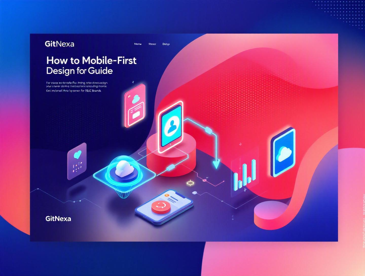
The Ultimate Guide to Mobile-First Design for B2C Brands
Introduction
In 2025, mobile devices accounted for over 59% of global website traffic, according to Statista. In some B2C industries—like fashion, food delivery, and travel—that number crosses 70%. Yet many brands still treat mobile as a secondary channel, designing for desktop first and "shrinking things down" later. The result? Frustrated users, abandoned carts, and lost revenue.
Mobile-first design isn’t just a UX preference anymore—it’s a revenue strategy. For B2C brands competing on speed, convenience, and emotional connection, your mobile experience often is your brand. If your checkout flow lags, your navigation feels cramped, or your images load slowly on 4G, customers won’t wait. They’ll switch tabs.
This comprehensive guide explores how to implement mobile-first design for B2C brands from strategy to execution. You’ll learn the principles behind mobile-first UX, how it differs from responsive design, what tools and frameworks to use, and how to measure performance. We’ll also cover real-world examples, technical patterns, and practical workflows used by high-growth consumer brands.
Whether you’re a CTO planning a digital transformation, a founder optimizing conversions, or a product manager rebuilding your storefront, this guide will give you a structured roadmap to design mobile-first—and win.
What Is Mobile-First Design?
Mobile-first design is a product design approach where the mobile experience is designed before desktop. Instead of creating a full desktop interface and trimming features for smaller screens, teams start with the constraints of mobile—limited space, touch interactions, variable connectivity—and then progressively enhance the experience for larger devices.
Luke Wroblewski popularized the concept in 2009, arguing that designing for smaller screens forces clarity. You must prioritize core actions, reduce clutter, and focus on what truly matters.
Mobile-First vs Responsive Design
Many people confuse mobile-first design with responsive design. They are related—but not identical.
| Aspect | Mobile-First Design | Responsive Design |
|---|---|---|
| Strategy | Design for mobile first | Adapt layout to multiple screens |
| Approach | Progressive enhancement | Fluid grids and breakpoints |
| Priority | Core functionality on small screens | Visual consistency across devices |
| Mindset | Constraint-driven | Layout-driven |
Responsive design ensures layouts adapt. Mobile-first design ensures priorities are correct.
Core Principles of Mobile-First UX
- Content prioritization – Only essential information appears first.
- Touch-first interactions – Buttons sized at least 44x44px (Apple HIG recommendation).
- Performance-first thinking – Lightweight assets, optimized scripts.
- Progressive enhancement – Add complexity for larger screens.
- Context awareness – Location, camera, notifications.
Think of mobile-first as designing the skeleton before adding muscle.
Why Mobile-First Design Matters in 2026
By 2026, mobile commerce (m-commerce) is projected to exceed $4.5 trillion globally (Statista, 2025 forecast). Google’s mobile-first indexing—fully rolled out years ago—means your mobile site determines your search ranking.
Here’s what’s changed recently:
- 5G adoption has increased expectations for speed.
- Short-form content platforms (TikTok, Instagram Reels) trained users to expect instant engagement.
- AI-driven personalization now happens primarily in mobile apps.
- Privacy regulations require clearer consent UX—often shown on mobile first.
According to Google’s Core Web Vitals documentation (https://web.dev/vitals/), pages that load within 2.5 seconds and maintain low layout shift outperform competitors in engagement and SEO.
For B2C brands, mobile-first impacts:
- Conversion rates
- Customer acquisition cost (CAC)
- Brand perception
- Retention and loyalty
If your competitor’s checkout takes 15 seconds and yours takes 5, guess who wins?
Designing for Mobile Constraints First
Constraints drive creativity. On mobile, you have:
- Limited screen real estate
- Variable network conditions
- Thumb-based navigation
- Short attention spans
Let’s break this down.
1. Prioritize Core User Actions
Start by answering: What is the one thing a user should do on this screen?
For an eCommerce B2C brand, typical primary actions include:
- Browse products
- Add to cart
- Checkout
- Track order
Design wireframes focusing on one primary CTA per screen.
Example simplified product page hierarchy:
[Product Image]
[Product Name]
[Price]
[Primary CTA: Add to Cart]
[Short Description]
[Expandable Details]
Everything else becomes secondary.
2. Thumb-Friendly Navigation
According to research by UX Matters, 75% of users navigate phones using one thumb. That means bottom navigation performs better.
Example mobile nav structure:
Home | Categories | Cart | Profile
Avoid hamburger-only navigation for critical B2C journeys.
3. Optimize for Speed First
Performance optimization strategies:
- Lazy loading images
- WebP or AVIF formats
- Code splitting with React
- CDN integration
Example in Next.js:
import Image from 'next/image'

<Image
  src="/product.jpg"
  alt="Product"
  width={500}
  height={500}
  priority={false}
/>
For more performance strategies, see our guide on web performance optimization strategies.
Building a Scalable Mobile-First Architecture
Design decisions fail if architecture doesn’t support them.
Frontend Stack Choices
Popular mobile-first stacks in 2026:
| Framework | Best For | Notes |
|---|---|---|
| Next.js | eCommerce, SEO-heavy B2C | Hybrid SSR/SSG |
| React Native | Cross-platform apps | Shared logic |
| Flutter | High-performance apps | Single codebase |
| Shopify Hydrogen | Commerce-first | Headless approach |
Progressive Enhancement Pattern
Start simple HTML, then enhance:
<button>Add to Cart</button>
Enhance with JS only when available:
if ('serviceWorker' in navigator) {
  navigator.serviceWorker.register('/sw.js');
}
API-First Backend
Mobile-first often pairs with headless commerce.
Architecture diagram:
Mobile App / PWA
        |
API Gateway
        |
Microservices (Auth, Cart, Payments)
        |
Database + CDN
We’ve covered similar patterns in our microservices architecture guide.
Mobile-First UX That Drives Conversions
Conversion is where mobile-first pays off.
1. Streamlined Checkout
Amazon reduced checkout friction with 1-Click ordering. Shopify reports that each additional checkout step can reduce conversion by up to 10%.
Best practices:
- Guest checkout default
- Autofill enabled
- Minimal form fields
- Real-time validation
Example HTML input:
<input type="email" inputmode="email" autocomplete="email" required />
2. Micro-Interactions
Small animations reassure users.
- Button feedback
- Cart updates
- Loading indicators
Avoid heavy JS animation libraries—use CSS transitions.
3. Social Proof & Trust Signals
Display:
- Reviews
- Ratings
- Security badges
- Return policy highlights
Keep them visible without overwhelming.
Testing and Optimization for Mobile-First B2C
Launching isn’t enough.
1. Core Web Vitals Tracking
Measure:
- LCP (Largest Contentful Paint)
- CLS (Cumulative Layout Shift)
- INP (Interaction to Next Paint)
Use tools:
- Google PageSpeed Insights
- Lighthouse
- WebPageTest
2. A/B Testing on Mobile
Test:
- CTA placement
- Button color
- Checkout layout
Example experimentation workflow:
- Identify drop-off stage
- Hypothesize improvement
- Launch experiment (Optimizely/VWO)
- Analyze statistical significance
3. Heatmaps & Session Recordings
Hotjar and Microsoft Clarity reveal thumb behavior patterns.
We dive deeper into experimentation in our conversion rate optimization guide.
Integrating Mobile Apps, PWAs, and Web
B2C brands often ask: Should we build an app?
Native App vs PWA Comparison
| Criteria | Native App | PWA |
|---|---|---|
| Performance | Excellent | Very good |
| Offline support | Strong | Good |
| App Store presence | Yes | No |
| Development cost | Higher | Lower |
Brands like Starbucks use PWAs to improve mobile ordering globally.
Learn more about cross-platform development in our mobile app development services.
How GitNexa Approaches Mobile-First Design
At GitNexa, mobile-first design isn’t an afterthought—it’s baked into our discovery workshops. We start by mapping user journeys specific to mobile contexts: commuting, shopping during breaks, multitasking.
Our process typically includes:
- Mobile wireframes before desktop mockups
- Performance budgets defined early
- API-first backend planning
- UX testing on real devices
- Continuous monitoring post-launch
We combine UI/UX research with scalable engineering practices, often integrating cloud-native infrastructure (see our insights on cloud-native application development).
The goal isn’t just a beautiful mobile interface—it’s measurable growth in conversion, retention, and lifetime value.
Common Mistakes to Avoid in Mobile-First Design
- Designing desktop first and "adapting" later.
- Ignoring performance budgets.
- Overloading mobile with popups.
- Hiding key actions in hamburger menus.
- Using tiny tap targets.
- Forgetting accessibility (WCAG 2.2 compliance).
- Testing only on high-end devices.
Each of these can directly reduce conversion rates.
Best Practices & Pro Tips
- Start with grayscale wireframes.
- Set a 2.5-second LCP target.
- Use bottom navigation for core journeys.
- Enable autofill everywhere.
- Reduce third-party scripts.
- Test on slow networks.
- Use analytics funnels to guide decisions.
- Design empty states carefully.
- Add sticky CTAs on product pages.
- Prioritize accessibility from day one.
Future Trends in Mobile-First Design (2026–2027)
- AI-personalized interfaces adjusting layouts in real time.
- Voice-assisted mobile shopping.
- Gesture-based navigation.
- AR product previews integrated directly in browsers.
- Privacy-first UX patterns.
Expect mobile interfaces to become predictive rather than reactive.
FAQ: Mobile-First Design for B2C Brands
What is mobile-first design in simple terms?
It’s designing for smartphones before designing for desktops, prioritizing small screens and essential features first.
Is mobile-first better for SEO?
Yes. Google uses mobile-first indexing, meaning your mobile site determines rankings.
How is mobile-first different from responsive design?
Mobile-first is a strategy. Responsive design is a technique for adapting layouts.
Should every B2C brand build a mobile app?
Not always. Many brands succeed with high-performance PWAs.
What are Core Web Vitals?
Metrics defined by Google to measure page performance and user experience.
How fast should a mobile page load?
Ideally under 2.5 seconds for optimal conversion and SEO.
What tools help test mobile UX?
Lighthouse, Hotjar, Optimizely, BrowserStack.
How do I reduce mobile checkout abandonment?
Simplify forms, enable autofill, reduce steps, and show trust signals.
What screen size should I design for first?
Start around 360–390px width (common smartphone size).
Can mobile-first work for enterprise B2C platforms?
Absolutely. Many large brands use mobile-first with headless architectures.
Conclusion
Mobile-first design for B2C brands is no longer optional. It shapes search visibility, conversion rates, and long-term customer loyalty. By designing for constraints, optimizing performance, simplifying checkout, and continuously testing, brands can create mobile experiences that feel intuitive and fast.
The companies that win in 2026 aren’t the ones with the flashiest websites. They’re the ones that load instantly, guide users clearly, and remove friction at every step.
Ready to design a high-converting mobile-first experience? Talk to our team to discuss your project.
Comments
Loading comments...