Sub Category
Latest Blogs
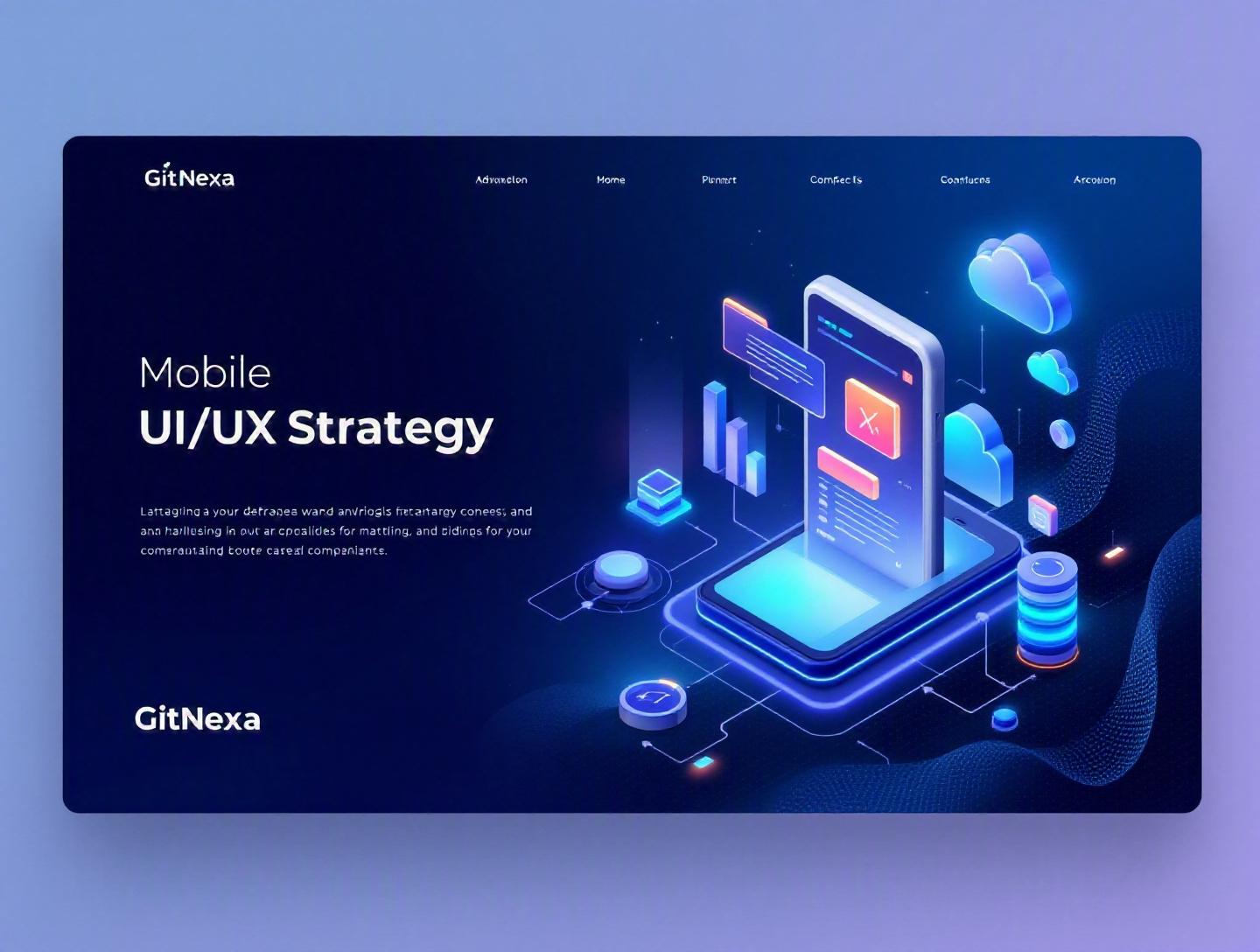
Ultimate Mobile App UI/UX Design Strategy Guide
Mobile apps fail fast—and often silently.
According to data published by Statista in 2024, users worldwide downloaded over 257 billion mobile apps, yet nearly 25% of apps are abandoned after just one use. Google has also reported that 53% of mobile users leave a page if it takes longer than three seconds to load. These numbers reveal a hard truth: without a deliberate mobile app UI/UX design strategy, even well-funded apps struggle to survive.
Mobile app UI/UX design strategy is not about choosing attractive colors or trendy animations. It’s about engineering experiences that reduce friction, guide user behavior, and align business goals with real human needs. For CTOs, founders, and product managers, this means balancing technical feasibility, usability testing, accessibility standards, and performance optimization—all within tight release cycles.
In this comprehensive guide, you’ll learn what mobile app UI/UX design strategy truly means, why it matters in 2026, how to build one step by step, which tools and frameworks to use, common pitfalls to avoid, and what future trends will shape mobile experiences in 2026–2027. We’ll also share how GitNexa approaches UI/UX strategy across industries—from fintech and healthcare to SaaS platforms.
Let’s start by defining the foundation.
What Is Mobile App UI/UX Design Strategy?
Mobile app UI/UX design strategy is a structured, research-driven plan that defines how a mobile application’s user interface (UI) and user experience (UX) will support user goals while achieving business objectives.
UI (User Interface) focuses on visual and interactive elements—typography, layout, icons, buttons, animations. UX (User Experience) addresses the overall journey: onboarding, navigation flow, task completion, emotional response, and usability.
A strategy connects these two domains with:
- Business KPIs (conversion rate, retention, revenue per user)
- User personas and behavioral insights
- Platform constraints (iOS Human Interface Guidelines, Android Material Design)
- Technical architecture (native, React Native, Flutter, PWA)
- Accessibility and compliance requirements (WCAG 2.2, HIPAA, GDPR)
Without strategy, teams often jump straight into wireframes. With strategy, teams begin with user research, define measurable goals, map user journeys, test assumptions, and iterate deliberately.
Think of it as architecture before construction. You wouldn’t build a 30-story tower without blueprints. Yet many teams build mobile apps that way.
Why Mobile App UI/UX Design Strategy Matters in 2026
The mobile landscape in 2026 is radically different from five years ago.
Market Saturation and User Expectations
As of 2025, Apple’s App Store hosts over 1.9 million apps, and Google Play lists more than 2.5 million. Users compare your product not just to competitors—but to Instagram, Uber, Spotify, and Duolingo. If your onboarding feels clunky, users won’t hesitate to uninstall.
Performance and Core Web Vitals for Apps
Google’s focus on performance metrics such as Largest Contentful Paint (LCP) and Interaction to Next Paint (INP) now influences mobile web apps and PWAs significantly. According to Google’s Web.dev documentation (https://web.dev), improving performance metrics can increase conversion rates by up to 20%.
AI-Driven Personalization
AI-powered interfaces are now mainstream. From predictive search to adaptive layouts, users expect apps to respond intelligently. UI/UX strategy must now incorporate data science pipelines and personalization logic.
Accessibility Is Non-Negotiable
WCAG 2.2 compliance and region-specific accessibility laws have become enforceable standards. Poor accessibility is not just bad UX—it’s legal risk.
Business Impact
Research from Forrester indicates that a well-designed UX can raise conversion rates by up to 400%. In competitive markets like fintech or healthtech, small usability improvements translate directly into revenue growth.
In short, mobile app UI/UX design strategy now determines product survival.
Core Pillar 1: User Research & Behavioral Insights
You cannot design for users you don’t understand.
Qualitative vs Quantitative Research
A strong mobile UX research process blends both.
| Method | Type | Best For | Tools |
|---|---|---|---|
| User Interviews | Qualitative | Deep motivations | Zoom, Lookback |
| Usability Testing | Qualitative | Friction points | Maze, UserTesting |
| Analytics | Quantitative | Behavior patterns | Firebase, Mixpanel |
| Heatmaps | Quantitative | Interaction zones | Hotjar |
Step-by-Step Research Process
- Define hypotheses (e.g., “Users drop off during onboarding because it’s too long.”)
- Recruit 8–12 participants per persona.
- Conduct moderated usability sessions.
- Analyze quantitative analytics.
- Identify recurring friction patterns.
- Convert findings into design requirements.
Real-World Example
A fintech startup approached GitNexa with a 65% onboarding drop-off rate. User testing revealed confusion around KYC document upload. Simplifying the flow into a 3-step wizard increased completion rates by 32% within one release cycle.
Research turns assumptions into evidence.
Core Pillar 2: Information Architecture & User Flows
Once you understand users, structure the experience.
Designing Clear Navigation
Mobile navigation must respect thumb reach zones and cognitive load.
Common patterns:
- Bottom navigation (Instagram, LinkedIn)
- Hamburger menu (older Android apps)
- Tab-based navigation (iOS apps)
Mapping User Flows
Create flow diagrams before UI screens.
Example user flow (E-commerce checkout):
Home → Product Page → Add to Cart → Cart Review → Shipping Info → Payment → Confirmation
Each step should answer:
- What does the user want?
- What information is required?
- What happens if they fail?
Progressive Disclosure
Instead of overwhelming users, reveal complexity gradually. For example, Revolut introduces advanced trading features only after basic onboarding.
Architecture and Development Alignment
When building with React Native or Flutter, define route structure early:
// Example React Navigation setup
<Stack.Navigator>
  <Stack.Screen name="Home" component={HomeScreen} />
  <Stack.Screen name="Details" component={DetailScreen} />
</Stack.Navigator>
Design decisions influence code structure. Poor planning leads to refactoring headaches later.
For deeper frontend architecture insights, see our guide on modern web development architecture.
Core Pillar 3: Visual Design Systems & Brand Consistency
Consistency builds trust.
Design Systems at Scale
Companies like Airbnb and Shopify maintain comprehensive design systems. These include:
- Color tokens
- Typography scales
- Spacing systems
- Component libraries
Example token structure:
{
  "primaryColor": "#0052CC",
  "fontBase": "16px",
  "spacingUnit": "8px"
}
Benefits of a Design System
- Faster development cycles
- Reduced inconsistencies
- Easier onboarding for new developers
- Improved accessibility compliance
Tools for 2026
- Figma with Dev Mode
- Storybook for component documentation
- Zeroheight for documentation portals
At GitNexa, we integrate design systems directly with frontend repositories for mobile apps and SaaS dashboards. Explore related insights in our ui-ux-design-process article.
Core Pillar 4: Interaction Design & Microinteractions
Small details shape perception.
What Are Microinteractions?
Microinteractions are subtle animations or feedback loops—button presses, loading indicators, swipe gestures.
Example in React Native:
Animated.timing(fadeAnim, {
  toValue: 1,
  duration: 300,
  useNativeDriver: true,
}).start();
Why They Matter
- Provide feedback
- Reduce uncertainty
- Increase perceived performance
Consider Duolingo’s celebratory animations. They reinforce user behavior and increase session length.
Performance Considerations
Animations should maintain 60fps. Poorly optimized animations cause jank, especially on mid-tier Android devices.
For cloud-backed performance optimization strategies, check our mobile-app-performance-optimization.
Core Pillar 5: Accessibility, Performance & Compliance
Neglecting accessibility excludes users and invites legal trouble.
Accessibility Checklist
- Minimum contrast ratio 4.5:1
- Touch targets ≥ 44px
- Screen reader compatibility
- Keyboard navigation support
Refer to official WCAG documentation: https://www.w3.org/WAI/standards-guidelines/wcag/
Performance Optimization
- Lazy load images.
- Compress assets.
- Minimize API calls.
- Implement caching.
- Use CDN distribution.
Security & Privacy by Design
For healthcare apps, HIPAA compliance requires encrypted storage and secure authentication.
Related reading: cloud-security-best-practices.
How GitNexa Approaches Mobile App UI/UX Design Strategy
At GitNexa, mobile app UI/UX design strategy begins with discovery workshops. We align stakeholders on KPIs, user personas, and technical constraints. Our design sprints typically run 2–4 weeks and include usability testing before final UI approval.
We integrate design systems with development workflows using Figma, Storybook, and CI/CD pipelines. Our teams collaborate across frontend, backend, DevOps, and AI specialists to ensure UI decisions align with infrastructure and scalability goals.
From MVP prototypes to enterprise mobile ecosystems, our approach balances creativity with engineering discipline.
Common Mistakes to Avoid
- Skipping user research.
- Designing only for high-end devices.
- Ignoring accessibility standards.
- Overloading onboarding flows.
- Inconsistent UI components.
- Failing to test on real users before launch.
- Prioritizing aesthetics over usability.
Best Practices & Pro Tips
- Start with low-fidelity wireframes.
- Validate assumptions with usability tests.
- Build a reusable design system.
- Optimize for thumb reach.
- Track analytics from day one.
- Prioritize performance budgets.
- Test across devices and OS versions.
- Document interaction states clearly.
Future Trends & What to Expect (2026–2027)
- AI-adaptive interfaces
- Voice-enabled micro-flows
- AR-driven mobile commerce
- Biometric-first authentication
- Emotion-aware UX via sentiment AI
Mobile UI/UX will increasingly merge with AI and data engineering disciplines.
FAQ
What is mobile app UI/UX design strategy?
It’s a structured plan that defines how an app’s interface and user journey support both user needs and business goals.
How long does it take to create a UI/UX strategy?
Typically 2–6 weeks depending on app complexity and research scope.
What tools are best for mobile UI/UX design?
Figma, Sketch, Adobe XD, Maze, Firebase Analytics, and Storybook are commonly used.
How does UX impact revenue?
Improved usability increases retention and conversions, directly influencing revenue metrics.
Should startups invest in UX early?
Yes. Early investment prevents costly redesigns later.
What is the difference between UI and UX?
UI focuses on visuals and controls; UX focuses on the entire user journey.
How do you measure UX success?
Through metrics like retention rate, task completion rate, NPS, and conversion rate.
Is accessibility mandatory?
In many regions, yes. It’s also ethically and commercially beneficial.
Conclusion
Mobile app UI/UX design strategy determines whether users stay or leave. By grounding decisions in research, structuring clear information architecture, building scalable design systems, optimizing performance, and prioritizing accessibility, teams create apps that deliver measurable business value.
Ready to build a high-performing mobile experience? Talk to our team to discuss your project.
Comments
Loading comments...