Sub Category
Latest Blogs
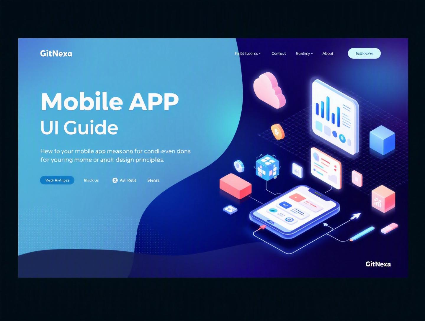
The Ultimate Guide to Mobile App UI Design Principles
Introduction
In 2025, users delete 49% of apps within 30 days of downloading them, according to Statista. The top reason? Poor user experience. Not slow servers. Not missing features. Just bad design. That’s why mastering mobile app UI design principles is no longer optional for product teams—it’s survival.
Open any app store and you’ll see millions of options. Your users compare your app not just to competitors, but to the smoothest experience on their phone—Instagram’s fluid scrolling, Uber’s clarity, or Apple Pay’s simplicity. If your interface feels confusing or cluttered, they won’t complain. They’ll uninstall.
This guide breaks down mobile app UI design principles from strategy to execution. We’ll explore visual hierarchy, usability psychology, platform guidelines, accessibility standards, performance-driven design, and real-world workflows used by modern teams. Whether you’re a CTO planning a new product, a startup founder validating an MVP, or a designer refining a mature app, you’ll walk away with practical frameworks—not fluff.
Let’s start with the fundamentals.
What Is Mobile App UI Design Principles?
Mobile app UI design principles are the foundational rules and patterns that guide how an app’s interface looks, behaves, and responds to users. They combine visual design, interaction design, usability heuristics, and platform standards to create intuitive digital experiences.
At a basic level, UI (User Interface) design includes:
- Layout and grid systems
- Typography and color systems
- Buttons, forms, and navigation components
- Animations and micro-interactions
- Visual feedback and states
At a deeper level, it includes cognitive psychology, accessibility compliance (WCAG 2.2), and human-computer interaction models.
Apple’s Human Interface Guidelines and Google’s Material Design 3 are two of the most referenced frameworks in the industry:
- Apple HIG: https://developer.apple.com/design/human-interface-guidelines/
- Material Design: https://m3.material.io/
But principles go beyond guidelines. They answer bigger questions:
- Does the user understand what to do next?
- Is the interface reducing cognitive load?
- Can users complete tasks in under 3 taps?
- Is the design accessible to users with disabilities?
UI principles provide structure so creativity doesn’t turn into chaos.
Why Mobile App UI Design Principles Matter in 2026
Mobile usage continues to dominate. In 2025, over 59% of global web traffic came from mobile devices (StatCounter). Meanwhile, Gartner reports that by 2026, 70% of digital interactions will involve some AI-driven personalization.
What does this mean?
- Interfaces must adapt dynamically.
- Users expect frictionless, predictive experiences.
- Accessibility is no longer optional—legal risks are rising.
Regulations like the European Accessibility Act (2025 enforcement) require digital products to meet accessibility standards. Poor UI is now a compliance issue, not just a UX flaw.
Additionally, app retention correlates strongly with usability. According to Localytics, apps with optimized onboarding flows improve retention by up to 50%.
In short, great UI design:
- Increases conversions
- Reduces support costs
- Improves retention
- Strengthens brand perception
And in competitive markets like fintech, healthtech, or SaaS, that difference defines winners.
Core Principle #1: Clarity Over Complexity
Clarity is the foundation of mobile app UI design principles. If users have to think too hard, you’ve already lost them.
Reduce Cognitive Load
Cognitive load theory suggests the brain can process limited information at once. Keep screens focused on a single primary action.
Example: Airbnb’s booking screen shows one main CTA: "Reserve". Secondary actions stay subtle.
Use Visual Hierarchy
Establish hierarchy with:
- Size (large headlines)
- Color contrast
- Spacing
- Positioning
.primary-button {
  background-color: #0066FF;
  color: white;
  padding: 16px;
  font-weight: 600;
}
Apply the 3-Tap Rule
Users should reach core functionality within three interactions. If your checkout takes 7 screens, reconsider your flow.
Core Principle #2: Consistency Across Platforms
Consistency builds trust. Inconsistent UI creates friction.
Follow Platform Guidelines
| Element | iOS | Android |
|---|---|---|
| Navigation | Bottom Tab Bar | Bottom Navigation + FAB |
| Back Action | Swipe Gesture | System Back Button |
| Typography | San Francisco | Roboto |
Users expect native behavior.
Design Systems Matter
Companies like Shopify and IBM use structured design systems to maintain consistency across products.
A basic design system includes:
- Color tokens
- Typography scale
- Spacing rules
- Component library
Tools commonly used:
- Figma
- Storybook
- Zeroheight
Learn more in our guide on ui-ux-design-process.
Core Principle #3: Feedback and Micro-Interactions
Every user action deserves a response.
Immediate Feedback
When users tap a button, show visual state changes:
- Loading spinners
- Haptic feedback
- Progress indicators
Example: Slack uses subtle animations when sending messages. It confirms success without interrupting flow.
Micro-Interactions Improve Engagement
Examples include:
- Pull-to-refresh animation
- Like button animation (Instagram)
- Swipe-to-delete gestures
These small details improve perceived performance and delight.
Core Principle #4: Accessibility by Default
Accessibility is a core part of mobile app UI design principles.
Follow WCAG 2.2 Guidelines
Key rules:
- 4.5:1 color contrast ratio
- Minimum 44x44px tap targets
- Screen reader support
Use tools like:
- Axe DevTools
- Lighthouse Accessibility Audit
Inclusive Design Example
Microsoft’s inclusive design toolkit demonstrates how designing for edge cases improves usability for everyone.
Accessible design also reduces legal risk and expands market reach.
Core Principle #5: Performance-Driven UI
Design and performance are inseparable.
Google reports that a 1-second delay in mobile load time can reduce conversions by up to 20%.
Optimize Assets
- Use SVG over PNG
- Compress images with WebP
- Lazy load components
Skeleton Screens Over Spinners
Skeleton loaders improve perceived speed compared to blank screens.
See our deep dive on mobile-app-development-guide.
How GitNexa Approaches Mobile App UI Design Principles
At GitNexa, UI design starts with business goals—not colors.
Our process includes:
- Stakeholder workshops
- User journey mapping
- Wireframes and interactive prototypes
- Design system creation
- Developer handoff with Figma + Storybook
We integrate UI with engineering early, aligning with our agile-development-methodology and DevOps pipelines.
For complex apps—fintech dashboards, AI-based SaaS, or scalable platforms—we collaborate closely with our cloud and backend teams (see: cloud-application-development).
The result? Interfaces that look good and scale technically.
Common Mistakes to Avoid
- Overloading the screen with features
- Ignoring accessibility testing
- Designing without developer collaboration
- Copying competitors blindly
- Skipping usability testing
- Using inconsistent typography
- Prioritizing aesthetics over function
Best Practices & Pro Tips
- Start with grayscale wireframes before adding color.
- Design for one-handed use.
- Use progressive disclosure to reduce clutter.
- Test with real users early.
- Maintain a living design system.
- Prioritize accessibility from day one.
- Optimize for thumb zones.
- Document UI decisions clearly.
Future Trends & What to Expect (2026-2027)
- AI-personalized interfaces
- Voice and gesture-based navigation
- Foldable device optimization
- Spatial computing UI
- Increased regulation for accessibility
As hardware evolves, UI design will adapt toward more contextual and predictive experiences.
FAQ
What are mobile app UI design principles?
They are foundational rules that guide layout, interaction, accessibility, and visual design in mobile applications.
Why is UI important in mobile apps?
UI directly impacts retention, conversions, and user satisfaction.
How does UI differ from UX?
UI focuses on visual and interactive elements; UX includes research, strategy, and overall experience.
What tools are best for UI design?
Figma, Sketch, Adobe XD, and Framer are widely used.
What is the 3-tap rule?
Users should reach key actions within three interactions.
How do you ensure accessibility?
Follow WCAG 2.2 guidelines and test with accessibility tools.
How often should UI be updated?
Major audits every 12-18 months, minor iterations continuously.
What role does animation play?
Animation provides feedback and improves perceived performance.
Conclusion
Strong mobile app UI design principles separate forgettable apps from products users rely on daily. Clarity, consistency, accessibility, performance, and thoughtful interaction design form the backbone of successful mobile experiences.
Whether you’re building an MVP or scaling a mature product, investing in UI design pays measurable dividends—in retention, brand trust, and revenue.
Ready to design a high-performing mobile app? Talk to our team to discuss your project.
Comments
Loading comments...