Sub Category
Latest Blogs
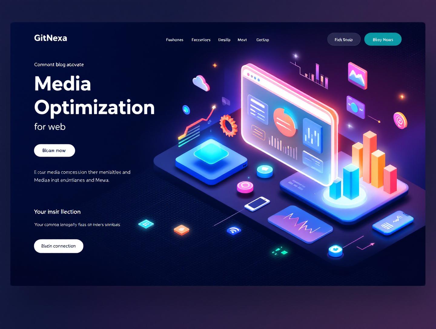
The Ultimate Guide to Media Optimization for Web Performance
Introduction
In 2024, Google reported that images and videos account for over 65% of the average webpage weight, and media-heavy pages are still the leading cause of slow Largest Contentful Paint scores on mobile. That single statistic explains why media optimization for web performance has become a non-negotiable discipline for modern teams. Users abandon slow pages fast. Google measures that impatience. Revenue feels the impact almost immediately.
Media optimization for web is not just about compressing images anymore. It touches how assets are created, stored, delivered, cached, and rendered across devices and network conditions. A 4K product image that looks perfect on a designer’s MacBook can quietly destroy conversion rates on a mid-range Android phone running on 4G.
This guide is written for developers, CTOs, startup founders, and product teams who want practical, real-world guidance. You will learn what media optimization for web really means in 2026, why it matters more than ever, and how teams at scale approach it. We will walk through formats, compression strategies, responsive delivery, video handling, CDNs, and automation. Along the way, you will see concrete examples, code snippets, tables, and workflows you can actually apply.
By the end, you should be able to audit your current media pipeline, spot inefficiencies, and make informed decisions that improve performance, SEO, and user experience without compromising visual quality.
What Is Media Optimization for Web
Media optimization for web is the practice of preparing, delivering, and rendering images, videos, audio, and animations in a way that minimizes file size and load time while preserving acceptable visual and functional quality. It spans multiple layers of a web system, from design tools and build pipelines to runtime delivery via CDNs and browser APIs.
At a basic level, it includes image compression and resizing. At a more advanced level, it involves responsive images, adaptive video streaming, lazy loading, modern codecs, caching strategies, and client hints. The goal is simple: deliver the right media, in the right format, at the right size, to the right device.
For beginners, think of it as shrinking files without making them look bad. For experienced teams, media optimization for web is an engineering system. It has inputs (raw assets), transformations (compression, transcoding), distribution (CDN and caching), and outputs (fast rendering and low Core Web Vitals).
This topic overlaps with frontend performance, DevOps, and even product design. A design decision to use autoplay background video is a media decision. A backend choice of storage and CDN is a media decision. That is why media optimization for web sits at the intersection of technology and business outcomes.
Why Media Optimization for Web Matters in 2026
Media optimization for web matters in 2026 because the web is heavier, users are less patient, and search engines are stricter. According to HTTP Archive data from 2025, the median mobile webpage is over 2.2 MB, with images alone averaging more than 900 KB. Video usage continues to rise, especially in ecommerce, SaaS landing pages, and online education.
Google’s Core Web Vitals remain ranking signals. Largest Contentful Paint is often an image or video element. Poorly optimized media directly hurts SEO. That is not theory. Teams that reduced hero image weight by 40–60% consistently report measurable LCP improvements within weeks.
There is also a cost angle. Serving unoptimized media increases bandwidth bills. For high-traffic platforms, especially those running on cloud infrastructure, that cost compounds quickly. Streaming platforms, marketplaces, and content-heavy blogs feel this pain first.
Another shift is device diversity. In 2026, teams must support foldables, high-DPI screens, low-end phones, and everything in between. A single static image no longer works. Media optimization for web is how you adapt gracefully.
Finally, privacy and sustainability are part of the conversation. Smaller media files mean less data transfer and lower energy consumption. Some European companies now track page weight as part of their sustainability reporting. Media optimization is quietly becoming a responsible engineering practice.
Understanding Image Formats and When to Use Them
Raster vs Vector Images
Raster images like JPEG, PNG, WebP, and AVIF are made of pixels. Vector images like SVG are mathematically defined. Choosing between them is the first optimization decision.
Use SVG for logos, icons, and simple illustrations. They scale infinitely and are often smaller than raster alternatives. Use raster formats for photographs and complex imagery.
Modern Image Formats Compared
| Format | Best Use Case | Compression Type | Browser Support (2026) |
|---|---|---|---|
| JPEG | Photographs | Lossy | Universal |
| PNG | Transparency, UI | Lossless | Universal |
| WebP | General web images | Lossy and lossless | 95%+ |
| AVIF | High-quality photos | Advanced lossy | 90%+ |
AVIF often delivers 20–30% smaller files than WebP at similar quality. Netflix and Google both reported significant bandwidth savings after adopting AVIF for supported browsers.
Practical Example
An ecommerce brand migrating product images from JPEG to AVIF reduced average image size from 220 KB to 140 KB. Multiply that by 10 images per page and millions of visits per month, and the savings become obvious.
Implementation Example
<picture>
  <source srcset="product.avif" type="image/avif">
  <source srcset="product.webp" type="image/webp">
  <img src="product.jpg" alt="Product image" loading="lazy">
</picture>
This approach ensures backward compatibility while prioritizing modern formats.
Responsive Images and Adaptive Delivery
Why One Image Size Is Not Enough
A 2400px-wide image served to a 375px mobile screen is wasted bytes. Responsive images solve this by letting the browser choose the most appropriate asset.
Using srcset and sizes
<img
  src="hero-800.jpg"
  srcset="hero-400.jpg 400w, hero-800.jpg 800w, hero-1600.jpg 1600w"
  sizes="(max-width: 600px) 90vw, 800px"
  alt="Hero banner">
The browser evaluates viewport size and device pixel ratio, then selects the best candidate.
CDN-Based Adaptation
CDNs like Cloudflare Images and Imgix dynamically resize images based on request parameters. This reduces the need to pre-generate multiple variants.
Real-World Workflow
- Upload a high-resolution source image.
- CDN generates optimized variants on demand.
- Cache variants at edge locations.
- Serve the smallest acceptable image per request.
Teams using this approach often cut image-related development time in half.
Video Optimization for Web Without Killing Performance
The Cost of Video
Video is the heaviest media type on the web. A 10-second background video can outweigh an entire landing page if mishandled.
Video Codecs and Containers
H.264 remains widely supported, but VP9 and AV1 offer better compression. YouTube reported up to 30% bandwidth reduction using AV1 for supported devices.
Adaptive Streaming with HLS and DASH
Instead of serving a single large MP4, adaptive streaming breaks video into chunks at multiple resolutions.
# Example HLS workflow
Source video → Transcoding → Multiple bitrates → Playlist (.m3u8)
Browsers switch quality based on network conditions.
Practical Tips
- Avoid autoplay unless necessary.
- Use poster images to delay video loading.
- Lazy load offscreen videos.
For SaaS marketing pages, replacing autoplay background video with a click-to-play interaction often improves engagement and performance.
Lazy Loading, Preloading, and Rendering Strategy
Native Lazy Loading
Modern browsers support lazy loading via a simple attribute.
<img src="gallery.jpg" loading="lazy" alt="Gallery image">
This defers loading until the image is near the viewport.
When to Preload Media
Critical images like hero banners can be preloaded.
<link rel="preload" as="image" href="hero.avif">
Used incorrectly, preload can hurt performance. Use it sparingly.
Rendering Order Matters
Media should not block critical rendering paths. Inline SVGs for icons often render faster than external image requests.
For deeper frontend performance strategies, see frontend performance optimization.
Automating Media Optimization in Build Pipelines
Build-Time Optimization
Tools like Sharp, ImageMagick, and Squoosh CLI automate image processing during builds.
Example with Sharp
const sharp = require('sharp');
sharp('input.jpg')
  .resize(800)
  .toFormat('webp')
  .toFile('output.webp');
CI/CD Integration
Teams integrate media optimization into CI pipelines so unoptimized assets never reach production.
This aligns well with DevOps practices discussed in ci-cd-pipeline-best-practices.
How GitNexa Approaches Media Optimization for Web
At GitNexa, media optimization for web is treated as a system, not a one-off task. Our teams start with performance audits using Lighthouse, WebPageTest, and real user monitoring data. We identify which media assets hurt Core Web Vitals and why.
From there, we design a media pipeline that fits the product. For startups, that might mean build-time optimization with modern formats. For enterprise platforms, it often includes CDN-based transformation, adaptive video streaming, and caching strategies tied to cloud infrastructure.
We work closely with design teams to align visual goals with technical constraints. A subtle design tweak can save hundreds of kilobytes per page. Our web development and cloud teams collaborate to ensure media delivery scales globally.
If you are exploring related improvements, our articles on web application development and cloud infrastructure optimization provide additional context.
Common Mistakes to Avoid
- Uploading raw design exports directly to production without optimization.
- Serving the same image size to all devices.
- Using PNG for photographs when modern formats are available.
- Autoplaying large videos on mobile.
- Ignoring CDN caching headers for media assets.
- Overusing preload and blocking critical rendering.
Each of these mistakes adds unnecessary weight and hurts user experience.
Best Practices & Pro Tips
- Always generate multiple image sizes or use a dynamic image CDN.
- Prefer AVIF or WebP with JPEG fallbacks.
- Lazy load non-critical media by default.
- Audit media weight monthly using automated tools.
- Treat video as a feature, not decoration.
- Monitor real user metrics, not just lab scores.
Future Trends & What to Expect
By 2027, wider AV1 adoption will further reduce video bandwidth. Client hints will become more reliable for adaptive delivery. AI-based perceptual compression will automate quality decisions. Browsers will continue to tighten performance budgets, making media optimization for web even more central to product success.
Frequently Asked Questions
What is media optimization for web
Media optimization for web is the process of reducing media file size and improving delivery without sacrificing quality or usability.
Does media optimization affect SEO
Yes. Optimized media improves Core Web Vitals, which are ranking signals in Google search.
Is WebP better than JPEG
In most cases, yes. WebP offers smaller file sizes at similar quality.
Should every site use a CDN for images
High-traffic and global sites benefit the most, but even small sites can see gains.
How do I optimize video for web
Use modern codecs, adaptive streaming, and avoid unnecessary autoplay.
Can lazy loading hurt SEO
When implemented correctly, it does not. Search engines support native lazy loading.
How often should media be audited
At least once per quarter, or after major design changes.
Are design tools enough for optimization
Design tools help, but production optimization should happen in the build or delivery pipeline.
Conclusion
Media optimization for web is one of the highest ROI improvements a team can make. It touches performance, SEO, cost, and user satisfaction all at once. In 2026, shipping unoptimized media is no longer a minor oversight. It is a competitive disadvantage.
By understanding formats, responsive delivery, video strategies, and automation, teams can build faster, more resilient web experiences. The best results come from treating media as part of your system architecture, not an afterthought.
Ready to improve your media optimization for web and ship faster experiences? Talk to our team at https://www.gitnexa.com/free-quote to discuss your project.
Comments
Loading comments...