Sub Category
Latest Blogs
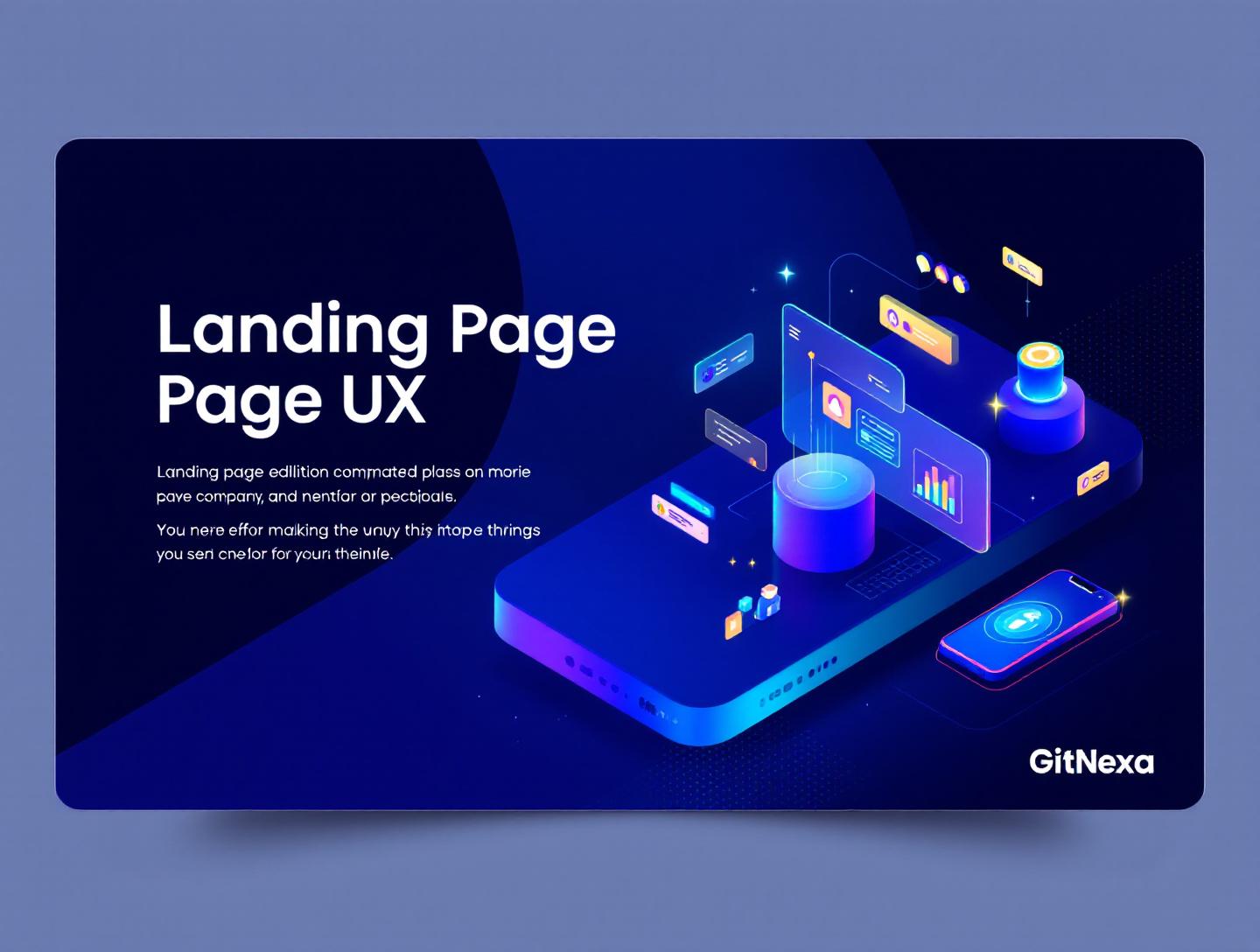
The Ultimate Guide to Landing Page UX That Converts
Introduction
In 2024, the average landing page conversion rate across industries hovered around 4.3%, according to Unbounce. That means more than 95% of visitors leave without taking action. For most businesses, the problem isn’t traffic. It’s landing-page-ux.
Landing page UX determines whether a visitor understands your offer in five seconds or bounces out of confusion, friction, or distrust. Founders often blame copy, marketers tweak headlines endlessly, and growth teams chase new channels. Meanwhile, the real issue sits quietly in how the page feels, flows, and responds to human behavior.
Landing-page-ux is not about pretty screens or trendy animations. It’s about clarity, intent, cognitive load, and decision-making psychology. When UX is done right, users don’t think. They act. When it’s done wrong, even the best offers struggle to convert.
In this guide, we’ll break down landing-page-ux from first principles to advanced execution. You’ll learn what landing page UX actually means, why it matters more in 2026 than ever before, and how high-performing teams design pages that consistently convert. We’ll analyze real-world examples, UX patterns, layout decisions, form strategies, and performance trade-offs. We’ll also show how GitNexa approaches landing page UX for startups and scale-ups building serious digital products.
Whether you’re a CTO reviewing funnel performance, a founder preparing for a paid acquisition push, or a designer tired of subjective feedback, this guide will give you a practical, evidence-based framework for landing page UX that works.
What Is Landing Page UX
Landing page UX refers to the end-to-end user experience of a visitor who arrives on a standalone page with a single conversion goal. Unlike general website UX, landing-page-ux is intentionally narrow. Every element exists to guide the user toward one action: sign up, request a demo, download a resource, or make a purchase.
At its core, landing page UX combines usability, psychology, information architecture, and performance. It answers three questions immediately:
- Where am I?
- What can I do here?
- Why should I care right now?
Good landing-page-ux removes friction between intent and action. That includes page load speed, visual hierarchy, content clarity, form design, accessibility, and trust signals. Poor UX introduces hesitation: unclear headlines, distracting layouts, slow pages, or forms that feel like interrogations.
A useful way to think about landing page UX is as a focused decision environment. Unlike a homepage with multiple paths, a landing page should feel like a well-designed checkout line. No clutter. No confusion. Just a clear next step.
For experienced teams, landing-page-ux is measurable. It shows up in scroll depth, time to first interaction, rage clicks, form abandonment rates, and ultimately conversion rate. Tools like Hotjar, Google Analytics 4, and FullStory exist because UX problems are often invisible until you watch real users struggle.
Why Landing Page UX Matters in 2026
Landing page UX has become more critical in 2026 for one simple reason: attention is more expensive than ever. Paid acquisition costs continue to rise. Meta’s average CPM increased by over 11% year-over-year in 2025, and Google Search ads followed a similar trend. When every click costs more, wasting traffic on poor UX is no longer tolerable.
User expectations have also shifted. People now expect near-instant load times, mobile-first layouts, and frictionless interactions. Google’s Core Web Vitals, especially Interaction to Next Paint (INP), directly influence both SEO and perceived quality. A slow or janky landing page doesn’t just convert poorly; it often doesn’t rank at all. Google has been explicit about this in its official documentation: https://developers.google.com/search/docs/appearance/core-web-vitals
Another shift is trust. Users have become more skeptical of marketing claims. Overdesigned pages with stock photos and vague promises feel untrustworthy. Clean, honest UX backed by social proof and transparent copy performs better.
Finally, AI-driven personalization is changing how landing pages are built. Dynamic content, A/B testing at scale, and behavior-based layouts are becoming standard for competitive teams. UX is no longer static. It adapts in real time, and teams that don’t design for this flexibility fall behind.
Landing Page UX Fundamentals: Layout, Hierarchy, and Flow
Visual Hierarchy That Matches User Intent
The first job of landing-page-ux is directing attention. Visual hierarchy answers the question: what should the user notice first, second, and third?
High-performing landing pages consistently follow a predictable pattern:
- Clear headline that states the primary value
- Supporting subheadline that clarifies audience or outcome
- Primary call-to-action (CTA)
- Social proof or credibility signals
Companies like Stripe and Webflow are textbook examples. Their landing pages rarely surprise users, and that’s the point. Familiar patterns reduce cognitive load.
Use size, contrast, and spacing deliberately. If everything is bold, nothing is. Designers often overuse accent colors, which dilutes focus. One primary CTA color per page is usually enough.
Above-the-Fold Content That Actually Works
“Above the fold” still matters, but not in the simplistic way it once did. It’s not about cramming everything into the first screen. It’s about answering the core questions before the user has to scroll.
A strong above-the-fold section includes:
- A benefit-driven headline
- A short explanation of who it’s for
- One primary CTA
- Optional visual that reinforces the value
Avoid sliders, autoplay videos, or rotating headlines. They add complexity without improving comprehension.
Designing for Scroll, Not Just Clicks
Modern landing-page-ux assumes scrolling. The goal is to create a narrative flow that rewards continued attention.
A simple structure looks like this:
- Problem
- Solution
- Proof
- Details
- Action
This structure mirrors how people evaluate decisions. When done right, scrolling feels natural, not forced.
Forms and CTAs: Reducing Friction Where It Matters Most
Form UX That Respects User Effort
Forms are where most landing pages fail. Every extra field reduces completion rates. HubSpot’s 2023 analysis showed that reducing form fields from 4 to 3 can increase conversions by up to 50%.
Ask only for information you genuinely need at that stage. For early-stage leads, name and email are often enough. Progressive profiling can collect more data later.
Practical form UX tips:
- Use single-column layouts
- Clearly label required fields
- Show inline validation
- Avoid placeholder-only labels
Here’s a simple HTML example of accessible form markup:
<label for="email">Work Email</label>
<input type="email" id="email" name="email" required />
CTA Copy That Signals Value, Not Action
“Submit” is one of the worst CTA labels in UX history. Users don’t want to submit. They want outcomes.
Effective CTAs describe what happens next:
- “Get the pricing breakdown”
- “See the product in action”
- “Download the full guide”
CTAs should reduce anxiety, not increase it. Microcopy below the button, such as “No credit card required,” often lifts conversions significantly.
Performance, Accessibility, and Technical UX
Speed as a UX Feature
Landing-page-ux is inseparable from performance. According to Google, a page that loads in 1 second has a conversion rate up to 3x higher than one that loads in 5 seconds.
Key performance practices:
- Use modern image formats like WebP
- Defer non-critical JavaScript
- Optimize fonts and avoid excessive weights
- Use CDN caching
Tools like Lighthouse and WebPageTest help diagnose issues early.
Accessibility Isn’t Optional
Accessible UX benefits everyone. Clear contrast, readable fonts, keyboard navigation, and screen-reader support improve usability across the board.
WCAG 2.2 guidelines are the baseline. Ignoring accessibility isn’t just risky from a legal perspective; it’s bad UX.
MDN provides excellent references on accessible form controls: https://developer.mozilla.org/en-US/docs/Learn/Forms/Accessibility
Trust Signals and Credibility Design
Social Proof That Feels Real
Logos alone don’t build trust anymore. Specific proof does.
Effective trust signals include:
- Short testimonials with names and roles
- Case study metrics ("Increased demo bookings by 37%")
- Security badges when relevant
Avoid fake reviews or overly polished quotes. Users can spot them instantly.
Consistency Across Touchpoints
Landing page UX doesn’t exist in isolation. If your ad promises one thing and your page delivers another, trust erodes fast.
Ensure message match between ads, emails, and landing pages. This alignment alone can improve conversion rates without any design changes.
How GitNexa Approaches Landing Page UX
At GitNexa, we treat landing-page-ux as a product, not a marketing asset. Our process starts with understanding user intent and business constraints, then designing UX that balances clarity, performance, and scalability.
We typically begin with funnel analysis using GA4 and session recordings to identify friction points. From there, our UX and engineering teams collaborate on wireframes, not just visual mockups. This ensures feasibility and performance from day one.
Our landing pages are built with modern stacks like Next.js, Tailwind CSS, and headless CMS setups when content velocity matters. We pay close attention to Core Web Vitals, accessibility, and long-term maintainability.
You can see related thinking in our work on UI/UX design services, web application development, and conversion-focused frontend architecture.
Common Mistakes to Avoid
- Designing for stakeholders instead of users
- Overloading the page with multiple CTAs
- Ignoring mobile UX until late
- Using generic stock imagery
- Asking for too much information upfront
- Neglecting performance optimization
- Skipping user testing entirely
Each of these mistakes introduces friction that compounds over time.
Best Practices & Pro Tips
- Write the headline last, not first
- Test one variable at a time
- Use real user language from interviews
- Prioritize clarity over creativity
- Design mobile-first, then enhance
- Treat speed as a feature
- Review session recordings monthly
Future Trends & What to Expect
Between 2026 and 2027, landing-page-ux will become more adaptive and data-driven. Expect wider adoption of AI-based personalization, real-time UX adjustments, and deeper integration between design systems and experimentation platforms.
We’ll also see stricter performance and accessibility expectations as browsers and search engines raise the bar. Teams that invest early will have a compounding advantage.
FAQ
What is landing page UX?
Landing page UX focuses on how users experience a single-purpose page designed to drive a specific action. It prioritizes clarity, speed, and minimal friction.
How is landing page UX different from website UX?
Website UX supports exploration across multiple pages, while landing-page-ux is intentionally narrow and conversion-focused.
What makes a landing page convert better?
Clear messaging, fast load times, strong visual hierarchy, and low-friction forms are the biggest factors.
How many CTAs should a landing page have?
Usually one primary CTA. Secondary CTAs should be used sparingly and only when necessary.
Does mobile UX matter more than desktop?
Yes. In many industries, over 60% of landing page traffic comes from mobile devices.
How fast should a landing page load?
Ideally under 2 seconds on a 4G connection.
Are animations bad for landing page UX?
Not inherently, but unnecessary animations often hurt performance and clarity.
How often should landing pages be tested?
Continuously. Even small improvements compound over time.
Conclusion
Landing-page-ux is one of the highest-leverage areas in digital product and marketing strategy. Small improvements in clarity, speed, and usability can produce outsized gains in conversion rates and ROI.
The best landing pages don’t feel clever. They feel obvious. They respect the user’s time, answer questions quickly, and make the next step easy.
If you’re investing in traffic, product launches, or growth experiments, landing page UX deserves serious attention. Ready to improve your landing-page-ux and convert more of the traffic you already have? Talk to our team to discuss your project.
Comments
Loading comments...