Sub Category
Latest Blogs
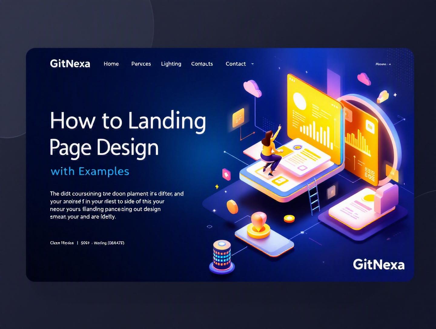
Ultimate Landing Page Design Guide with Examples
According to HubSpot’s 2024 Marketing Benchmark Report, the average landing page conversion rate across industries is just 9.7%. That means roughly 9 out of 10 visitors leave without taking action. For startups burning ad budgets, SaaS founders chasing MRR, and enterprises scaling digital campaigns, that’s a costly problem.
Landing page design isn’t about making something that looks nice. It’s about engineering a focused, persuasive experience that converts traffic into leads, signups, bookings, or sales. A well-designed landing page can double or triple conversion rates without increasing traffic. That’s real leverage.
In this comprehensive guide, we’ll break down how to approach landing page design strategically and technically. You’ll learn what makes high-converting pages work, see real-world examples, review UX principles, explore layout frameworks, understand performance considerations, and discover how to test and optimize for measurable growth. We’ll also cover common mistakes, future trends, and how GitNexa builds landing pages that drive measurable ROI.
If you’re a developer, CTO, product manager, or marketing leader looking to improve conversion rates in 2026, this guide will give you both the theory and the tactical execution plan.
What Is Landing Page Design?
Landing page design is the process of creating a single, focused web page built to drive one specific action — such as form submissions, demo bookings, product purchases, or app downloads.
Unlike a homepage, which serves multiple purposes and audiences, a landing page is intentionally narrow in scope. It aligns tightly with a campaign, keyword, or user intent.
Key Characteristics of Landing Pages
A high-performing landing page typically includes:
- A clear, benefit-driven headline
- A supporting subheadline
- A strong primary call-to-action (CTA)
- Visual proof (images, product screenshots, videos)
- Social proof (testimonials, logos, reviews)
- Minimal navigation (to reduce distractions)
In short, landing page design blends conversion rate optimization (CRO), UI/UX design, behavioral psychology, and performance engineering.
How Landing Pages Differ from Regular Web Pages
| Feature | Homepage | Landing Page |
|---|---|---|
| Goal | Multiple | Single-focused |
| Navigation | Full menu | Limited or none |
| Audience | Broad | Specific segment |
| Conversion intent | Indirect | Direct |
For example, when Slack runs a Google Ads campaign targeting “team collaboration software,” it sends users to a focused landing page — not its homepage. That page speaks directly to the search intent.
That focus is what makes landing page design so powerful.
Why Landing Page Design Matters in 2026
User expectations are rising. Attention spans are shrinking. And paid traffic is getting more expensive.
In 2025, WordStream reported that the average cost-per-click (CPC) in competitive B2B industries exceeded $8. If your landing page doesn’t convert, you’re literally burning money.
Key Trends Driving Importance
- Privacy-first marketing: With third-party cookies declining, first-party data capture via landing pages is critical.
- AI-powered personalization: Dynamic content is becoming the norm.
- Mobile-first dominance: Over 63% of web traffic in 2025 came from mobile devices (Statista).
- Performance expectations: Google’s Core Web Vitals directly impact rankings.
A slow, cluttered, or confusing landing page now hurts both paid and organic acquisition.
SEO and Landing Pages
Well-structured landing pages can rank organically if optimized correctly. For technical implementation strategies, see our guide on SEO-friendly web development.
Landing page design in 2026 isn’t optional — it’s foundational to digital growth.
Core Element #1: Crafting a High-Converting Layout
Design isn’t decoration. It’s structure.
The Proven Layout Framework
Most high-performing landing pages follow this flow:
- Hero section (headline + CTA)
- Problem statement
- Solution explanation
- Benefits breakdown
- Social proof
- Objection handling (FAQs)
- Final CTA
This mirrors the AIDA model (Attention, Interest, Desire, Action).
Real-World Example: Webflow
Webflow’s landing pages use bold headlines, clear CTAs, and product screenshots immediately visible above the fold. The CTA appears multiple times, but never feels repetitive.
Example HTML Structure
<section class="hero">
  <h1>Build High-Converting Landing Pages</h1>
  <p>Launch in days, not weeks.</p>
  <button>Start Free Trial</button>
</section>

<section class="benefits">
  <h2>Why It Works</h2>
</section>
Above-the-Fold Strategy
Users form an opinion in 50 milliseconds (Google UX research). Your hero section must:
- Communicate value instantly
- Show relevance to user intent
- Present a clear CTA
Clarity beats cleverness every time.
Core Element #2: Conversion Psychology in Landing Page Design
Good landing page design uses psychology intentionally.
1. Social Proof
Logos, testimonials, case studies.
Example: Shopify displays "Trusted by millions of businesses worldwide." That scale builds trust.
2. Scarcity and Urgency
Limited-time offers increase conversions.
Example: "Only 12 spots left for June onboarding."
3. Risk Reversal
Money-back guarantees reduce friction.
4. Visual Hierarchy
Use size, color, spacing to guide attention.
CTA Button Design
- High contrast color
- Clear action text ("Get My Free Audit")
- Ample white space
Psychology isn’t manipulation. It’s clarity applied intentionally.
Core Element #3: Mobile-First and Performance Optimization
A beautiful landing page that loads slowly is useless.
Google recommends Largest Contentful Paint (LCP) under 2.5 seconds. You can measure using Lighthouse or PageSpeed Insights.
Performance Checklist
- Use Next.js or Nuxt for server-side rendering
- Compress images (WebP format)
- Lazy-load below-the-fold assets
- Use CDN (Cloudflare, AWS CloudFront)
Example Next.js Image:
import Image from 'next/image'

<Image src="/hero.webp" width={800} height={600} alt="Landing page design" />
Mobile UX Best Practices
- Thumb-friendly buttons
- Short forms
- Sticky CTA
For scalable deployment pipelines, explore DevOps best practices.
Performance directly impacts conversion and SEO.
Core Element #4: Forms and Lead Capture Optimization
Forms are where conversion happens.
Reduce Friction
Every extra field lowers conversion rates. HubSpot found reducing form fields from 4 to 3 increased conversions by 50% in a case study.
Smart Form Techniques
- Progressive profiling
- Multi-step forms
- Autofill support
Example Form Structure
<form>
  <input type="email" placeholder="Work Email" required />
  <button type="submit">Get Started</button>
</form>
Security Signals
- SSL certificate
- Privacy policy link
- GDPR compliance note
For secure backend integration, see our article on cloud-native application architecture.
Core Element #5: A/B Testing and Continuous Optimization
No landing page is perfect on version one.
Testing Framework
- Form hypothesis
- Create variation
- Run experiment (Google Optimize alternatives like VWO or Optimizely)
- Measure statistical significance
What to Test
- Headlines
- CTA text
- Button color
- Hero image
- Pricing layout
Example Hypothesis
"Changing CTA from 'Submit' to 'Get My Free Plan' will increase conversions by 15%."
Conversion optimization is an ongoing engineering process.
For deeper experimentation strategies, check our guide on data-driven product development.
How GitNexa Approaches Landing Page Design
At GitNexa, we treat landing page design as a performance system — not a design exercise.
Our approach combines:
- UX research and user journey mapping
- High-performance frontend engineering (React, Next.js)
- Conversion copywriting
- Analytics integration (GA4, Mixpanel)
- Continuous A/B testing
We align landing pages with broader digital strategy — whether it’s SaaS onboarding, mobile app acquisition (see mobile app development insights), or enterprise digital transformation.
Every decision is measured against one metric: conversion impact.
Common Mistakes to Avoid in Landing Page Design
-
Too many CTAs Confuses users and dilutes focus.
-
Weak headlines If your headline doesn’t communicate value, users bounce.
-
Slow load times Kills both SEO and conversions.
-
Ignoring mobile Majority traffic is mobile.
-
No social proof Trust is non-negotiable.
-
Long, complex forms Creates friction.
-
No analytics tracking You can’t improve what you don’t measure.
Best Practices & Pro Tips
- Write headlines that focus on outcomes, not features.
- Use real product screenshots instead of generic stock photos.
- Place primary CTA above the fold.
- Repeat CTA after each major section.
- Use contrasting colors intentionally.
- Keep copy concise but benefit-driven.
- Add microcopy near forms to reduce anxiety.
- Use heatmaps (Hotjar, Crazy Egg) to analyze user behavior.
Future Trends & What to Expect (2026–2027)
AI-generated personalization will dominate landing page design. Tools like Adobe Sensei and dynamic CMS platforms will customize content in real-time.
Voice-search optimized landing pages will grow as conversational AI interfaces expand.
Interactive landing pages using WebGL and micro-animations will increase engagement.
Privacy-centric analytics will replace traditional tracking.
And performance standards will become stricter as Google updates Core Web Vitals.
FAQ: Landing Page Design
What makes a landing page high-converting?
A clear headline, focused CTA, strong social proof, and minimal distractions.
How long should a landing page be?
As long as necessary to address objections. Short for simple offers, long for high-ticket services.
Should landing pages have navigation menus?
Typically no. Removing navigation reduces distraction and increases conversions.
What is a good landing page conversion rate?
Average is around 9-10%, but top-performing pages exceed 20%.
How many CTAs should a landing page have?
One primary CTA repeated throughout the page.
Are landing pages good for SEO?
Yes, when optimized for specific keywords and search intent.
What tools help build landing pages?
Webflow, Unbounce, Next.js, WordPress, HubSpot.
How often should you A/B test?
Continuously. Optimization never stops.
Conclusion
Landing page design is where marketing, psychology, design, and engineering intersect. It’s not about aesthetics alone — it’s about measurable results. When you structure content strategically, optimize performance, reduce friction, and test relentlessly, small improvements compound into significant revenue gains.
If your acquisition costs are rising or conversions are stagnating, your landing page might be the bottleneck.
Ready to build high-converting landing pages that drive measurable growth? Talk to our team to discuss your project.
Comments
Loading comments...