Sub Category
Latest Blogs
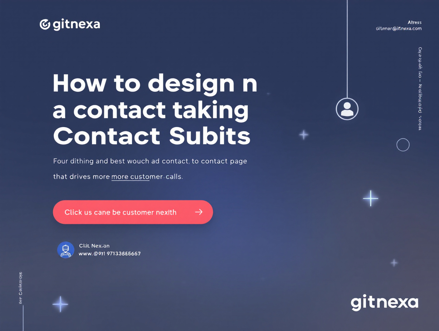
How to Design a Contact Page That Drives More Customer Calls
Introduction
For many businesses, the contact page is treated as a formality—a simple page with an email address, a phone number, and maybe a contact form. Yet in reality, your contact page is one of your website’s most powerful conversion assets. It’s the moment of truth where interested visitors decide whether they trust you enough to reach out, pick up the phone, and start a conversation. When designed strategically, a contact page can become a high-performing lead generator that consistently drives quality customer calls and revenue opportunities.
The problem is that most contact pages are built with aesthetics in mind, not psychology, usability, or intent. Visitors arrive with questions, doubts, and urgency. If your contact page doesn’t immediately reassure them, eliminate friction, and clearly show why calling you is the best next step, they’ll quietly leave—often to a competitor who made it easier.
In this comprehensive guide, you’ll learn exactly how to design a contact page that drives more customer calls. We’ll cover proven UX principles, conversion-focused copy, trust-building elements, mobile optimization, CTA placement, analytics, and real-world examples. You’ll also discover common mistakes that silently kill call conversions and how to avoid them. By the end of this article, you’ll have a step-by-step blueprint to turn your contact page into a call-generating machine.
Why Your Contact Page Matters More Than You Think
The Contact Page as a Conversion Point
Your contact page is not just informational—it’s transactional. According to Google’s consumer behavior research, users who visit a contact or location page are significantly more likely to convert within the same session. This makes the contact page one of the most intent-heavy pages on your website, rivaled only by pricing and checkout pages.
High-Intent Visitors Deserve High-Intent Design
Visitors who land on your contact page are rarely browsing casually. They usually fall into one of three categories:
- Prospects ready to buy and looking for confirmation
- Leads with specific questions before making a decision
- Existing customers seeking support or reassurance
Each group benefits from clarity, speed, and confidence. A poorly designed contact page introduces friction, while a well-designed one removes doubt and accelerates action.
For deeper insight into conversion funnels, see: https://www.gitnexa.com/blogs/how-conversion-rate-optimization-works
Understanding User Intent Before Designing
Mapping Intent to Design Decisions
Before choosing layouts or colors, you need to understand why users are on your contact page. Intent determines everything—from CTA wording to form length. High-intent users want immediate access to a phone number, while lower-intent users may prefer a form or chat option.
Behavioral Signals That Indicate Call Readiness
Some signals that indicate a visitor is ready to call include:
- Visiting pricing or service description pages
- Returning to the website multiple times
- Spending longer time on service pages
Design your contact page to prioritize calls for these users, while still offering secondary options.
Core Elements of a Call-Driven Contact Page
Prominent Phone Number Placement
Your phone number should be:
- Above the fold
- Clickable on mobile devices
- Repeated strategically throughout the page
Avoid hiding it in small fonts or footers. Use contrast and whitespace to make it stand out.
Call-Focused Headlines
Instead of generic headings like “Contact Us,” use benefit-driven headlines:
- “Speak Directly With a Solution Expert Today”
- “Call Now for a Free 15-Min Consultation”
These headlines set expectations and reduce hesitation.
Minimal, Purposeful Forms
Forms should support calls, not replace them. If you include a form:
- Ask only essential information
- Clearly state what happens after submission
- Offer a call as a faster alternative
Designing for Mobile Users First
Why Mobile-First is Non-Negotiable
Over 60% of contact page visits happen on mobile devices. Google confirms that mobile usability directly affects user satisfaction and conversions. A mobile-first contact page ensures tap-to-call functionality, fast loading times, and readable layouts.
Best Mobile Design Practices
- Use large, tappable CTA buttons
- Place the phone number at the top
- Avoid multi-column layouts
- Reduce text clutter
Learn more about mobile UX here: https://www.gitnexa.com/blogs/mobile-first-web-design-best-practices
Copywriting Techniques That Encourage Calls
Use Conversational, Reassuring Language
Your copy should sound human, not corporate. Phrases like “Talk to a real person” and “No pressure, no obligation” reduce anxiety and increase call likelihood.
Address Objections Before They Arise
Common objections include pricing concerns, commitment fears, or time constraints. Address these proactively:
- “Free consultation—no credit card required”
- “Average call time: 10–15 minutes”
Building Trust and Credibility on the Contact Page
Social Proof That Supports Calls
Trust indicators significantly increase call conversions. Effective elements include:
- Client logos
- Short testimonials near the CTA
- Star ratings or review snippets
According to BrightLocal, 87% of consumers read online reviews for local businesses, and seeing them near a contact CTA improves conversion confidence.
Visual Trust Signals
Add:
- Security badges
- Certifications
- Team photos
For authority-building strategies, see: https://www.gitnexa.com/blogs/building-digital-trust-for-brands
Strategic CTA Design for More Phone Calls
CTA Placement and Frequency
A single CTA is rarely enough. Place call CTAs:
- At the top of the page
- After trust sections
- Near the bottom as a final prompt
Color, Size, and Microcopy
Use contrasting colors and clear microcopy like:
- “Call Now—We’re Ready to Help”
- “Speak to an Expert Within Minutes”
Using Location and Availability to Boost Calls
Local Signals Increase Confidence
Displaying your business address, service area, or local phone number reassures users that you’re accessible and real.
Show Availability Clearly
Mention:
- Business hours
- Time zone
- Response times
For businesses serving multiple locations, reference: https://www.gitnexa.com/blogs/local-seo-strategies-for-service-businesses
Accessibility and Inclusivity in Contact Page Design
Accessible Design Drives More Engagement
Accessible pages benefit everyone. Use:
- Clear font sizes
- High-contrast colors
- Screen-reader-friendly labels
Google emphasizes accessibility as a ranking and usability factor.
Tracking and Optimizing Call Performance
Call Tracking Tools
Use tools like Google Analytics, Google Tag Manager, or call tracking platforms to measure:
- Click-to-call events
- Call duration
- Source pages
A/B Testing Contact Page Elements
Test:
- CTA wording
- Placement of phone number
- Headline variations
For optimization insights, see: https://www.gitnexa.com/blogs/ab-testing-for-higher-conversions
Real-World Examples and Use Cases
B2B Service Company Example
A SaaS consulting firm replaced a generic form with a call-first layout and saw a 42% increase in qualified calls within 60 days.
Local Business Example
A local HVAC company added mobile tap-to-call buttons and operating hours, increasing inbound calls by 35% quarter-over-quarter.
Best Practices for Designing High-Converting Contact Pages
- Prioritize calls over forms
- Use benefit-driven headlines
- Optimize for mobile first
- Build trust with proof and transparency
- Reduce friction and distractions
- Track, test, and refine continuously
Common Mistakes to Avoid
- Burying the phone number
- Using long, intimidating forms
- Vague CTAs like “Submit”
- Ignoring mobile usability
- Failing to track call conversions
Frequently Asked Questions
What makes a contact page convert better?
Clarity, trust signals, mobile optimization, and strong CTAs.
Should I remove forms altogether?
No. Keep them as secondary options while prioritizing calls.
How many CTAs should a contact page have?
At least three contextual call prompts.
Does design really affect phone calls?
Yes. UX and copy changes can increase calls by 30–50%.
What color works best for call buttons?
High-contrast colors like green or orange often perform well.
How do I track calls from my website?
Use Google Analytics and call tracking software.
Is a contact page important for SEO?
Indirectly, yes—user engagement signals matter.
Should I include live chat?
Yes, but never as a replacement for calls.
Conclusion: Turning Your Contact Page Into a Call Engine
A well-designed contact page is one of the most overlooked growth opportunities for businesses. By aligning design, copy, trust, and usability with user intent, you can dramatically increase the number of high-quality customer calls your website generates. The strategies outlined in this guide are not theoretical—they’re rooted in real-world testing, behavioral psychology, and proven conversion principles.
As customer expectations evolve, contact pages will continue to play a central role in lead generation and sales conversations. Businesses that invest in optimizing this critical page will consistently outperform competitors who treat it as an afterthought.
Ready to Build a Contact Page That Drives Calls?
If you want expert help designing or optimizing a contact page that converts more visitors into customer calls, our team can help.
👉 Get a free consultation and project quote here: https://www.gitnexa.com/free-quote
Authoritative References:
- Google UX Guidelines: https://developers.google.com/web/fundamentals/design-and-ux
- BrightLocal Consumer Review Survey
- Nielsen Norman Group UX Research
Comments
Loading comments...