Sub Category
Latest Blogs
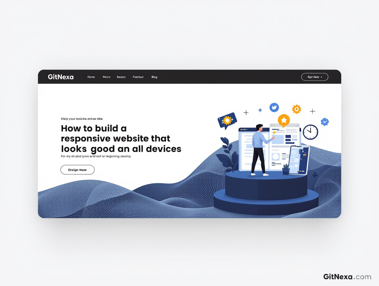
How to Build a Responsive Website That Looks Good on All Devices
Introduction
In today’s digital-first world, your website is no longer viewed only on desktop monitors. It’s accessed on smartphones during commutes, tablets on couches, laptops at work, and even large ultra-wide screens in creative studios. According to Google, over 60% of global web traffic now comes from mobile devices, and users expect a seamless experience regardless of the screen they’re using. If your website looks beautiful on a desktop but clumsy, broken, or slow on mobile, you are actively losing trust, conversions, and revenue.
This is where responsive web design becomes not just a technical choice, but a business necessity. Building a responsive website means creating one site that automatically adjusts its layout, content, images, and interactions to fit any device. But doing it well—so that it not only works, but looks polished and intentional on all screens—requires more than using a responsive framework or shrinking elements to fit smaller viewports.
In this in-depth guide, you’ll learn how to build a responsive website that looks good and performs brilliantly on all devices. We’ll go far beyond surface-level advice. You’ll understand responsive design principles, modern CSS techniques, mobile-first workflows, performance considerations, real-world use cases, common mistakes, and future trends. Whether you’re a business owner, designer, developer, or product manager, this guide will help you create websites that users love and Google ranks.
Understanding Responsive Web Design at Its Core
Responsive web design is the practice of creating websites that adapt fluidly to different screen sizes, resolutions, and orientations. Instead of building separate websites for mobile, tablet, and desktop, you build one flexible system that rearranges itself intelligently.
The Three Foundational Pillars
Fluid Layouts
Fluid layouts use relative units like percentages, vw, and vh instead of fixed pixel widths. This allows containers, columns, and sections to resize proportionally to the screen. A layout that’s 80% wide will behave consistently whether the viewport is 320px or 1920px wide.
Flexible Media
Images, videos, and other media must scale within their containers. A responsive image never overflows its parent or causes horizontal scrolling. Techniques like max-width: 100%, responsive image formats, and lazy loading are essential to making media adapt gracefully.
Media Queries
Media queries allow you to apply different CSS rules depending on screen width, height, resolution, or orientation. They are what enable layouts to switch from multi-column desktops to stacked mobile views.
Together, these pillars ensure that users get a usable, visually coherent experience across devices.
For a broader understanding of modern layout systems, you may find our guide on https://www.gitnexa.com/blogs/modern-web-design-principles helpful.
Why Responsive Design Is Critical for SEO and Conversions
Google officially recommends responsive design as the best approach for mobile optimization. Since Google uses mobile-first indexing, it evaluates your mobile site as the primary version when ranking pages.
SEO Benefits
- Single URL structure improves crawl efficiency
- Consistent content avoids duplicate content issues
- Faster mobile experiences reduce bounce rates
Google’s own documentation confirms that responsive sites are easier to index and rank than separate mobile URLs.
Conversion and UX Benefits
A responsive website improves user experience by:
- Reducing friction during navigation
- Making forms easier to complete on mobile
- Preserving brand consistency across devices
In a real-world case study, an ecommerce brand redesigned their site with a mobile-first responsive approach and saw a 35% increase in mobile conversions within three months.
To understand how UX directly impacts business results, explore https://www.gitnexa.com/blogs/user-experience-design-for-business-growth.
Mobile-First Design: Starting Small to Win Big
Mobile-first design flips traditional thinking. Instead of designing for desktops and then removing features for smaller screens, you design for mobile first and progressively enhance for larger displays.
Why Mobile-First Works
- Forces prioritization of essential content
- Improves load performance
- Aligns with real user behavior
Practical Mobile-First Workflow
- Design wireframes for mobile screens
- Identify core actions users must take
- Add layout enhancements for tablets and desktops
By starting with constraints, you end up with cleaner, more focused layouts that scale naturally.
Planning Layouts That Adapt Gracefully
Responsive layouts require thoughtful planning before any code is written.
Content Hierarchy and Information Flow
Ask yourself:
- What is the most important action on this page?
- What content must appear above the fold on mobile?
Grid Systems
Modern responsive grids use CSS Grid and Flexbox instead of rigid frameworks. These tools allow rows and columns to reflow based on available space.
For a deep dive into layout systems, see https://www.gitnexa.com/blogs/css-grid-vs-flexbox.
Typography That Looks Good on Every Screen
Typography is one of the most overlooked aspects of responsive design.
Responsive Font Sizing
Use relative units like rem, em, and clamp() to scale text smoothly across devices. Avoid setting body text in fixed pixels.
Line Length and Readability
Optimal line length is approximately 60–75 characters. On large screens, constrain content width to maintain readability.
Touch-Friendly Text
Make sure links and buttons have sufficient spacing to avoid accidental taps.
Responsive Images and Media Optimization
Images often account for the majority of page weight.
Techniques for Responsive Images
- Use
srcsetandsizes - Serve modern formats like WebP
- Apply lazy loading
Performance Impact
According to Google, reducing image payload can improve mobile load times by up to 50%.
Learn more in our performance guide: https://www.gitnexa.com/blogs/website-performance-optimization.
Navigation Design for Small and Large Screens
Navigation must evolve with screen size.
Mobile Navigation Patterns
- Hamburger menus
- Bottom navigation bars
- Accordion submenus
Desktop Enhancements
- Mega menus
- Hover-based interactions
Consistency is key: users should always know where they are.
Forms and Interactions That Work Anywhere
Forms are often the conversion bottleneck.
Mobile-Friendly Forms
- Use appropriate input types
- Minimize required fields
- Enable autofill
A responsive form can double mobile lead submissions.
Testing Responsiveness Across Devices
Never assume responsiveness works without testing.
Tools for Testing
- Chrome DevTools
- BrowserStack
- Real devices
What to Test
- Layout integrity
- Touch interactions
- Performance under slow networks
For QA strategies, see https://www.gitnexa.com/blogs/website-quality-assurance-checklist.
Accessibility and Inclusive Responsive Design
Responsive design should work for everyone.
Key Accessibility Considerations
- Color contrast
- Keyboard navigation
- Screen reader compatibility
WCAG-compliant responsive sites improve usability and reduce legal risk.
Real-World Use Cases and Examples
SaaS Website
A SaaS company redesigned its dashboard responsively, improving mobile session duration by 42%.
Ecommerce Store
Responsive product grids increased add-to-cart rates on mobile by 28%.
Corporate Website
A B2B brand improved credibility by ensuring consistent visuals across devices.
Best Practices for Building Responsive Websites
- Design mobile-first
- Use flexible layouts
- Optimize images aggressively
- Test on real devices
- Prioritize performance
Common Mistakes to Avoid
- Designing only for desktop
- Hiding critical content on mobile
- Using fixed-width layouts
- Ignoring performance
Future Trends in Responsive Web Design
Responsive design continues to evolve.
Emerging Trends
- Container queries
- Adaptive loading
- Responsive animations
Staying updated ensures long-term scalability.
FAQs: Responsive Website Design
What is responsive web design?
Responsive web design ensures a website adapts to all screen sizes using flexible layouts and media queries.
Is responsive design better than separate mobile sites?
Yes, it’s easier to maintain, better for SEO, and provides a consistent user experience.
How long does it take to build a responsive website?
Depending on complexity, it can take weeks to months.
Do responsive sites cost more?
Initially, they may cost more, but they’re cheaper to maintain long-term.
What devices should I test on?
Test on popular smartphones, tablets, laptops, and desktops.
Does responsive design affect loading speed?
When done correctly, it improves performance by serving optimized assets.
Can old websites be made responsive?
Yes, but it may require a redesign.
Is responsive design required for SEO?
While not required, it’s strongly recommended by Google.
Conclusion: Building Websites That Thrive Everywhere
A responsive website is no longer optional—it’s the foundation of modern digital success. By combining mobile-first thinking, flexible layouts, performance optimization, and real-world testing, you can build a website that looks great and performs flawlessly on every device.
If you want expert help building a responsive website that converts and scales, our team at GitNexa is here for you.
Ready to Build a Responsive Website?
👉 Get a custom solution tailored to your business. Visit https://www.gitnexa.com/free-quote to get started today.
Authoritative References:
- Google Search Central: Mobile-First Indexing
- W3C Responsive Web Design Standards
- Nielsen Norman Group on Mobile UX
Comments
Loading comments...