Sub Category
Latest Blogs
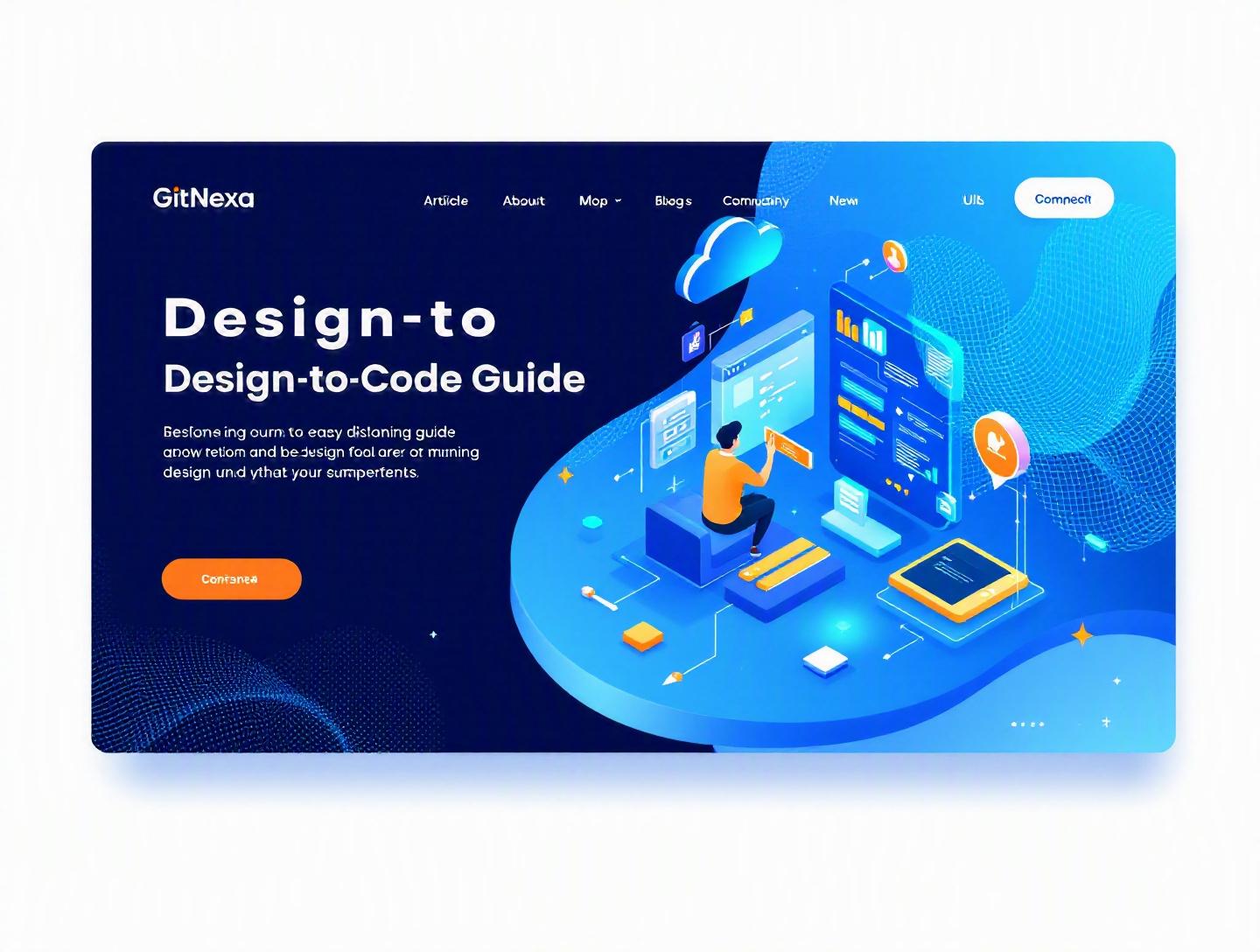
The Ultimate Design-to-Code Workflow Guide for 2026
Introduction
In 2025, a Forrester report revealed that nearly 37% of development rework in digital products stems from misalignment between design and engineering teams. That’s not a tooling problem. It’s a workflow problem.
The design-to-code workflow guide you’re about to read tackles that exact gap—how teams move from Figma files and wireframes to production-ready code without friction, duplication, or endless Slack threads. If you’ve ever seen pixel-perfect mockups fall apart in staging, or developers complain about "unclear specs," you’ve experienced a broken design-to-code process.
For startups, speed matters. For enterprises, consistency matters. For agencies, margin matters. In all three cases, the design-to-code workflow determines whether your product ships smoothly—or burns cycles in QA.
In this comprehensive guide, you’ll learn:
- What a modern design-to-code workflow actually looks like
- Why it matters more in 2026 than ever before
- Step-by-step processes to align designers and developers
- Tools, architecture patterns, and code examples
- Common pitfalls and advanced optimization strategies
- How GitNexa structures design-to-code delivery across client projects
Whether you're a CTO planning a new SaaS platform, a product designer building scalable UI systems, or a founder trying to reduce iteration cycles, this guide will give you a practical, field-tested blueprint.
What Is a Design-to-Code Workflow?
A design-to-code workflow is the structured process of converting UI/UX designs into production-ready code while maintaining visual fidelity, performance, and scalability.
At its simplest, it connects:
Design tools → Design system → Frontend architecture → Production deployment
But in real-world product teams, it’s more layered.
Core Components of a Design-to-Code Workflow
1. UI/UX Design Assets
- Wireframes
- High-fidelity mockups
- Interactive prototypes
- Design tokens (colors, typography, spacing)
Most teams use Figma, Sketch, or Adobe XD. In 2026, Figma dominates with over 75% market share among professional design teams (Statista, 2025).
2. Design Systems
A design system translates visual elements into reusable components.
Example:
{
  "color-primary": "#1A73E8",
  "font-heading": "Inter, sans-serif",
  "spacing-md": "16px"
}
These tokens then map into CSS variables:
:root {
  --color-primary: #1A73E8;
  --spacing-md: 16px;
}
3. Component-Based Frontend Development
Modern frameworks like React, Vue, and Angular rely on reusable UI components.
Example (React button component):
export const Button = ({ variant = "primary", children }) => {
  return (
    <button className={`btn btn-${variant}`}>
      {children}
    </button>
  );
};
4. Handoff & QA Process
- Dev-ready specs
- Storybook documentation
- Visual regression testing
- Cross-browser checks
A mature design-to-code workflow ensures zero ambiguity at this stage.
Why Design-to-Code Workflow Matters in 2026
The stakes are higher than ever.
1. AI-Assisted Design Is Accelerating Output
Tools like Figma AI and Uizard generate layouts in minutes. But generating designs faster without structured engineering alignment only increases chaos.
2. Multi-Platform Expectations
Users expect consistent experiences across:
- Web apps
- iOS and Android
- Progressive Web Apps
- Desktop apps (Electron, Tauri)
A broken workflow means inconsistency everywhere.
3. Component-Driven Architecture Is the Norm
According to the State of JS 2025 survey, over 82% of frontend developers use component-based frameworks. Without design-system alignment, scalability collapses quickly.
4. Remote & Distributed Teams
Designers in Berlin. Developers in Bangalore. Product managers in Toronto. Async collaboration demands clear systems.
5. Cost of Rework Is Rising
Gartner estimates that poor requirement alignment increases project costs by 15–25%.
In short, the design-to-code workflow is no longer optional—it’s infrastructure.
Building a Scalable Design System Foundation
If your workflow starts with "send Figma link," you’re already behind.
Step 1: Define Design Tokens
Create platform-agnostic tokens for:
- Colors
- Typography
- Spacing
- Elevation
- Motion
Store them centrally (Style Dictionary or Tokens Studio plugin).
Step 2: Map Tokens to Code
Use CSS variables or Tailwind config:
// tailwind.config.js
module.exports = {
  theme: {
    colors: {
      primary: '#1A73E8',
      secondary: '#F4B400'
    }
  }
}
Step 3: Create Atomic Components
Follow Atomic Design principles:
- Atoms: Buttons, Inputs
- Molecules: Form Groups
- Organisms: Header, Sidebar
Comparison: No System vs Design System
| Factor | No System | With Design System |
|---|---|---|
| Consistency | Manual | Automatic |
| Dev Speed | Slow | Faster over time |
| Reusability | Low | High |
| Maintenance | Chaotic | Predictable |
Companies like Shopify (Polaris) and Atlassian (Atlassian Design System) publicly document their systems for this reason.
If you’re building SaaS products, pairing this with modern UI practices from our UI/UX development guide can drastically reduce design drift.
The Step-by-Step Design-to-Code Workflow
Here’s the structured process we’ve seen work repeatedly.
Phase 1: Collaborative Discovery
- Define user flows
- Create low-fidelity wireframes
- Validate interactions with stakeholders
No pixels yet. Focus on structure.
Phase 2: High-Fidelity & System Alignment
- Apply tokens
- Ensure responsive breakpoints defined
- Document states (hover, disabled, loading)
Phase 3: Developer-Ready Handoff
Use a checklist:
- ✅ Spacing rules documented
- ✅ Assets exported (SVG preferred)
- ✅ Design tokens synced
- ✅ Interaction notes included
Figma Dev Mode (2024 update) allows direct inspection of CSS values.
Official documentation: https://help.figma.com/hc/en-us/articles/360040451373
Phase 4: Component Implementation
Develop in isolation using Storybook:
npx storybook init
Each component mirrors Figma variants.
Phase 5: Visual QA & Regression Testing
Use tools like:
- Chromatic
- Percy
- Playwright
Example Playwright snippet:
await expect(page).toHaveScreenshot('homepage.png');
Phase 6: Continuous Deployment
Integrate into CI/CD pipelines. Learn more in our DevOps automation guide.
Bridging Designers and Developers: Communication Frameworks
Tools don’t solve communication gaps—process does.
1. Shared Vocabulary
Define terms like:
- Container
- Card
- Variant
- State
2. Weekly Design-Engineering Sync
Agenda:
- Review upcoming components
- Identify edge cases
- Discuss technical constraints
3. Design Reviews in PRs
Attach screenshots in pull requests.
4. Async Documentation
Use Notion or Confluence with clear component specs.
This alignment reduces friction seen in many web builds discussed in our custom web development roadmap.
Tools That Power Modern Design-to-Code Workflows
Design Tools
- Figma
- Adobe XD
- Sketch
Handoff Tools
- Figma Dev Mode
- Zeplin
- Avocode
Development Stack
- React / Next.js
- Vue / Nuxt
- Angular
- Tailwind CSS
Automation & QA
- Storybook
- Chromatic
- Playwright
- Cypress
AI-Assisted Tools
- Locofy
- Anima
- Builder.io
AI-generated code works for prototypes—but rarely production-scale apps.
For scalable deployments, pair your workflow with strong cloud practices like those discussed in our cloud-native architecture guide.
How GitNexa Approaches Design-to-Code Workflow
At GitNexa, we treat the design-to-code workflow as an engineering discipline—not a handoff event.
Our process includes:
- Early developer involvement in UX discussions
- Token-first design system creation
- Component libraries built in Storybook before feature assembly
- CI pipelines with visual regression testing
- Cross-platform validation (web + mobile where required)
For clients building mobile apps, we align this with strategies from our mobile app development lifecycle guide.
The result? Reduced rework, predictable sprint cycles, and consistent UI across platforms.
Common Mistakes to Avoid in a Design-to-Code Workflow
-
Skipping Design Tokens Hardcoding colors leads to inconsistencies.
-
Treating Handoff as a One-Time Event Questions always arise. Plan for collaboration.
-
Ignoring Edge States Empty states and error states often get overlooked.
-
Over-Reliance on Auto-Generated Code AI outputs messy markup that lacks scalability.
-
No Version Control for Design Assets Use proper versioning in Figma.
-
Poor Naming Conventions "Button2" is not helpful.
-
No Performance Consideration Heavy animations may impact Core Web Vitals (see https://web.dev/vitals/).
Best Practices & Pro Tips
-
Start with Mobile-First Design Reduces complexity early.
-
Define Breakpoints Explicitly Document pixel values.
-
Use Semantic HTML Improves accessibility.
-
Automate Visual Testing Prevents UI regressions.
-
Maintain a Living Component Library Update continuously.
-
Align Sprint Cycles Design one sprint ahead of development.
-
Use Feature Flags Test UI changes safely.
-
Measure Rework Rate Track percentage of UI revisions post-dev.
Future Trends in Design-to-Code Workflow (2026–2027)
1. AI Co-Pilots for Frontend
GitHub Copilot now suggests UI components from design tokens.
2. Design Tokens as API
Centralized token servers syncing across web and mobile.
3. WebAssembly UI Layers
Performance-heavy UI components compiled via WASM.
4. Full-Stack Design Systems
Shared across marketing sites, dashboards, and mobile apps.
5. Headless UI Architectures
Separation of UI logic and presentation layers.
6. AR/VR Interface Prototyping
Design-to-code expanding beyond 2D screens.
Teams that prepare now will ship faster next year.
FAQ: Design-to-Code Workflow Guide
1. What is a design-to-code workflow?
It’s the structured process of converting UI designs into scalable, production-ready code using systems and collaboration frameworks.
2. How do developers use Figma designs effectively?
By using Dev Mode, extracting tokens, and aligning components with design system documentation.
3. Can AI fully automate design-to-code?
Not reliably for large-scale applications. AI assists, but human review ensures scalability and maintainability.
4. What tools are best for design handoff?
Figma Dev Mode, Zeplin, and Storybook are widely used.
5. How do you prevent design drift?
Use tokens, component libraries, and visual regression testing.
6. Should designers learn basic frontend code?
Yes. Understanding HTML/CSS improves collaboration.
7. How long does it take to implement a design system?
For mid-sized SaaS products, 4–8 weeks is common.
8. Is Tailwind good for design-to-code workflows?
Yes, especially when configured with design tokens.
9. What’s the biggest challenge in design-to-code?
Communication gaps between teams.
10. How do startups optimize this workflow?
Start small, document early, and build reusable components from day one.
Conclusion
A strong design-to-code workflow guide isn’t about tools—it’s about alignment. When design systems, development practices, and QA automation work together, teams ship faster and argue less.
In 2026, the difference between average and exceptional digital products often comes down to how efficiently ideas move from mockup to production.
If your team still relies on screenshots and guesswork, it’s time to upgrade your process.
Ready to optimize your design-to-code workflow and ship faster with confidence? Talk to our team to discuss your project.
Comments
Loading comments...