Sub Category
Latest Blogs
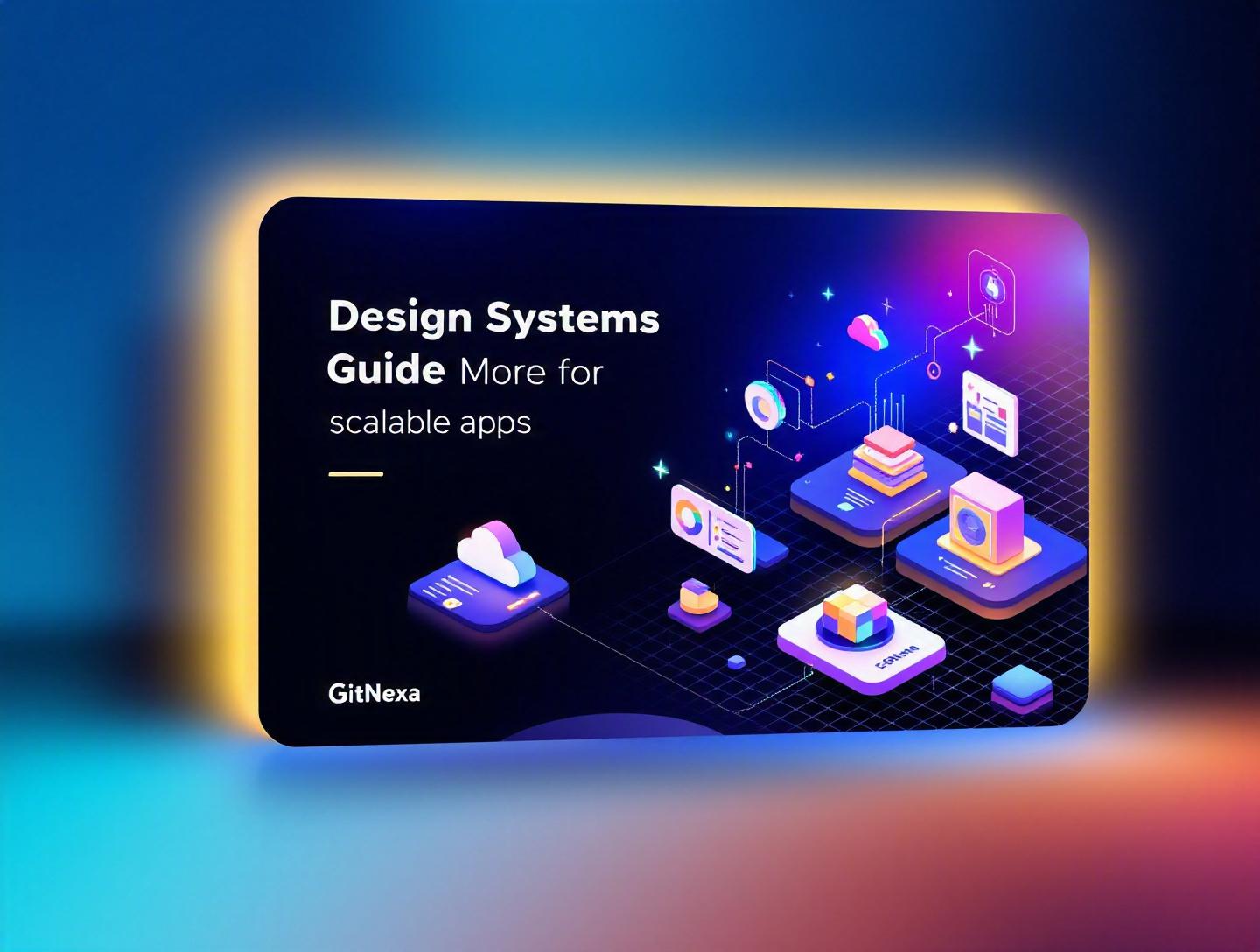
The Ultimate Guide to Design Systems for Scalable Apps
Introduction
In 2025, Figma reported that over 90% of enterprise product teams use some form of design system to manage UI consistency across platforms. Yet, according to a 2024 Forrester study, nearly 60% of scaling SaaS companies admit their UI becomes inconsistent within two years of rapid growth. That disconnect is exactly why design systems for scalable apps have moved from "nice-to-have" to mission-critical.
When your product grows from a single MVP to multiple web apps, mobile apps, admin dashboards, and micro-frontends, design chaos creeps in. Buttons look slightly different across modules. Spacing rules get ignored. Accessibility suffers. Developers reinvent components instead of reusing them. Suddenly, shipping a simple feature takes twice as long.
Design systems for scalable apps solve this problem by creating a shared language between designers and developers. They combine UI components, design tokens, documentation, and governance into a single source of truth.
In this comprehensive guide, you’ll learn what a design system actually is, why it matters in 2026, how to architect one for growth, how companies like Shopify and IBM use them at scale, common pitfalls to avoid, and how GitNexa approaches design systems in real-world projects. If you’re a CTO, product lead, or developer building for long-term growth, this guide is for you.
What Is Design Systems for Scalable Apps?
At its core, a design system is a collection of reusable components, standards, documentation, and design principles that guide product development. When we talk about design systems for scalable apps, we’re specifically referring to systems built to support growth across teams, platforms, and codebases.
A design system typically includes:
- Design tokens (colors, typography, spacing, shadows)
- UI components (buttons, modals, forms, tables)
- Patterns (authentication flows, dashboards, onboarding)
- Documentation (usage guidelines, accessibility rules)
- Code libraries (React, Vue, Angular components)
Think of it as the architectural blueprint of your digital product. You wouldn’t construct a skyscraper without standardized materials and structural plans. Why build a complex application without a UI blueprint?
Design System vs. Style Guide vs. Component Library
Here’s where confusion usually starts.
| Feature | Style Guide | Component Library | Design System |
|---|---|---|---|
| Colors & Typography | ✅ | ✅ | ✅ |
| Reusable Components | ❌ | ✅ | ✅ |
| Documentation | Limited | Limited | Extensive |
| Governance Model | ❌ | ❌ | ✅ |
| Cross-team Standards | ❌ | Partial | ✅ |
A style guide defines visual rules. A component library gives developers reusable UI blocks. A design system combines both — and adds process, governance, and scalability.
Core Elements of a Modern Design System
- Design Tokens – Variables that define visual properties.
- Atomic Components – Following Brad Frost’s Atomic Design principles.
- Theming & Variants – Light/dark mode, brand customization.
- Accessibility Standards – WCAG 2.2 compliance.
- Versioning & Distribution – Managed via npm packages or monorepos.
Example of design tokens in code:
:root {
  --color-primary: #2563eb;
  --color-secondary: #1e293b;
  --spacing-sm: 8px;
  --spacing-md: 16px;
  --font-base: 'Inter', sans-serif;
}
And the same in a React component library:
export const Button = ({ variant = "primary", children }) => (
  <button className={`btn btn-${variant}`}>
    {children}
  </button>
);
When built correctly, these components scale across products without duplication.
Why Design Systems for Scalable Apps Matter in 2026
Software complexity isn’t slowing down. It’s accelerating.
According to Gartner (2025), organizations building digital products across three or more platforms increased by 40% compared to 2022. Meanwhile, AI-generated interfaces and personalization engines are adding new layers of UI variation.
Here’s why design systems are non-negotiable in 2026:
1. Multi-Platform Reality
Apps are no longer just web-based. You’re building for:
- Web (React, Next.js)
- Mobile (React Native, Flutter)
- Desktop (Electron)
- Embedded dashboards
- AI-powered conversational UIs
Without a unified system, fragmentation becomes inevitable.
2. Faster Time to Market
Teams using mature design systems ship features 30–50% faster (Forrester, 2024). Why? They reuse tested components instead of reinventing UI elements.
3. AI-Driven Development
AI coding tools like GitHub Copilot work best when clear patterns exist. A structured design system provides predictable component architecture.
4. Accessibility & Compliance
New accessibility regulations in the EU (European Accessibility Act, 2025) require stricter compliance. Centralized design tokens make global accessibility updates manageable.
5. Cost Efficiency
Engineering duplication is expensive. If five teams build five button components, maintenance costs multiply. A shared system cuts long-term technical debt.
Building the Foundation: Architecture of a Scalable Design System
Creating design systems for scalable apps starts with architecture decisions.
Step 1: Define Design Principles
Before components, define rules:
- Clarity over decoration
- Accessibility by default
- Mobile-first layouts
- Performance budget under 100KB per component bundle
These principles guide decisions later.
Step 2: Establish Design Tokens
Store tokens in a centralized JSON structure:
{
  "color": {
    "primary": "#2563eb",
    "danger": "#dc2626"
  },
  "spacing": {
    "sm": "8px",
    "md": "16px"
  }
}
Use tools like:
- Style Dictionary
- Tokens Studio for Figma
- Theo
Reference: https://developer.mozilla.org/en-US/docs/Web/CSS/Using_CSS_custom_properties
Step 3: Component Architecture
Adopt Atomic Design:
- Atoms → Buttons, Inputs
- Molecules → Form groups
- Organisms → Navigation bars
- Templates → Page layouts
Use Storybook for documentation and testing.
Step 4: Version Control & Distribution
Use:
- Monorepos (Nx, Turborepo)
- Private npm packages
- Semantic versioning
Step 5: Documentation
Great design systems fail without documentation. Use:
- Storybook Docs
- Zeroheight
- Notion
Documentation should include usage rules, accessibility notes, and code examples.
Governance & Collaboration Models
Technology is only half the equation. Governance determines longevity.
Centralized vs. Federated Models
| Model | Best For | Pros | Cons |
|---|---|---|---|
| Centralized | Mid-size teams | Strong consistency | Slower approvals |
| Federated | Enterprises | Scales across business units | Risk of drift |
Design System Team Roles
- Design System Lead
- UI Engineer
- UX Researcher
- Accessibility Specialist
- DevOps Engineer
Contribution Workflow
- Submit proposal
- Design review
- Engineering review
- Accessibility audit
- Merge & release
Use GitHub pull requests and automated visual testing (Chromatic).
Real-World Examples of Scalable Design Systems
Shopify Polaris
Shopify’s Polaris powers thousands of apps. It includes:
- React components
- Design tokens
- Accessibility baked-in
Polaris documentation: https://polaris.shopify.com
IBM Carbon
Carbon supports IBM’s enterprise products across cloud, AI, and analytics platforms.
It includes:
- Vanilla, React, Vue implementations
- Dark/light themes
- Global accessibility standards
Airbnb Design Language System (DLS)
Airbnb scaled globally with a unified system that supports localization and motion standards.
Key takeaway? Successful design systems evolve continuously.
Scaling Across Frontend Frameworks
Many organizations run multiple frameworks.
Strategy 1: Framework-Agnostic Tokens
Keep tokens separate from UI implementations.
Strategy 2: Headless Component Libraries
Use logic-first components without styling.
Strategy 3: Micro-Frontend Compatibility
Ensure shared dependency versions.
Example with Nx monorepo:
/apps
  /web
  /admin
/libs
  /ui
  /tokens
Performance & Accessibility Considerations
Scalability means performance at scale.
Performance Optimization
- Tree-shaking
- Code splitting
- Lazy loading
- Bundle size monitoring
Accessibility Best Practices
- ARIA labels
- Color contrast ratio 4.5:1
- Keyboard navigation
Use tools:
- axe DevTools
- Lighthouse
How GitNexa Approaches Design Systems for Scalable Apps
At GitNexa, we treat design systems as infrastructure — not decoration.
When building enterprise platforms or SaaS products, our team integrates design systems early in the product lifecycle. We align UX research, frontend architecture, and DevOps pipelines to ensure UI consistency across web and mobile apps.
Our approach typically includes:
- UX audit and interface inventory
- Token standardization
- Component refactoring
- Storybook implementation
- CI/CD integration
For companies modernizing legacy systems, we combine our expertise in UI/UX design services, frontend development, and DevOps implementation.
The result? Faster release cycles, reduced design debt, and measurable improvements in developer productivity.
Common Mistakes to Avoid
- Treating it as a one-time project – Design systems require ongoing maintenance.
- Ignoring accessibility early – Retrofitting accessibility is costly.
- Over-engineering components – Keep APIs simple.
- Lack of documentation – Adoption drops without clarity.
- No governance model – Leads to inconsistency.
- Skipping performance testing – Bloated libraries hurt scalability.
- Not involving developers early – Causes friction between design and engineering.
Best Practices & Pro Tips
- Start with an audit of existing UI components.
- Define naming conventions early (BEM or similar).
- Use semantic versioning strictly.
- Automate visual regression testing.
- Prioritize accessibility from day one.
- Keep components composable.
- Track adoption metrics.
- Schedule quarterly system reviews.
Future Trends & What to Expect (2026–2027)
- AI-generated component scaffolding
- Cross-platform token pipelines
- Design-to-code automation improvements
- Voice & spatial interface integration
- Real-time personalization tokens
As AR/VR interfaces grow, design systems will expand beyond screens.
FAQ: Design Systems for Scalable Apps
1. What is the main purpose of a design system?
It ensures consistency, scalability, and efficiency across digital products by standardizing UI components and design patterns.
2. How is a design system different from a UI kit?
A UI kit provides visual components, while a design system includes governance, documentation, and development workflows.
3. Are design systems only for large enterprises?
No. Startups benefit significantly when planning for rapid growth.
4. What tools are best for building design systems?
Figma, Storybook, Style Dictionary, Nx, and GitHub are commonly used.
5. How long does it take to build one?
Initial versions take 2–4 months depending on complexity.
6. Can design systems support multiple brands?
Yes, through token-based theming and brand layers.
7. Do design systems improve developer productivity?
Yes. Teams report up to 50% faster feature delivery.
8. How do you measure ROI?
Track reduced design debt, faster releases, and lower bug counts.
9. Should mobile and web share the same system?
They should share tokens and patterns but may have platform-specific components.
10. What happens if you don’t use a design system?
Inconsistency, technical debt, slower releases, and higher maintenance costs.
Conclusion
Design systems for scalable apps are no longer optional. They are foundational infrastructure for modern digital products. When built thoughtfully, they improve consistency, speed up development, reduce costs, and support long-term growth across platforms.
Whether you’re launching a SaaS startup or modernizing an enterprise platform, investing in a design system pays dividends over time.
Ready to build scalable digital products with a strong design foundation? Talk to our team to discuss your project.
Comments
Loading comments...