Sub Category
Latest Blogs
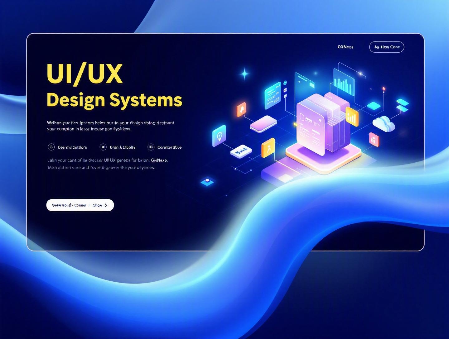
The Ultimate Guide to UI/UX Design Systems
Introduction
In 2024, Forrester reported that design-led companies outperform competitors by 228% over ten years. That number alone should make any CTO or product leader pause. Yet most teams still ship inconsistent interfaces, duplicate components across repositories, and spend weeks debating button styles instead of solving real user problems.
This is where UI/UX design systems change the game. A well-built design system doesn’t just standardize colors and typography—it creates a shared language between designers and developers, reduces rework, accelerates feature delivery, and ensures brand consistency across platforms.
Without a design system, scaling a product feels like building a skyscraper without blueprints. Every new screen introduces inconsistencies. Engineering velocity slows. Technical debt creeps in. Cross-functional collaboration becomes reactive instead of strategic.
In this comprehensive guide, you’ll learn:
- What UI/UX design systems really are (and what they’re not)
- Why they matter more in 2026 than ever before
- How companies like Google, Shopify, and IBM use them
- The architecture, tooling, and workflows behind successful systems
- Common mistakes to avoid
- Best practices for building and maintaining your own system
Whether you’re a startup founder building your first SaaS product or a CTO managing multiple product lines, this guide will give you a practical roadmap to building scalable, efficient, and future-proof UI/UX design systems.
What Is a UI/UX Design System?
A UI/UX design system is a centralized collection of reusable components, design standards, documentation, and guidelines that teams use to design and build digital products consistently.
Think of it as the operating system for your product’s interface.
It typically includes:
- Design tokens (colors, typography, spacing, shadows)
- UI components (buttons, inputs, modals, cards)
- Layout systems and grids
- Accessibility guidelines
- Interaction patterns
- Code libraries (React, Vue, Angular, etc.)
- Documentation and usage examples
Design System vs Style Guide vs Component Library
These terms often get mixed up. They’re related—but not identical.
| Feature | Style Guide | Component Library | Design System |
|---|---|---|---|
| Colors & Typography | ✅ | ✅ | ✅ |
| UI Components | ❌ | ✅ | ✅ |
| Code Implementation | ❌ | ✅ | ✅ |
| Documentation | Limited | Moderate | Extensive |
| Governance Model | ❌ | ❌ | ✅ |
| Cross-Team Collaboration | ❌ | Limited | ✅ |
A style guide defines visual identity. A component library provides reusable UI blocks. A design system goes further—it includes governance, documentation, workflows, and alignment between design and engineering.
Core Building Blocks of UI/UX Design Systems
1. Design Tokens
Design tokens are the atomic values of your interface.
Example (JSON format):
{
  "color-primary": "#0052CC",
  "font-size-base": "16px",
  "spacing-md": "16px"
}
Tokens ensure consistency across web, mobile, and even native apps.
2. Components
Reusable UI blocks such as:
- Buttons
- Form fields
- Navigation bars
- Tables
- Modals
Example in React:
export const Button = ({ variant = "primary", children }) => {
  return (
    <button className={`btn btn-${variant}`}>
      {children}
    </button>
  );
};
3. Documentation
Documentation explains:
- When to use a component
- When NOT to use it
- Accessibility considerations
- Code examples
Tools like Storybook, Zeroheight, and Notion are commonly used.
4. Governance Model
A true design system defines ownership:
- Who approves new components?
- Who maintains tokens?
- How are changes versioned?
Without governance, a design system quickly becomes outdated.
Why UI/UX Design Systems Matter in 2026
The digital product landscape in 2026 looks very different from 2018.
According to Statista, global digital transformation spending surpassed $3.9 trillion in 2025. Companies are launching web apps, mobile apps, internal dashboards, customer portals, and AI-powered interfaces simultaneously.
This multi-platform reality makes UI/UX design systems essential.
1. Faster Time-to-Market
Teams using mature design systems report up to 34% faster development cycles (InVision Design Maturity Report, 2023).
Instead of redesigning components:
- Designers reuse patterns.
- Developers import components.
- QA tests known behaviors.
2. Improved Developer Productivity
Engineers prefer clear standards. When every component behaves differently, productivity drops.
A design system reduces:
- Duplicate code
- Styling conflicts
- Refactoring overhead
3. Better Accessibility Compliance
With WCAG 2.2 standards enforced more strictly in the US and EU, accessibility is no longer optional. Centralized components ensure:
- Proper ARIA attributes
- Keyboard navigation
- Contrast compliance
Refer to the official W3C documentation: https://www.w3.org/WAI/standards-guidelines/wcag/
4. Scalability for AI-Driven Interfaces
AI-generated UI (think dynamic dashboards or personalized content blocks) requires flexible, token-driven systems. Hardcoded styles don’t scale.
This ties directly into modern AI integration strategies, like those discussed in our guide on AI-powered product development.
5. Brand Consistency Across Channels
When your SaaS product, marketing site, and mobile app look unrelated, user trust drops.
Design systems eliminate that fragmentation.
Deep Dive #1: Architecture of Modern UI/UX Design Systems
A design system is only as strong as its architecture.
Let’s break it down.
Layered Architecture Model
Modern systems follow a layered approach:
- Design Tokens Layer
- Primitive Components Layer
- Composite Components Layer
- Templates & Layouts Layer
[ Tokens ] → [ Primitives ] → [ Components ] → [ Templates ] → [ Pages ]
Atomic Design Methodology
Brad Frost’s Atomic Design framework remains influential.
- Atoms: Buttons, labels
- Molecules: Form groups
- Organisms: Header sections
- Templates: Page structure
- Pages: Final UI
More details: https://atomicdesign.bradfrost.com/
Monorepo vs Multi-Repo
| Approach | Pros | Cons |
|---|---|---|
| Monorepo | Unified versioning, easier dependency management | Larger repo size |
| Multi-repo | Independent releases | Sync challenges |
Many teams use Nx or Turborepo for monorepo management.
Versioning Strategy
Semantic versioning is essential:
- MAJOR: Breaking changes
- MINOR: New components
- PATCH: Bug fixes
Example:
@company/design-system@2.3.1
Without disciplined versioning, downstream apps break.
Deep Dive #2: Tools That Power UI/UX Design Systems
Tooling can make or break adoption.
Design Tools
- Figma (most dominant in 2026)
- Adobe XD
- Sketch (declining but still used)
Figma’s Variables and Dev Mode features have transformed token syncing.
Documentation Platforms
- Storybook
- Zeroheight
- Docusaurus
- Notion
Example Storybook setup:
npx storybook@latest init
npm run storybook
Token Sync Tools
- Style Dictionary
- Tokens Studio (Figma plugin)
- Theo
CI/CD Integration
Design systems should integrate into DevOps pipelines.
For example:
name: Publish Design System
on:
  push:
    tags:
      - 'v*'
jobs:
  publish:
    runs-on: ubuntu-latest
    steps:
      - uses: actions/checkout@v2
      - run: npm install
      - run: npm publish
This aligns with modern DevOps best practices.
Deep Dive #3: Building a UI/UX Design System from Scratch
Here’s a practical roadmap.
Step 1: Audit Existing UI
Inventory:
- All button styles
- Typography variations
- Form patterns
- Color inconsistencies
You’ll likely find 12 "primary" button styles.
Step 2: Define Core Principles
Examples:
- Accessibility-first
- Mobile-first
- Performance-optimized
Step 3: Create Design Tokens
Start with:
- Color palette
- Spacing scale (4px or 8px grid)
- Typography scale
Step 4: Build Primitive Components
Focus on:
- Button
- Input
- Card
- Modal
Test them extensively.
Step 5: Document Everything
Include:
- Do’s and don’ts
- Accessibility notes
- Code examples
Step 6: Establish Governance
Define:
- Contribution process
- Approval workflow
- Release cadence
For teams building web platforms, our guide on scalable web application architecture complements this process.
Deep Dive #4: Real-World Examples of UI/UX Design Systems
Google Material Design
Material Design provides:
- Extensive documentation
- Cross-platform components
- Motion guidelines
Official site: https://m3.material.io/
Shopify Polaris
Shopify’s Polaris supports:
- E-commerce workflows
- Admin dashboards
- Merchant tools
Polaris helped Shopify scale to over 2 million merchants.
IBM Carbon
IBM Carbon supports enterprise-grade apps across cloud products.
Strong focus on accessibility and enterprise compliance.
Lessons from These Systems
Common traits:
- Clear documentation
- Strong governance
- Dedicated system teams
- Community contribution model
Deep Dive #5: Scaling UI/UX Design Systems in Enterprise
Enterprise environments add complexity.
Multi-Brand Architecture
Use theme layers:
:root {
  --color-primary: #0052CC;
}

.brand-b {
  --color-primary: #E60023;
}
Micro-Frontend Compatibility
Design systems must work across independent deployments.
Strategies:
- Publish as npm package
- Use CDN distribution
- Avoid global CSS conflicts
Performance Optimization
- Tree shaking
- Lazy loading
- CSS-in-JS optimization
These strategies are aligned with modern cloud-native development.
How GitNexa Approaches UI/UX Design Systems
At GitNexa, we treat UI/UX design systems as infrastructure—not decoration.
Our approach includes:
- UX research and interface audits
- Token-driven design architecture
- React/Vue component library development
- CI/CD integration for version control
- Accessibility validation (WCAG 2.2)
- Cross-platform scalability (web + mobile)
We align design systems with broader product engineering strategies, including custom web development and mobile-first frameworks.
Instead of building static style guides, we create living systems that evolve alongside your product roadmap.
Common Mistakes to Avoid
-
Treating It as a One-Time Project
Design systems require ongoing maintenance. -
Ignoring Accessibility
Retroactive fixes are expensive. -
Over-Engineering Early
Start small. Expand gradually. -
Lack of Governance
Without ownership, systems decay. -
Poor Documentation
If developers can’t understand it, they won’t use it. -
No Developer Involvement
Design-only systems rarely succeed. -
Forcing Adoption
Education works better than mandates.
Best Practices & Pro Tips
- Start with tokens, not components.
- Use an 8px spacing system for consistency.
- Build accessibility into every component.
- Version releases strictly.
- Measure adoption metrics internally.
- Create a feedback loop with product teams.
- Maintain a public changelog.
- Dedicate at least one system owner.
- Integrate with CI/CD pipelines.
- Keep documentation brutally clear.
Future Trends & What to Expect (2026–2027)
1. AI-Generated Components
AI tools will generate layouts using predefined tokens.
2. Cross-Platform Token Standards
The W3C Design Tokens Community Group is pushing standardization.
3. Voice & Multimodal Interfaces
Design systems will expand beyond screens.
4. Automated Accessibility Testing
AI-driven accessibility audits integrated into pipelines.
5. Headless UI Architecture
Separation of logic and presentation for flexibility.
FAQ: UI/UX Design Systems
1. What is the main purpose of a UI/UX design system?
It ensures consistency, speeds up development, and aligns design with engineering through reusable components and standards.
2. How long does it take to build a design system?
An MVP can take 6–12 weeks. Enterprise systems may take 6–12 months.
3. Are design systems only for large companies?
No. Startups benefit significantly from early standardization.
4. What tools are best for building design systems?
Figma, Storybook, Style Dictionary, and GitHub Actions are widely used.
5. How do design tokens work?
They store design decisions (colors, spacing, typography) in reusable variables.
6. How do you maintain a design system?
Through governance, versioning, documentation, and feedback loops.
7. What’s the difference between UX and UI in design systems?
UI focuses on visuals; UX includes flows, interactions, and usability principles.
8. Can design systems improve accessibility?
Yes. Standardized accessible components reduce compliance risk.
9. How do you measure success of a design system?
Track adoption rate, development speed, and reduction in UI inconsistencies.
10. Should design systems support multiple frameworks?
If your organization uses multiple stacks, yes—via token abstraction and framework adapters.
Conclusion
UI/UX design systems are no longer optional for growing digital products. They reduce chaos, improve collaboration, speed up development, and ensure consistent user experiences across platforms. Companies that invest in scalable systems today will move faster and operate more efficiently tomorrow.
Whether you’re building your first SaaS product or scaling enterprise software across multiple teams, a thoughtful design system can transform how you design and ship software.
Ready to build a scalable UI/UX design system for your product? Talk to our team to discuss your project.
Comments
Loading comments...