Sub Category
Latest Blogs
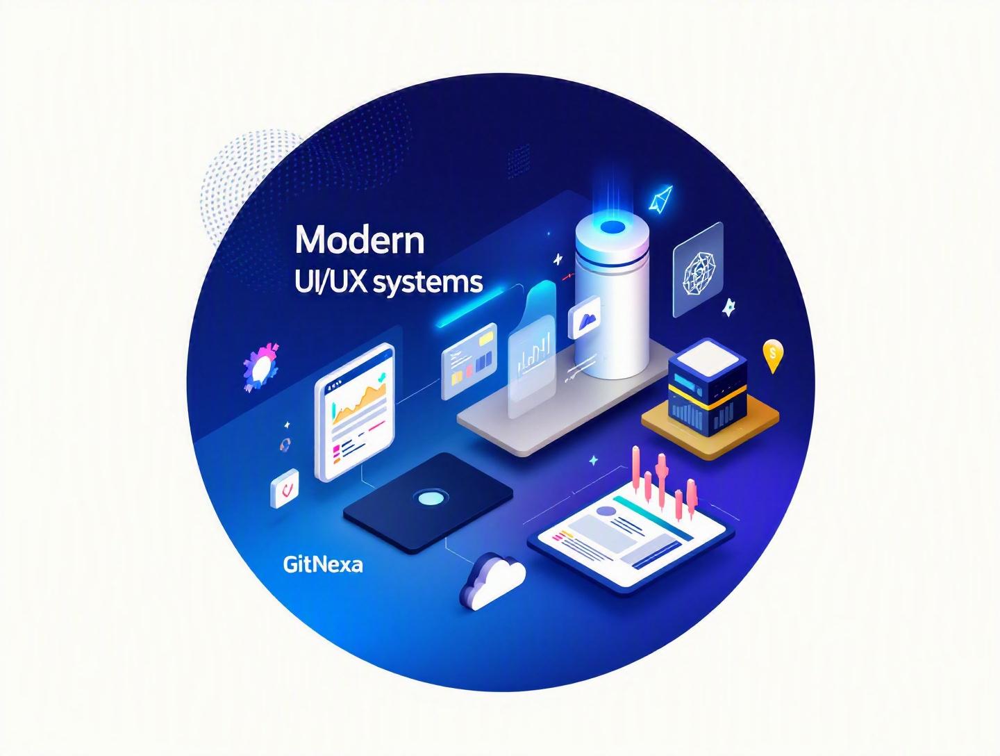
The Ultimate Guide to Modern UI/UX Design Systems
Introduction
In 2025, organizations using mature design systems reported up to 34% faster feature delivery and 25% fewer design inconsistencies, according to the 2024 Design Systems Survey by Knapsack. That’s not a small edge—it’s the difference between shipping weekly and shipping quarterly.
Modern UI/UX design systems have moved far beyond shared color palettes and button libraries. Today, they are strategic assets that align product, engineering, and business teams around a unified digital experience. Yet many companies still struggle with fragmented components, inconsistent user interfaces, and duplicated development effort across web and mobile platforms.
If you’re a CTO scaling multiple products, a startup founder preparing for rapid growth, or a product designer tired of redesigning the same modal for the fifth time, this guide is for you.
In this comprehensive deep dive, we’ll explore what modern UI/UX design systems really are, why they matter in 2026, how leading companies structure them, common pitfalls to avoid, and how to implement one effectively. We’ll also look at architecture patterns, real-world examples, code snippets, and future trends shaping design systems over the next two years.
Let’s start with the fundamentals.
What Is a Modern UI/UX Design System?
At its core, a modern UI/UX design system is a centralized collection of reusable components, design guidelines, interaction patterns, and governance rules that ensure consistency across digital products.
But that definition barely scratches the surface.
A mature design system typically includes:
- Design tokens (colors, typography, spacing, elevation, motion)
- UI components (buttons, forms, cards, navigation, modals)
- Interaction patterns (authentication flows, checkout, onboarding)
- Accessibility standards (WCAG compliance, ARIA roles)
- Documentation & governance
- Code implementation (React, Vue, Angular, Flutter, etc.)
It acts as a bridge between:
- Designers (Figma, Sketch)
- Frontend developers (React, Vue, Svelte)
- Backend engineers
- Product managers
Design System vs Style Guide vs Component Library
Let’s clear up a common misconception.
| Aspect | Style Guide | Component Library | Modern UI/UX Design System |
|---|---|---|---|
| Colors & Typography | ✅ | ✅ | ✅ |
| Reusable Components | ❌ | ✅ | ✅ |
| Design Tokens | ❌ | Partial | ✅ |
| Documentation | Limited | Limited | Extensive |
| Governance Model | ❌ | ❌ | ✅ |
| Cross-platform Support | ❌ | Partial | ✅ |
A style guide tells you what a brand looks like. A component library gives you building blocks. A modern UI/UX design system governs how everything works together.
Companies like Google (Material Design), Shopify (Polaris), and Atlassian (Atlassian Design System) treat their design systems as products—not side projects.
Why Modern UI/UX Design Systems Matter in 2026
The software industry in 2026 looks very different from five years ago.
1. Multi-Platform Explosion
Products now span:
- Web apps
- Native mobile apps
- Smart TVs
- Wearables
- Voice interfaces
Without a unified design system, maintaining consistency becomes nearly impossible.
2. Faster Product Cycles
According to the 2024 State of Agile Report by Digital.ai, 71% of organizations release updates at least once per month. Many ship weekly.
Modern UI/UX design systems reduce:
- Redundant UI decisions
- Rework due to inconsistencies
- QA cycles caused by UI variance
3. Accessibility & Compliance Pressure
With stricter digital accessibility regulations in the EU and US, teams must adhere to WCAG 2.2 standards. A centralized system ensures compliance is baked into every component.
Reference: https://www.w3.org/WAI/standards-guidelines/wcag/
4. AI-Generated Interfaces
Generative AI tools now produce UI prototypes in minutes. Without a design system to validate outputs, chaos follows.
A modern design system acts as a constraint framework—keeping innovation structured.
Core Components of Modern UI/UX Design Systems
1. Design Tokens: The Foundation
Design tokens are platform-agnostic variables representing design decisions.
Example (JSON):
{
  "color-primary": "#2563EB",
  "spacing-medium": "16px",
  "border-radius-small": "4px"
}
These tokens integrate into frameworks like Tailwind CSS or styled-components.
const Button = styled.button`
  background-color: var(--color-primary);
  padding: var(--spacing-medium);
`;
This approach ensures scalability across platforms.
2. Atomic Design Architecture
Brad Frost’s Atomic Design methodology structures systems into:
- Atoms (buttons, labels)
- Molecules (form groups)
- Organisms (navigation bars)
- Templates
- Pages
This hierarchical structure prevents UI duplication.
3. Component-Driven Development
Tools like Storybook allow teams to develop components in isolation.
npx storybook init
Developers can:
- Test states
- Validate accessibility
- Document variations
Official docs: https://storybook.js.org/docs
4. Documentation & Governance
Strong design systems include:
- Contribution guidelines
- Version control policies
- Deprecation rules
- Review committees
Without governance, systems degrade into outdated libraries.
Building a Modern UI/UX Design System: Step-by-Step
Here’s a practical roadmap we’ve used with scaling SaaS startups.
Step 1: Audit Your Existing UI
Inventory:
- All buttons
- Forms
- Typography variations
- Color inconsistencies
You’ll likely find 12 button styles instead of 3.
Step 2: Define Design Principles
Examples:
- Accessibility first
- Mobile-first layout
- Performance-conscious UI
Step 3: Extract Design Tokens
Convert visual elements into reusable variables.
Step 4: Build Core Components
Start with:
- Buttons
- Inputs
- Navigation
- Cards
Step 5: Integrate with CI/CD
Use GitHub Actions to automate component testing.
name: UI Tests
on: [push]
jobs:
  test:
    runs-on: ubuntu-latest
Step 6: Documentation Portal
Use tools like Zeroheight or Docusaurus.
Real-World Examples of Modern UI/UX Design Systems
1. Google Material Design
Material Design 3 introduced dynamic color theming and adaptive layouts.
It supports:
- Android
- Web
- Flutter
Docs: https://m3.material.io/
2. Shopify Polaris
Built specifically for eCommerce experiences.
Polaris ensures merchants have consistent admin interfaces across apps.
3. Airbnb Design Language System (DLS)
Airbnb created a cross-functional governance model combining engineering and design.
Their approach reduced UI drift across global teams.
Integrating Modern UI/UX Design Systems with Development Workflows
Design systems must integrate with:
- CI/CD pipelines
- DevOps practices
- Frontend frameworks
For deeper insight into scalable frontend architecture, see our guide on modern web application development.
Teams using monorepos (Nx, Turborepo) can centralize UI packages.
Example structure:
/packages
  /ui-components
  /design-tokens
  /docs
/apps
  /web
  /mobile
This ensures shared updates propagate instantly.
How GitNexa Approaches Modern UI/UX Design Systems
At GitNexa, we treat modern UI/UX design systems as long-term infrastructure—not short-term design deliverables.
Our process typically includes:
- Cross-team discovery workshops
- UX research validation
- Design token architecture
- Component library engineering (React, Vue, Flutter)
- Accessibility audits
- DevOps integration
We align design systems with broader digital transformation efforts, whether it's enterprise mobile app development or cloud-native application architecture.
The result? Faster releases, lower maintenance costs, and consistent user experiences across platforms.
Common Mistakes to Avoid
-
Treating it as a one-time project
Design systems require ongoing maintenance. -
No governance model
Without ownership, components diverge. -
Over-engineering too early
Start small. Expand gradually. -
Ignoring accessibility
Retroactive fixes are expensive. -
Lack of developer involvement
Design-only systems fail in production. -
Poor documentation
If engineers don’t understand it, they won’t use it. -
No version control strategy
Use semantic versioning.
Best Practices & Pro Tips
- Start with 20% of components used 80% of the time.
- Adopt atomic design hierarchy.
- Use automated visual regression testing (Chromatic).
- Maintain changelogs.
- Build feedback loops between designers and engineers.
- Audit quarterly.
- Track adoption metrics.
- Align system updates with product roadmap.
Future Trends & What to Expect (2026–2027)
-
AI-Assisted Component Generation
Design systems integrated with AI copilots. -
Cross-Platform Design Tokens Standardization
W3C Design Tokens Community Group progress. -
Voice & Spatial UI Systems
AR/VR design systems gaining traction. -
Composable Frontends
Micro frontends sharing centralized UI libraries. -
Performance-First Systems
Core Web Vitals influencing component design.
Explore related DevOps practices in our guide on scalable DevOps pipelines.
FAQ: Modern UI/UX Design Systems
1. What is a modern UI/UX design system?
A centralized framework of reusable UI components, design tokens, and governance guidelines ensuring consistency across digital products.
2. How is it different from a component library?
A component library contains reusable UI pieces, while a design system includes governance, documentation, and cross-platform strategy.
3. How long does it take to build one?
For mid-sized products, 3–6 months for a foundational system.
4. Are design systems only for enterprises?
No. Startups benefit even more due to rapid scaling needs.
5. Which tools are best for building design systems?
Figma, Storybook, Zeroheight, Nx, and React are common choices.
6. Do design systems improve ROI?
Yes. Reduced rework and faster releases improve efficiency.
7. How do you measure success?
Track adoption rate, release velocity, and UI defect reduction.
8. Can design systems support mobile apps?
Absolutely. Flutter and React Native integrate well.
9. What role does accessibility play?
Accessibility must be foundational, not optional.
10. How often should systems be updated?
Continuously, with quarterly audits.
Conclusion
Modern UI/UX design systems are no longer optional for growing digital products. They reduce redundancy, accelerate development, enforce accessibility, and create cohesive brand experiences across platforms.
Whether you're scaling a SaaS product, modernizing enterprise software, or preparing for multi-platform expansion, investing in a structured design system pays long-term dividends.
Ready to build a scalable modern UI/UX design system? Talk to our team to discuss your project.
Comments
Loading comments...