Sub Category
Latest Blogs
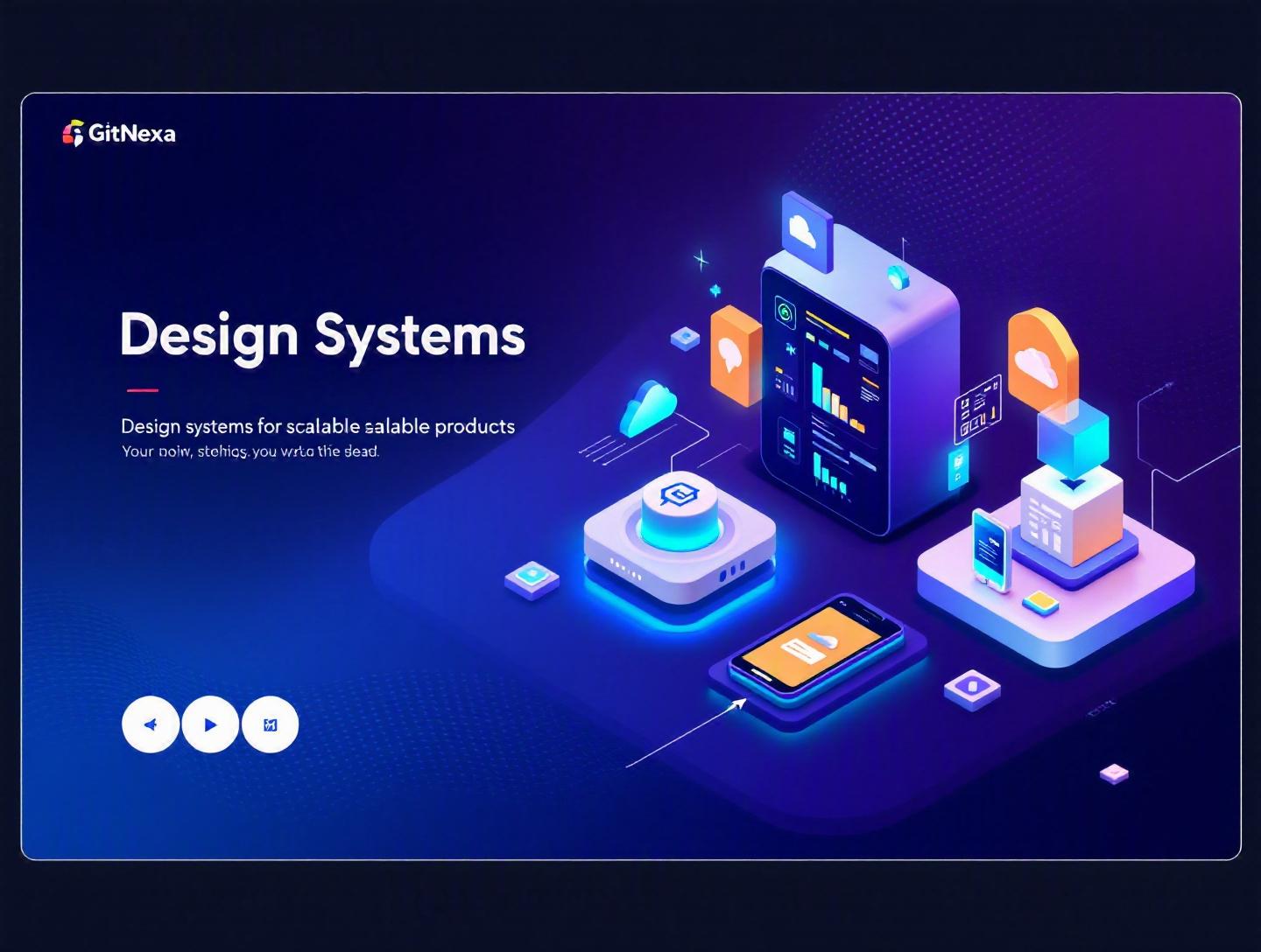
The Ultimate Guide to Design Systems for Scalable Products
Introduction
In 2024, Figma reported that over 90% of enterprise design teams use shared component libraries to ship products faster. Yet, despite this widespread adoption, most growing startups still struggle with UI inconsistency, duplicated code, and product teams reinventing the same button five different ways.
That’s where design systems for scalable products come in. When your product moves from 5 engineers to 50, from one app to an ecosystem of web, mobile, and dashboards, ad-hoc design decisions start breaking things. Styles drift. Accessibility gets ignored. Release cycles slow down. Technical debt multiplies.
A well-structured design system acts as the connective tissue between design and engineering. It standardizes UI components, defines visual language, and codifies interaction patterns—so teams can build faster without sacrificing quality.
In this guide, you’ll learn:
- What design systems actually are (and what they’re not)
- Why they matter even more in 2026
- How companies like Shopify, Airbnb, and Atlassian scale with them
- The architecture behind modern component libraries
- Common mistakes that derail implementation
- How to build and evolve your own system the right way
If you’re a CTO planning product expansion, a startup founder aiming for rapid iteration, or a design lead tired of inconsistency, this deep dive will give you a practical blueprint for building design systems that scale.
What Is a Design System?
At its core, a design system is a single source of truth for product design and UI development. It combines reusable components, design guidelines, code standards, and documentation into one structured ecosystem.
But that’s the textbook definition. Let’s break it down.
Design System vs. Style Guide vs. Component Library
Many teams confuse these terms.
| Element | What It Includes | Who Uses It | Purpose |
|---|---|---|---|
| Style Guide | Colors, typography, spacing | Designers | Maintain visual consistency |
| Component Library | Buttons, inputs, modals | Developers | Reusable UI blocks |
| Design System | Style guide + components + documentation + governance | Designers + Developers + Product | Scalable product development |
A style guide is static. A component library is tactical. A design system is strategic.
The Core Elements of a Modern Design System
A production-grade system typically includes:
1. Design Tokens
Design tokens are the smallest design decisions—colors, font sizes, spacing values—stored as variables.
Example:
{
  "color-primary": "#0052CC",
  "spacing-medium": "16px",
  "font-heading": "Inter, sans-serif"
}
These tokens sync across tools like Figma and codebases via tools such as Style Dictionary.
2. Component Library
Reusable UI elements built with frameworks like:
- React + Storybook
- Vue + Vite
- Angular + Nx
Example React Button component:
export const Button = ({ variant = "primary", children }) => {
  return (
    <button className={`btn btn-${variant}`}>
      {children}
    </button>
  );
};
3. Documentation Portal
Hosted with tools like:
- Storybook
- Zeroheight
- Docusaurus
Documentation explains usage, accessibility rules, and code snippets.
4. Governance Model
Clear ownership:
- Who approves changes?
- How are new components added?
- How are deprecated patterns handled?
Without governance, design systems collapse into chaos.
Why Design Systems Matter in 2026
If you think design systems are just for tech giants, think again.
Multi-Platform Explosion
By 2025, Statista reported over 7.5 billion smartphone users worldwide. Add tablets, smart TVs, wearables, and enterprise dashboards—and your UI now spans multiple devices.
Design systems for scalable products ensure consistency across:
- Web apps
- iOS/Android apps
- Internal admin panels
- Marketing microsites
AI-Driven UI Generation
With AI-assisted tools generating interfaces, consistency becomes harder to maintain. Systems act as guardrails. Instead of free-form generation, AI tools pull from approved components.
Faster Release Cycles
According to the 2023 State of DevOps Report by Google Cloud, high-performing teams deploy 208 times more frequently than low performers. That speed is impossible if teams rebuild UI patterns every sprint.
Design systems reduce:
- Duplicate code
- Design QA cycles
- Accessibility rework
Remote & Distributed Teams
With distributed engineering teams across time zones, shared standards are no longer optional. A documented system replaces tribal knowledge.
Building Design Systems for Scalable Products: Step-by-Step
Let’s get practical.
Step 1: Audit Your Existing Product
Before building anything new:
- Identify UI inconsistencies
- List duplicated components
- Document accessibility gaps
- Analyze CSS bloat
Tools that help:
- Figma analytics
- Chrome DevTools coverage tab
- ESLint style audits
Step 2: Define Design Tokens
Start with:
- Color system (primary, semantic states)
- Typography scale
- Spacing scale (4px or 8px grid)
Example spacing scale:
| Token | Value |
|---|---|
| xs | 4px |
| sm | 8px |
| md | 16px |
| lg | 24px |
| xl | 32px |
Step 3: Build Foundational Components
Start small:
- Button
- Input
- Modal
- Card
- Dropdown
Avoid building 50 components at once.
Step 4: Document Everything
For each component include:
- Usage guidelines
- Do’s and don’ts
- Accessibility requirements (ARIA attributes)
- Code examples
Step 5: Integrate Into CI/CD
Publish as:
- Private NPM package
- Monorepo package (Nx, Turborepo)
Automate:
- Visual regression tests (Chromatic)
- Accessibility tests (axe-core)
Architecture Patterns for Scalable Design Systems
How you structure your system determines long-term success.
Monorepo Architecture
Tools:
- Nx
- Turborepo
- Lerna
Benefits:
- Shared dependencies
- Easier versioning
- Centralized governance
Structure example:
packages/
  tokens/
  components/
  utils/
  docs/
Atomic Design Methodology
Popularized by Brad Frost.
Hierarchy:
- Atoms (buttons, inputs)
- Molecules (form groups)
- Organisms (header sections)
- Templates
- Pages
This approach prevents component sprawl.
Micro-Frontend Compatibility
Large enterprises use micro-frontends. Your design system must:
- Be framework-agnostic
- Avoid global CSS leakage
- Support versioning
Using Web Components can help.
Real-World Examples of Design Systems at Scale
Shopify Polaris
Polaris powers thousands of merchant interfaces. It includes:
- React components
- Accessibility standards
- Clear content guidelines
Docs: https://polaris.shopify.com
Atlassian Design System
Used across Jira, Confluence, Trello.
Strong focus on:
- Design tokens
- Theming
- Cross-product consistency
Airbnb Design Language System (DLS)
Airbnb reduced design-to-development handoff time significantly by unifying Sketch libraries and React components.
Common thread? Strong governance.
How GitNexa Approaches Design Systems for Scalable Products
At GitNexa, we treat design systems as infrastructure—not decoration.
Our process usually includes:
- Product audit and UI consistency analysis
- Token extraction and brand alignment
- Component engineering using React or Vue
- Integration with CI/CD pipelines
- Developer documentation portal setup
We often combine design system creation with:
- UI/UX design services
- Web application development
- Mobile app development strategy
- Cloud-native architecture planning
- DevOps automation pipelines
Because without deployment alignment, even the best system fails.
Common Mistakes to Avoid
-
Overengineering from Day One
Start small. Many teams build 100 components before validating adoption. -
Ignoring Accessibility
WCAG 2.2 compliance should be built-in, not patched later. -
No Ownership Model
Without a core team, updates stall. -
Poor Documentation
If developers can’t understand usage in 2 minutes, they won’t adopt it. -
Not Versioning Properly
Breaking changes without semantic versioning create chaos. -
Treating It as a One-Time Project
Design systems are products. They need roadmaps.
Best Practices & Pro Tips
- Start with high-impact components.
- Use design tokens as the foundation.
- Automate visual regression testing.
- Align design and engineering rituals.
- Create contribution guidelines.
- Track adoption metrics.
- Maintain changelogs.
- Review quarterly.
Future Trends & What to Expect (2026–2027)
- AI-assisted component generation tied to tokens
- Real-time cross-platform sync between design and code
- More framework-agnostic Web Component systems
- Increased focus on accessibility automation
- Design systems integrated with product analytics
Design systems will move from "nice-to-have" to mandatory infrastructure.
FAQ: Design Systems for Scalable Products
1. What is the main purpose of a design system?
To create consistency and efficiency by standardizing reusable UI components and design rules.
2. Are design systems only for large enterprises?
No. Startups benefit even more because they scale faster and need consistency early.
3. How long does it take to build one?
A foundational system can take 8–12 weeks.
4. What tools are commonly used?
Figma, Storybook, Nx, Style Dictionary, Chromatic.
5. How do design systems improve developer productivity?
By reducing repeated UI coding and providing tested, documented components.
6. How do you maintain a design system?
With governance, versioning, documentation updates, and roadmap planning.
7. Can design systems work with micro-frontends?
Yes, if built with modular architecture and clear versioning.
8. What’s the difference between UI kit and design system?
A UI kit is visual assets. A design system includes governance, documentation, and code.
Conclusion
Design systems for scalable products are no longer optional infrastructure. They’re foundational to shipping consistent, accessible, and high-quality digital experiences at speed.
From tokens and atomic design to governance and CI/CD integration, a well-structured system reduces technical debt and accelerates growth. Whether you’re scaling a SaaS platform or expanding into multiple platforms, the right system keeps your product cohesive.
Ready to build a scalable design system for your product? Talk to our team to discuss your project.
Comments
Loading comments...