Sub Category
Latest Blogs
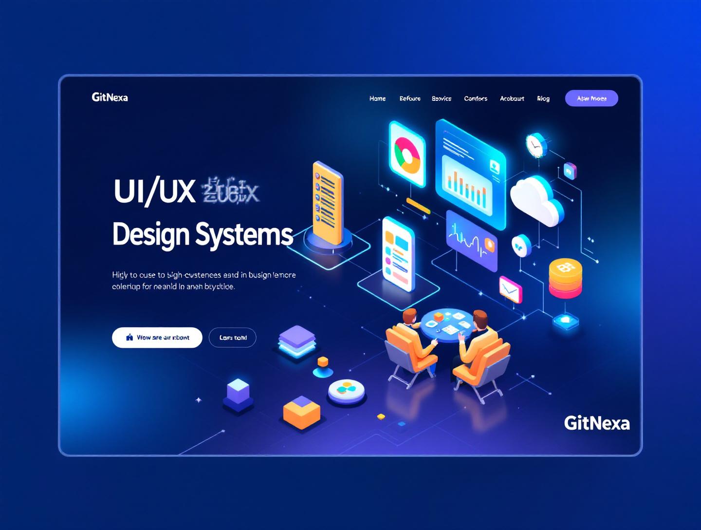
The Ultimate Guide to UI/UX Design Systems in 2026
Introduction
In 2025, Forrester reported that companies with mature design systems ship digital features 34% faster and reduce design debt by nearly 50%. That’s not a marginal gain. That’s the difference between leading your category and constantly playing catch-up.
UI/UX design systems have quietly become the backbone of modern digital products. From Airbnb’s "Design Language System" to Shopify’s Polaris and Google’s Material Design, the world’s most successful platforms rely on structured, scalable systems—not scattered Figma files or inconsistent component libraries.
Yet many teams still confuse a style guide with a true UI/UX design system. They build components but ignore governance. They document colors but skip accessibility tokens. They design beautiful interfaces but struggle to scale across web, mobile, and emerging platforms.
In this comprehensive guide, you’ll learn exactly what UI/UX design systems are, why they matter in 2026, how to build and implement one effectively, common pitfalls to avoid, and how forward-thinking companies structure them for long-term growth. Whether you’re a CTO managing multiple product squads, a founder scaling from MVP to Series B, or a product designer tired of repetitive UI rework—this guide will give you a clear roadmap.
Let’s start with the fundamentals.
What Is UI/UX Design Systems?
A UI/UX design system is a centralized, reusable collection of components, patterns, design tokens, documentation, and governance rules that define how digital products are built and experienced.
At its core, a design system bridges the gap between design and engineering.
It typically includes:
- Design tokens (colors, typography scales, spacing, motion)
- Reusable UI components (buttons, forms, modals, cards)
- Interaction patterns (navigation flows, validation behavior)
- Accessibility standards (WCAG compliance rules)
- Code implementation (React, Vue, Flutter components)
- Documentation and contribution guidelines
Think of it as a product’s DNA. Instead of every team inventing its own button or grid system, everyone works from the same source of truth.
Design System vs Style Guide vs Component Library
These terms are often used interchangeably, but they’re not the same.
| Feature | Style Guide | Component Library | UI/UX Design System |
|---|---|---|---|
| Colors & Typography | ✅ | ✅ | ✅ |
| UI Components | ❌ | ✅ | ✅ |
| Code Integration | ❌ | ✅ | ✅ |
| Governance Rules | ❌ | ❌ | ✅ |
| Versioning | ❌ | Limited | ✅ |
| Accessibility Standards | Limited | Partial | ✅ |
A style guide tells you what something looks like. A component library gives you reusable UI blocks. A design system governs how everything works together—across teams, platforms, and releases.
The Core Building Blocks
1. Design Tokens
Design tokens are platform-agnostic variables that store design decisions.
Example (JSON):
{
  "color-primary": "#1A73E8",
  "font-size-base": "16px",
  "spacing-sm": "8px"
}
Tokens allow consistent implementation across React, iOS (SwiftUI), Android (Jetpack Compose), and even Flutter.
2. UI Components
Reusable building blocks such as:
- Buttons
- Input fields
- Dropdowns
- Navigation bars
- Data tables
Example (React Button):
export const Button = ({ variant = "primary", children }) => {
  return (
    <button className={`btn btn-${variant}`}>
      {children}
    </button>
  );
};
3. Patterns & Layouts
Patterns define how components interact.
Examples:
- Multi-step onboarding flow
- Dashboard layout with side navigation
- E-commerce checkout process
4. Governance Model
A mature design system includes:
- Version control (Git-based)
- Contribution workflows
- Review boards
- Change logs
Without governance, systems degrade into chaos.
Now let’s explore why this matters more than ever.
Why UI/UX Design Systems Matter in 2026
The digital product ecosystem in 2026 is more complex than ever.
1. Multi-Platform Explosion
Users interact across:
- Web apps
- Native mobile apps
- PWAs
- Smart TVs
- Wearables
- Voice interfaces
Maintaining visual and functional consistency across platforms without a unified UI/UX design system is nearly impossible.
2. Faster Release Cycles
According to the 2025 State of DevOps Report, elite teams deploy code 973x more frequently than low performers. Without reusable design patterns, speed becomes technical and design debt.
3. AI-Powered Interfaces
Generative UI and adaptive experiences require token-driven architectures. Static design files won’t survive AI-driven personalization.
4. Accessibility Regulations
WCAG 2.2 compliance is no longer optional in many regions. The official W3C documentation outlines stricter standards: https://www.w3.org/WAI/standards-guidelines/wcag/
Embedding accessibility rules directly into a design system prevents compliance issues at scale.
5. Cost Reduction
A 2024 McKinsey study found that companies with design maturity outperform industry peers by 32% revenue growth. Design systems reduce redundant work and onboarding time.
If your team keeps rebuilding UI elements sprint after sprint, the cost compounds fast.
Core Components of a High-Performing UI/UX Design System
Design Tokens Architecture
Modern systems separate tokens into tiers:
- Global Tokens (brand colors)
- Semantic Tokens (success, warning, error)
- Component Tokens (button-primary-bg)
Example structure:
tokens/
 ├── global.json
 ├── semantic.json
 └── components.json
This architecture ensures flexibility while preserving consistency.
Component Development Workflow
- Design in Figma using auto-layout
- Sync tokens via tools like Style Dictionary
- Develop in React with Storybook
- Test accessibility with axe-core
- Publish as npm package
Popular tools:
- Figma
- Storybook
- Zeroheight
- Style Dictionary
- Chromatic
Documentation Strategy
Documentation should include:
- Usage guidelines
- Do/Don’t examples
- Accessibility notes
- Code snippets
- Version history
Poor documentation kills adoption faster than bad design.
Governance Model Example
High-performing teams assign:
- Design System Lead
- Core Maintainers
- Contributors
- Review Committee
Pull requests follow semantic versioning.
How to Build a UI/UX Design System from Scratch
Step 1: Audit Existing UI
Inventory all screens and components. Group similar patterns. Identify inconsistencies.
Step 2: Define Design Principles
Example principles:
- Clarity over decoration
- Accessibility by default
- Mobile-first layouts
Step 3: Create Design Tokens
Start with typography, spacing, and color scales.
Step 4: Build Core Components
Start small:
- Button
- Input
- Card
- Modal
Step 5: Establish Contribution Workflow
Use GitHub pull requests. Create approval guidelines. Maintain changelog.
Step 6: Roll Out Gradually
Don’t refactor everything at once. Migrate feature by feature.
Real-World UI/UX Design Systems Examples
Google Material Design
Comprehensive documentation and token system. Official docs: https://m3.material.io/
Shopify Polaris
Focused on merchant experience. Strong accessibility focus.
IBM Carbon Design System
Enterprise-grade scalability. Strong React and Angular support.
Each of these systems evolved over years—not weeks.
How GitNexa Approaches UI/UX Design Systems
At GitNexa, we treat UI/UX design systems as long-term infrastructure, not design assets.
Our process typically includes:
- Product ecosystem audit
- Cross-team stakeholder workshops
- Token architecture setup
- Component library development (React, Vue, Flutter)
- Documentation portal creation
- DevOps integration for version control
We often integrate systems within broader initiatives like custom web application development, mobile app architecture strategy, and cloud-native deployments.
The goal is simple: scalability without friction.
Common Mistakes to Avoid
- Treating it as a one-time project
- Ignoring engineering collaboration
- Over-designing before validation
- Skipping accessibility testing
- Lack of documentation
- No versioning system
- Failing to measure adoption
A design system is a product. It needs maintenance.
Best Practices & Pro Tips
- Start small and expand iteratively
- Use semantic versioning
- Automate visual regression testing
- Embed accessibility in tokens
- Track usage metrics
- Maintain a public changelog
- Assign clear ownership
Future Trends & What to Expect (2026-2027)
- AI-generated UI powered by token systems
- Cross-platform token standardization (W3C Design Tokens Community Group)
- Voice and spatial interface integration
- Real-time theming and personalization
- Design system analytics dashboards
Design systems will evolve from static libraries into adaptive product ecosystems.
FAQ: UI/UX Design Systems
What is a UI/UX design system?
A structured framework of reusable components, tokens, and documentation that ensures consistency across digital products.
How is a design system different from a component library?
A design system includes governance, tokens, and documentation. A component library focuses only on reusable UI components.
How long does it take to build one?
For mid-sized products, 3–6 months for initial rollout.
Are design systems only for large companies?
No. Startups benefit significantly during scaling.
Which tools are best for design systems?
Figma, Storybook, Style Dictionary, Zeroheight.
Do design systems improve developer productivity?
Yes. Reusable components reduce redundant coding.
How do you measure ROI?
Track release speed, bug reduction, and UI consistency metrics.
Can AI generate design systems?
AI can assist, but governance and strategic decisions require human oversight.
Conclusion
UI/UX design systems are no longer optional for scaling digital products. They reduce costs, accelerate development, improve accessibility, and create consistent brand experiences across platforms.
If your team is rebuilding the same components every sprint, it’s time to rethink your approach.
Ready to build a scalable UI/UX design system? Talk to our team to discuss your project.
Comments
Loading comments...