Sub Category
Latest Blogs
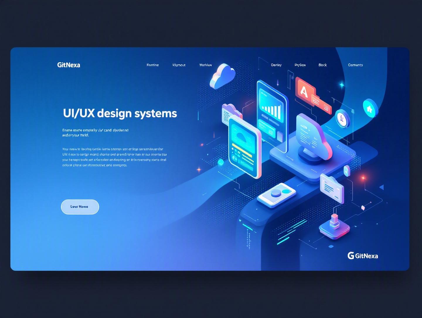
The Ultimate Guide to UI/UX Design Systems
Introduction
In 2024, Forrester reported that a well-implemented design system can reduce design and development time by up to 50%. Yet most companies still treat UI components like one-off assets—reinvented for every feature, every sprint, every product. The result? Inconsistent interfaces, bloated front-end codebases, frustrated developers, and confused users.
UI/UX design systems have moved from "nice-to-have" to mission-critical infrastructure. If your product spans web, mobile, tablets, wearables, or multiple brand lines, you’re already dealing with complexity. A UI/UX design system acts as your product’s operating manual—codifying visual identity, interaction patterns, accessibility standards, and reusable components into a single source of truth.
In this comprehensive guide, we’ll break down what UI/UX design systems really are (and what they’re not), why they matter more in 2026 than ever before, and how companies like Google, Shopify, and Atlassian use them to scale. We’ll explore architecture patterns, governance models, tooling stacks (Figma, Storybook, Tokens Studio), implementation workflows, and real-world pitfalls.
If you’re a CTO scaling a SaaS platform, a product manager juggling multiple teams, or a design lead tired of inconsistent UI decisions, this guide will give you both strategic clarity and practical steps.
What Is a UI/UX Design System?
A UI/UX design system is a structured collection of reusable components, design guidelines, standards, and documentation that define how digital products should look and behave.
At its core, a design system includes:
- Design tokens (colors, typography, spacing, elevation)
- UI components (buttons, inputs, modals, navigation)
- Interaction patterns (form validation, error states, animations)
- Accessibility standards (WCAG compliance rules)
- Brand principles and usage guidelines
- Code implementations (React, Vue, Angular, Swift, etc.)
It’s not just a Figma file. And it’s definitely not just a UI kit.
Design System vs Style Guide vs Component Library
| Feature | Style Guide | Component Library | UI/UX Design System |
|---|---|---|---|
| Brand colors & typography | ✅ | ✅ | ✅ |
| Reusable UI components | ❌ | ✅ | ✅ |
| Interaction guidelines | ❌ | ❌ | ✅ |
| Accessibility standards | ❌ | ⚠️ Partial | ✅ |
| Governance model | ❌ | ❌ | ✅ |
| Multi-platform support | ❌ | ⚠️ Sometimes | ✅ |
A style guide defines how things look. A component library provides reusable code. A UI/UX design system ties everything together—design, development, governance, and documentation.
Google’s Material Design (https://m3.material.io/) is one of the most recognized examples. It defines principles, motion guidelines, elevation models, accessibility constraints, and ready-to-use components across Android, web, and beyond.
Why UI/UX Design Systems Matter in 2026
By 2026, digital products rarely exist in isolation. A single SaaS company may have:
- A marketing website
- A web application
- An iOS app
- An Android app
- Internal admin dashboards
- Embedded widgets for clients
Without a unified UI/UX design system, each surface drifts.
Market & Industry Shifts
- According to Gartner (2024), over 70% of enterprise organizations maintain at least one formal design system.
- McKinsey’s 2023 "Business Value of Design" report found that design-led companies outperformed industry benchmarks by 2:1 in revenue growth.
- Accessibility regulations (EU Accessibility Act 2025) are forcing companies to standardize accessible components.
The Developer Efficiency Factor
In fast-moving teams, repeated UI decisions create friction:
- "What shade of blue should we use?"
- "Is this button primary or secondary?"
- "Do we use a modal or a drawer?"
A mature UI/UX design system eliminates decision fatigue.
Instead of debating, teams reference documented patterns. Instead of rebuilding components, developers import them:
import { Button, Modal, Input } from "@company/design-system";
Now multiply that by 30 engineers and 200 features per year. The time savings compound quickly.
And if you're scaling a cloud-native product, design consistency directly affects your frontend performance and maintainability—topics we’ve covered in our guide to modern web development architecture.
Core Components of a UI/UX Design System
Let’s break the system into its essential layers.
1. Design Tokens
Design tokens are named variables that store visual properties.
Example (JSON format):
{
  "color-primary": "#2563EB",
  "spacing-md": "16px",
  "font-size-base": "14px",
  "border-radius-sm": "4px"
}
These tokens sync across platforms using tools like:
- Tokens Studio (Figma plugin)
- Style Dictionary
- Theo by Salesforce
Why tokens matter:
- They enable theming (dark mode, brand variations)
- They reduce hard-coded styles
- They centralize design decisions
2. Component Library
Components are built using frameworks like React, Vue, or Angular.
Example React button:
export const Button = ({ variant = "primary", children }) => {
  return (
    <button className={`btn btn-${variant}`}>
      {children}
    </button>
  );
};
Storybook (https://storybook.js.org/) is commonly used to document and test components in isolation.
3. Interaction & UX Patterns
This includes:
- Form validation behavior
- Empty states
- Loading skeletons
- Error messaging tone
For example, Slack’s design system defines clear microcopy guidelines for error messages—short, human, actionable.
4. Accessibility Standards
WCAG 2.2 compliance requires:
- Minimum 4.5:1 contrast ratio
- Keyboard navigability
- ARIA roles
Instead of auditing accessibility per feature, embed it directly into your UI/UX design system components.
How to Build a UI/UX Design System (Step-by-Step)
Building a design system isn’t a weekend project. It’s product infrastructure.
Step 1: Audit Existing Interfaces
Inventory:
- Colors
- Typography
- Buttons
- Form patterns
- Navigation systems
You’ll likely find 6 different button styles across 3 teams.
Step 2: Define Design Principles
Example principles:
- Accessibility-first
- Mobile-first responsive design
- Performance-conscious UI
- Clear hierarchy
These principles guide future decisions.
Step 3: Create Token Architecture
Define naming conventions:
color.background.primary
color.text.secondary
spacing.layout.md
Consistency in naming prevents chaos later.
Step 4: Build Core Components
Start small:
- Button
- Input
- Card
- Modal
- Typography system
Don’t attempt 80 components at once.
Step 5: Documentation & Governance
Use tools like:
- Notion
- Zeroheight
- Storybook Docs
Define:
- Contribution process
- Versioning strategy
- Deprecation policy
This ties directly into strong DevOps best practices.
Design System Architecture for Scalable Products
As your product grows, architecture matters.
Monorepo vs Multi-Repo
| Approach | Pros | Cons |
|---|---|---|
| Monorepo (Nx, Turborepo) | Unified versioning, shared tooling | Larger repo complexity |
| Multi-repo | Clear separation | Version drift risk |
Most modern SaaS teams prefer monorepos with CI/CD pipelines.
Versioning Strategy
Follow semantic versioning:
- MAJOR: Breaking changes
- MINOR: New components
- PATCH: Bug fixes
Example:
@company/design-system@2.3.1
Theming Architecture
For multi-brand platforms:
base tokens → brand overrides → component styles
This is common in white-label SaaS products.
If you’re running multi-tenant apps on AWS or Azure, your design system must align with your cloud architecture strategy.
Real-World Examples of UI/UX Design Systems
1. Shopify Polaris
Polaris supports thousands of third-party apps. It ensures:
- Accessibility compliance
- Consistent merchant experience
- Cross-platform UI
2. Atlassian Design System
Used across Jira, Confluence, Trello.
Key strength: strict contribution model and documentation depth.
3. IBM Carbon
Carbon emphasizes accessibility and enterprise-grade scalability.
Each system demonstrates one truth: design systems are long-term commitments.
How GitNexa Approaches UI/UX Design Systems
At GitNexa, we treat UI/UX design systems as core product infrastructure—not decoration.
Our approach typically includes:
- Cross-functional workshops with designers, frontend engineers, and product stakeholders
- Full UI audit across web and mobile platforms
- Token-driven architecture setup
- Component development in React, Next.js, or Vue
- Storybook-powered documentation
- Accessibility validation (WCAG 2.2)
For startups, we build lean, scalable systems that grow with the product. For enterprises, we implement governance models and CI-integrated versioning.
Many of our UI/UX engagements connect directly with broader initiatives like custom web application development and mobile app development strategy.
Common Mistakes to Avoid
- Treating it as a one-time project
- Building too many components too early
- Ignoring developer involvement
- Skipping accessibility until late-stage audits
- Poor documentation
- No governance model
- Hard-coding design values instead of tokens
Each of these mistakes creates long-term maintenance debt.
Best Practices & Pro Tips
- Start with tokens, not components
- Automate visual regression testing (Chromatic)
- Align design and code naming conventions
- Enforce semantic versioning
- Run quarterly audits
- Assign a design system owner
- Build feedback loops from product teams
- Keep documentation brutally clear
Future Trends & What to Expect (2026–2027)
- AI-assisted component generation in Figma
- Design-to-code automation improvements
- Multi-brand token engines
- Increased regulation around accessibility
- AR/VR interface standardization
AI tools will assist—but not replace—human UX strategy.
We’re already seeing convergence between AI workflows and design systems in modern AI-powered product development.
FAQ: UI/UX Design Systems
What is the difference between a design system and a UI kit?
A UI kit is a collection of design assets. A design system includes components, tokens, documentation, governance, and implementation standards.
How long does it take to build a UI/UX design system?
For startups, 6–12 weeks for a foundational system. Enterprise-level systems can take 6–12 months.
Do small startups need a design system?
Yes—but start lean. Even 10 reusable components can prevent early inconsistency.
Which tools are best for design systems?
Figma, Storybook, Tokens Studio, Style Dictionary, Zeroheight.
How do design systems improve developer productivity?
They eliminate repetitive UI work and reduce decision fatigue.
Are design systems only for web apps?
No. They support web, mobile, desktop, wearables, and even embedded systems.
How do you maintain a design system?
Through governance models, version control, and regular audits.
What role does accessibility play?
Accessibility must be embedded at the component level to ensure compliance and usability.
Conclusion
UI/UX design systems are no longer optional for serious digital products. They reduce costs, accelerate development, improve accessibility, and create consistent user experiences across platforms.
When built thoughtfully—with tokens, governance, and developer collaboration—they become one of the most valuable assets in your product ecosystem.
Ready to build or scale your UI/UX design system? Talk to our team to discuss your project.
Comments
Loading comments...