Sub Category
Latest Blogs
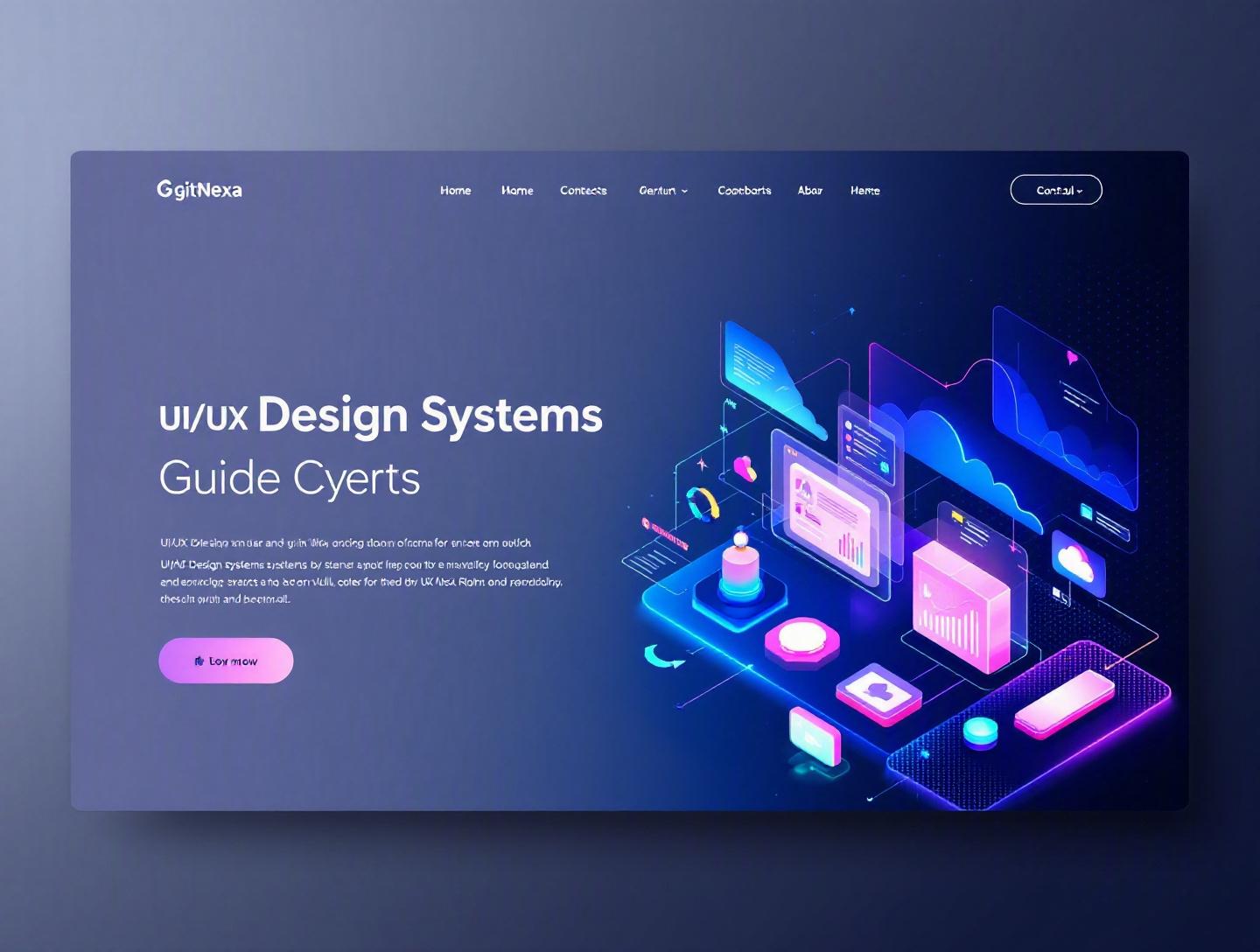
The Ultimate UI/UX Design Systems Guide for 2026
Introduction
In 2025, Figma reported crossing 4 million paid seats globally, with enterprise adoption of shared libraries and design systems growing over 60% year-over-year. That’s not just a design trend—it’s an operational shift. Teams are no longer asking whether they need a UI/UX design system. They’re asking how fast they can implement one before their product complexity spirals out of control.
A UI/UX design systems guide is no longer optional reading for product teams. As digital products scale across web, mobile, wearables, and even automotive interfaces, consistency becomes a competitive advantage. Without a structured design system, teams waste hours recreating buttons, debating typography, and patching accessibility gaps after release.
If you’re a CTO juggling multiple squads, a founder trying to scale design without hiring ten more designers, or a product lead tired of inconsistent UI across platforms, this guide is for you.
In this comprehensive UI/UX design systems guide, you’ll learn:
- What a UI/UX design system actually is (and what it’s not)
- Why design systems matter more than ever in 2026
- How to build and scale one step by step
- Real-world examples from companies like Airbnb, Shopify, and IBM
- Common mistakes teams make—and how to avoid them
- Best practices, tools, and future trends shaping design systems
Let’s start with the fundamentals.
What Is a UI/UX Design System?
A UI/UX design system is a structured collection of reusable components, design standards, documentation, and governance principles that guide how digital products are designed and built.
Think of it as a single source of truth for both designers and developers.
At its core, a design system includes:
- Design tokens (colors, spacing, typography scales)
- UI components (buttons, modals, cards, form elements)
- Interaction patterns (navigation, validation, microinteractions)
- Accessibility guidelines
- Code implementations (React, Vue, Flutter, etc.)
- Documentation and usage rules
Design System vs. Style Guide vs. Component Library
Teams often confuse these terms. They’re related—but not the same.
| Asset | Purpose | Includes Code? | Governance? |
|---|---|---|---|
| Style Guide | Visual identity rules | No | Limited |
| Component Library | Reusable UI components | Yes | Minimal |
| Design System | End-to-end product design framework | Yes | Yes |
A style guide defines fonts and colors. A component library gives you reusable UI blocks. A design system governs how everything fits together—from brand voice to accessibility compliance.
The Technical Layer: Design Tokens
Modern systems rely heavily on design tokens—platform-agnostic variables that define visual decisions.
Example:
{
  "color-primary": "#0052FF",
  "spacing-md": "16px",
  "font-size-lg": "20px"
}
These tokens sync across platforms—web (CSS), mobile (Swift/Kotlin), and even React Native.
According to the W3C Design Tokens Community Group (2024), standardized token formats are becoming foundational for cross-platform consistency.
A mature UI/UX design system integrates:
- Figma or Sketch libraries
- Frontend frameworks (React, Angular, Vue)
- Documentation tools (Storybook, Zeroheight)
- CI/CD workflows
Now that we’ve defined it, let’s understand why it matters more than ever.
Why UI/UX Design Systems Matter in 2026
Digital product teams are under pressure from three forces: speed, scale, and AI-driven personalization.
According to Gartner (2025), organizations that invest in design systems reduce design and development rework by up to 34%. That translates into faster release cycles and lower engineering costs.
Here’s what’s changed in 2026.
1. Multi-Platform Complexity
Users expect consistency across:
- Web apps
- iOS and Android apps
- Smart TVs
- Wearables
- Embedded systems
Without a unified system, teams rebuild UI patterns repeatedly.
2. AI-Generated Interfaces
With AI-assisted prototyping tools like Figma AI and Uizard, teams can generate layouts instantly. But without a structured system, AI outputs become inconsistent.
A design system acts as guardrails.
3. Accessibility and Compliance
WCAG 2.2 adoption is increasing globally. Accessibility isn’t optional anymore. A design system ensures:
- Color contrast compliance
- Keyboard navigation standards
- Screen reader compatibility
For more on accessibility engineering, see our guide on web accessibility best practices.
4. Faster Product Scaling
Airbnb’s design system reduced new feature design time by nearly 30% (internal case study). Shopify’s Polaris ensures consistent UX across thousands of partner apps.
Companies that scale fastest build systems early.
Now let’s break down how to build one properly.
Core Elements of a UI/UX Design System
A successful UI/UX design system rests on six foundational layers.
1. Design Principles
Start with philosophy. Define:
- What does your brand stand for?
- How should interactions feel?
- Are you optimizing for speed, clarity, or delight?
Example from IBM’s Carbon:
- "Do the hard work to make it simple"
- "Be essential"
These principles guide every UI decision.
2. Design Tokens
Tokens standardize visual attributes.
Categories typically include:
- Color palette
- Spacing scale (4px or 8px grid)
- Typography hierarchy
- Shadows and elevation
- Motion duration
Example CSS implementation:
:root {
  --color-primary: #0052FF;
  --spacing-sm: 8px;
  --font-heading: 24px;
}
3. UI Components
Core reusable elements:
- Buttons
- Inputs
- Dropdowns
- Modals
- Tooltips
- Data tables
Each component should include:
- Variants (primary, secondary, disabled)
- States (hover, focus, error)
- Accessibility notes
- Code snippets
4. Patterns
Patterns combine components into workflows:
- Authentication flows
- Checkout flows
- Dashboard layouts
- Search experiences
5. Documentation
Documentation answers:
- When to use this component
- When not to use it
- Code examples
- Accessibility notes
Storybook is widely used for interactive documentation.
6. Governance Model
Who approves changes?
Define:
- Contribution process
- Versioning policy
- Review committee
- Release cycle
Without governance, your system becomes outdated quickly.
Step-by-Step Process to Build a UI/UX Design System
Let’s get practical.
Step 1: Audit Existing Interfaces
Inventory all UI components across products.
Look for:
- Duplicate buttons
- Inconsistent spacing
- Multiple color variations
Step 2: Define Design Tokens
Create a unified token structure. Align with engineering early.
Step 3: Build a Component Library
Start small.
Prioritize:
- Buttons
- Forms
- Navigation
- Cards
Use React + Storybook for web projects.
Step 4: Document Everything
Use Zeroheight, Notion, or internal docs.
Step 5: Integrate into CI/CD
Connect system releases with deployment pipelines.
Learn more in our CI/CD implementation guide.
Step 6: Train Teams
Host workshops. Create onboarding material.
Step 7: Measure Adoption
Track:
- Component reuse rate
- Design-to-dev handoff time
- Bug reduction metrics
Tools and Technologies for Modern Design Systems
Choosing the right tools matters.
Design Tools
- Figma – Real-time collaboration
- Sketch – Mature ecosystem
- Adobe XD – Enterprise integration
Documentation Tools
- Storybook
- Zeroheight
- Docusaurus
Frontend Frameworks
- React (with TypeScript)
- Vue 3
- Angular
Token Management Tools
- Style Dictionary (Amazon)
- Theo
For frontend architecture insights, read our modern frontend architecture guide.
Real-World Examples of Design Systems
1. Google Material Design
Comprehensive guidelines + open-source components.
Documentation: https://m3.material.io/
2. IBM Carbon
Enterprise-focused system with accessibility built in.
3. Shopify Polaris
Optimized for eCommerce.
4. Atlassian Design System
Supports Jira, Confluence, and Trello.
Key takeaway: every successful system aligns tightly with business goals.
How GitNexa Approaches UI/UX Design Systems
At GitNexa, we treat UI/UX design systems as engineering products—not design side projects.
Our process includes:
- Cross-functional workshops with designers and developers
- Token architecture aligned with frontend frameworks
- Automated testing for component libraries
- Accessibility validation (WCAG 2.2)
- CI/CD integration for continuous updates
We often combine system creation with broader initiatives like custom web application development and mobile app development strategy.
The result? Scalable, maintainable product ecosystems.
Common Mistakes to Avoid
- Building Everything at Once – Start small and iterate.
- Ignoring Developers – Design-only systems fail.
- No Governance Model – Chaos follows.
- Poor Documentation – Adoption drops.
- Over-Engineering Components – Keep them practical.
- Skipping Accessibility – Retrofits are expensive.
- Not Measuring ROI – Leadership needs metrics.
Best Practices & Pro Tips
- Start with high-impact components.
- Use semantic naming for tokens.
- Automate visual regression testing.
- Version your system (SemVer).
- Encourage community contributions.
- Conduct quarterly audits.
- Integrate with DevOps pipelines.
For DevOps alignment, explore our DevOps transformation roadmap.
Future Trends & What to Expect (2026–2027)
1. AI-Assisted Component Generation
Systems will auto-generate variants based on usage patterns.
2. Cross-Platform Token Standards
W3C token standardization efforts will mature.
3. Voice and Spatial Interfaces
Design systems will expand beyond screens.
4. Analytics-Driven Design
Components optimized via real-time usage data.
5. Accessibility Automation
Automated compliance checks integrated into CI.
FAQ: UI/UX Design Systems Guide
What is included in a UI/UX design system?
A design system includes design tokens, reusable UI components, documentation, accessibility standards, and governance processes.
How long does it take to build a design system?
For mid-sized products, 3–6 months for a mature foundation.
Are design systems only for large companies?
No. Startups benefit even more due to limited resources.
What tools are best for design systems in 2026?
Figma, Storybook, Style Dictionary, and React remain dominant.
How do design tokens work?
They define visual attributes in a platform-agnostic format and sync across platforms.
How do you measure design system ROI?
Track component reuse, bug reduction, and release velocity.
What’s the difference between UI kit and design system?
A UI kit is a static asset collection; a design system includes governance and code.
Can AI replace design systems?
No. AI enhances systems but needs structured rules.
How do you maintain a design system?
Through versioning, audits, and governance committees.
Is accessibility mandatory in design systems?
Yes. It ensures compliance and inclusivity.
Conclusion
A well-implemented UI/UX design system reduces duplication, accelerates product development, and strengthens brand consistency across platforms. In 2026, it’s not just a design asset—it’s infrastructure.
If you’re scaling products across web and mobile, investing in a structured system will pay dividends in speed, quality, and maintainability.
Ready to build or optimize your UI/UX design system? Talk to our team to discuss your project.
Comments
Loading comments...