Sub Category
Latest Blogs
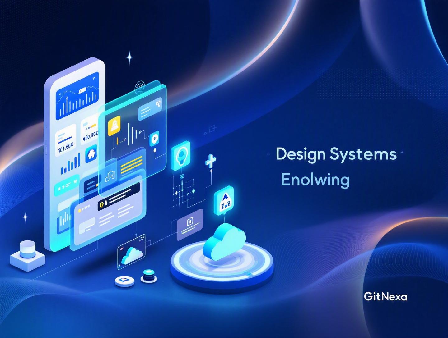
The Ultimate Guide to UI/UX Design Systems in 2026
Introduction
In 2025, Figma reported that over 80% of enterprise design teams rely on shared component libraries to ship products faster. Yet, according to a 2024 Forrester study, nearly 60% of digital teams still struggle with inconsistent user interfaces across platforms. That gap tells a story: companies know they need UI/UX design systems, but many haven’t implemented them correctly.
A UI/UX design system is no longer a "nice-to-have" for scaling products. It’s the backbone of modern digital experiences — from SaaS dashboards and fintech apps to eCommerce platforms and enterprise portals. Without a structured system, teams waste hours debating button styles, rewriting CSS, or redesigning components that already exist somewhere else.
In this comprehensive guide, we’ll unpack what UI/UX design systems really are, why they matter more than ever in 2026, and how companies like Google, Shopify, and Atlassian use them to scale products across teams and continents. You’ll learn the architecture behind effective systems, how to build one step-by-step, common pitfalls, and future trends shaping the next generation of design infrastructure.
Whether you’re a CTO planning platform standardization, a startup founder scaling product development, or a design lead tired of inconsistency, this guide will give you practical clarity — not theory.
What Is a UI/UX Design System?
A UI/UX design system is a centralized collection of reusable components, design standards, documentation, and code guidelines that ensure consistent user experiences across digital products.
It goes far beyond a style guide.
Design System vs. Style Guide vs. Component Library
Let’s clarify common confusion:
| Element | Purpose | Includes Code? | Scope |
|---|---|---|---|
| Style Guide | Visual standards | No | Colors, typography, spacing |
| Component Library | Reusable UI elements | Yes | Buttons, modals, inputs |
| UI/UX Design System | Complete ecosystem | Yes | Components, tokens, patterns, documentation, governance |
A mature UI/UX design system typically includes:
- Design tokens (colors, spacing, typography scales)
- Reusable components (buttons, dropdowns, cards)
- Interaction patterns (navigation, forms, onboarding flows)
- Accessibility standards (WCAG 2.2 compliance)
- Code implementation (React, Vue, Angular components)
- Documentation & governance
For example:
- Google Material Design: Comprehensive cross-platform system
- Shopify Polaris: Merchant-focused UX consistency
- IBM Carbon Design System: Enterprise-focused accessibility and scalability
These systems align designers and developers around a single source of truth.
Why UI/UX Design Systems Matter in 2026
Digital products are no longer single-platform experiences. A fintech startup might operate:
- Web app (React)
- iOS app (SwiftUI)
- Android app (Kotlin)
- Internal admin dashboard
- Marketing website
Without a UI/UX design system, fragmentation is inevitable.
1. Faster Product Development
According to McKinsey (2023), companies with mature design practices increased revenue growth by up to 32% compared to industry peers. A strong design system reduces redundant work and accelerates feature releases.
2. AI-Assisted Design Workflows
In 2026, AI tools like Figma AI and GitHub Copilot generate UI code directly from design components. Structured systems allow AI to work predictably.
3. Remote & Distributed Teams
With global teams becoming standard, consistency depends on shared documentation and reusable UI assets.
4. Accessibility & Compliance
Regulations like the European Accessibility Act (2025 enforcement) require digital accessibility. Embedding WCAG standards into your design system prevents legal risk.
5. Cost Reduction
A 2024 report from Gartner estimates that inconsistent UX increases development rework by 20–30%. A design system cuts this significantly.
Core Elements of a Modern UI/UX Design System
Design Tokens: The Foundation
Design tokens are platform-agnostic variables representing visual decisions.
Example (JSON format):
{
  "color-primary": "#2563EB",
  "spacing-medium": "16px",
  "font-base": "Inter, sans-serif"
}
Tokens ensure consistency across web and mobile.
Component Architecture
Modern systems use atomic design principles:
- Atoms (buttons, inputs)
- Molecules (form groups)
- Organisms (headers, modals)
- Templates
- Pages
Example React component:
export const Button = ({ variant = "primary", children }) => {
  return (
    <button className={`btn btn-${variant}`}>
      {children}
    </button>
  );
};
Documentation Tools
Common tools include:
- Storybook
- Zeroheight
- Figma Libraries
- Notion
Storybook example documentation pattern:
npm run storybook
Step-by-Step: How to Build a UI/UX Design System
Step 1: Audit Existing UI
Review all:
- Buttons
- Typography scales
- Color palettes
- Layout grids
Identify inconsistencies.
Step 2: Define Design Principles
Example principles:
- Clarity over decoration
- Accessibility first
- Performance-conscious UI
Step 3: Create Design Tokens
Centralize visual decisions before building components.
Step 4: Build Core Components
Start with high-frequency elements:
- Buttons
- Inputs
- Cards
- Modals
Step 5: Documentation & Governance
Assign ownership. Without governance, systems decay.
Real-World Examples of UI/UX Design Systems
Google Material Design
- Cross-platform adaptability
- Extensive documentation
- Accessibility built-in
Official docs: https://m3.material.io/
Shopify Polaris
Focused on merchant workflows and data-heavy dashboards.
Atlassian Design System
Supports Jira, Confluence, Trello across millions of users.
How GitNexa Approaches UI/UX Design Systems
At GitNexa, we treat UI/UX design systems as product infrastructure — not decoration. When delivering custom web application development, we establish reusable component libraries from sprint one.
Our approach includes:
- UX audit and interface inventory
- Design token architecture
- Component-driven development (React, Next.js, Vue)
- Storybook-based documentation
- DevOps-aligned CI/CD integration
We often integrate design systems within broader initiatives like DevOps automation strategies and cloud-native architecture planning.
The result? Faster releases, lower rework, and scalable product ecosystems.
Common Mistakes to Avoid
- Treating it as a one-time project
- Ignoring developer involvement
- Overengineering early components
- Lack of documentation
- No accessibility validation
- Failing to measure adoption
- Not assigning ownership
Best Practices & Pro Tips
- Start small, scale gradually.
- Prioritize high-impact components.
- Automate token syncing.
- Version components semantically.
- Track usage metrics.
- Embed accessibility testing.
- Align with product roadmap.
- Review quarterly.
Future Trends & What to Expect (2026–2027)
- AI-generated component variants
- Cross-platform token automation
- Accessibility automation tools
- Headless design systems
- DesignOps expansion
Expect deeper integration between Figma, GitHub, and CI/CD pipelines.
FAQ: UI/UX Design Systems
What is the difference between a UI kit and a design system?
A UI kit is a collection of visual components. A design system includes governance, code, documentation, and UX standards.
How long does it take to build a design system?
For startups: 6–10 weeks. Enterprises: 4–6 months.
Are design systems only for large companies?
No. Startups benefit early to prevent scaling chaos.
Which tools are best?
Figma, Storybook, Zeroheight, Tokens Studio.
How do design systems improve ROI?
They reduce rework, accelerate development, and improve UX consistency.
Do design systems include UX research?
They embed UX principles but are separate from research execution.
Can AI generate design systems?
AI can assist, but human governance remains essential.
How often should a design system be updated?
Quarterly reviews are recommended.
Conclusion
UI/UX design systems are no longer optional. They are operational infrastructure for digital product teams. When implemented correctly, they align design and development, reduce cost, improve accessibility, and accelerate innovation.
If your product ecosystem is growing — across platforms, teams, or markets — now is the time to formalize your system.
Ready to build a scalable UI/UX design system? Talk to our team to discuss your project.
Comments
Loading comments...