Sub Category
Latest Blogs
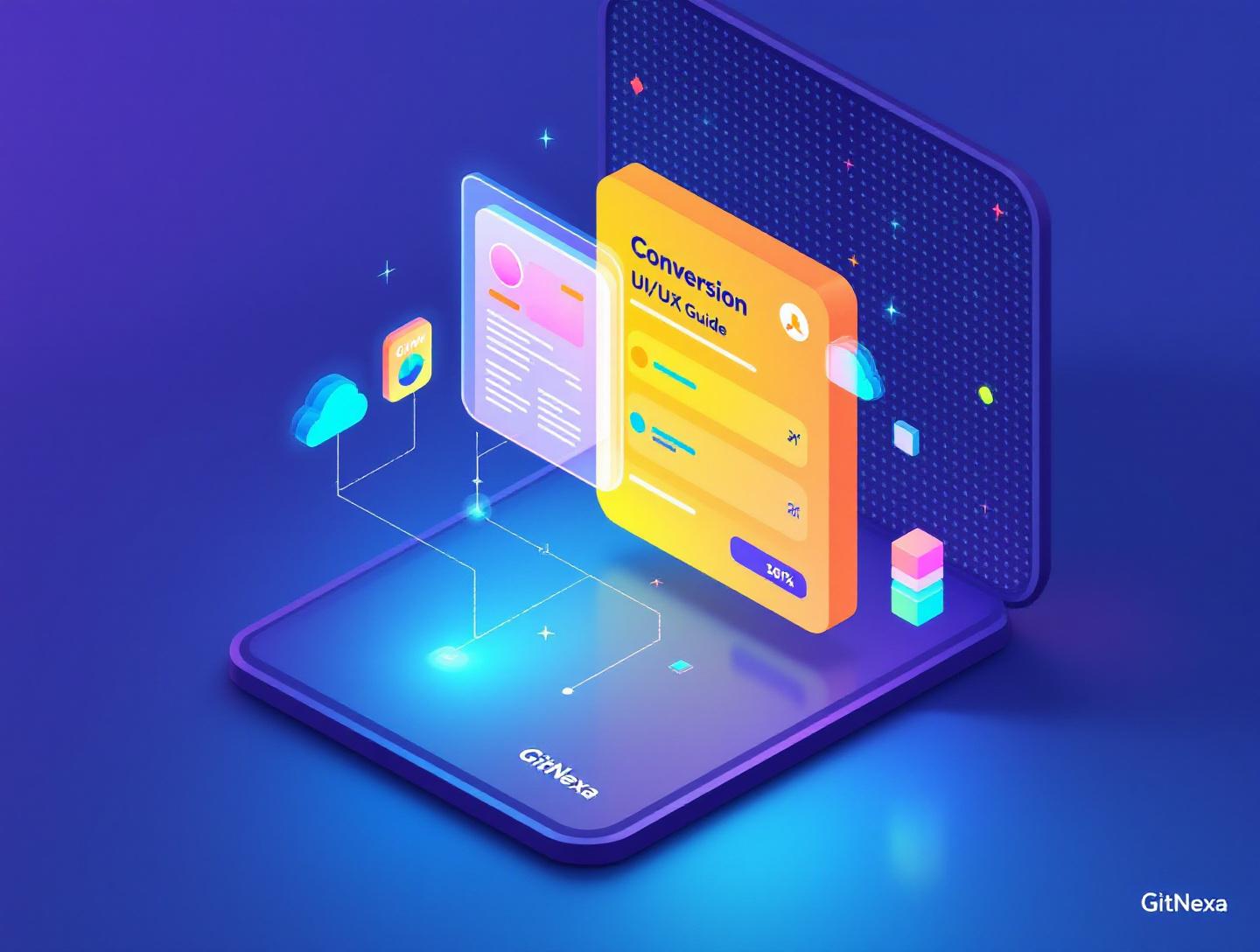
The Ultimate Guide to Conversion-Focused UI/UX Design
Introduction
In 2024, Forrester reported that a well-designed user interface can raise conversion rates by up to 200%, while better UX design can push that number to 400%. Those are not vanity metrics. They are boardroom numbers that decide whether a product scales or quietly dies. Yet many teams still treat UI as paint and UX as a checklist. The result? Beautiful interfaces that users admire… and abandon.
Conversion-focused UI/UX design flips that mindset. Instead of asking, "Does this look good?" it asks, "Does this help the user decide and act?" In the first 100 words, let’s be clear: conversion-focused UI/UX design is not about dark patterns or tricking users. It is about clarity, trust, and reducing friction so the right users can move forward with confidence.
Founders feel this pain early. Traffic is coming in from ads, SEO, referrals, and partnerships, but sign-ups stall. CTOs see performance budgets blown on animations that add zero business value. Designers are frustrated because their work looks great in Figma but underperforms in production. Everyone senses something is off, yet the fixes feel vague.
This guide exists to remove that vagueness. You will learn what conversion-focused UI/UX design actually means, why it matters even more in 2026, and how high-performing teams apply psychology, data, and engineering discipline to design decisions. We will break down real-world examples, practical workflows, and mistakes that quietly kill conversions. You will also see how GitNexa approaches conversion-focused UI/UX design in real client projects, from SaaS dashboards to mobile apps and enterprise platforms.
If your product deserves more than guesswork, you are in the right place.
What Is Conversion-Focused UI/UX Design
Conversion-focused UI/UX design is the practice of designing interfaces and experiences with a primary goal: guiding users toward a specific, measurable action while respecting their intent and context.
That action could be signing up for a free trial, completing a purchase, booking a demo, or even finishing an onboarding flow. The key is intentionality. Every layout decision, interaction, copy block, and performance trade-off exists to support that outcome.
UI vs UX vs Conversion Optimization
UI (User Interface) focuses on visual elements: typography, color, spacing, buttons, and components. UX (User Experience) looks at the broader journey: how users move through the product, where they hesitate, and how they feel at each step. Conversion optimization adds a business lens on top of both.
When these disciplines work in isolation, you get problems. UI-only work produces visually pleasing screens that confuse users. UX-only work can become abstract journey maps that never translate into pixels. Conversion-only thinking risks manipulative patterns. Conversion-focused UI/UX design balances all three.
A Practical Definition
In practical terms, conversion-focused UI/UX design means:
- Designing flows, not just screens
- Reducing cognitive load at every decision point
- Making the next step obvious and low-risk
- Using data to validate design decisions
- Aligning user success with business success
This approach borrows from behavioral psychology, information architecture, accessibility standards, and front-end engineering. It is not a phase at the end of a project. It starts at discovery and continues post-launch.
Why Conversion-Focused UI/UX Design Matters in 2026
By 2026, user expectations are higher and patience is thinner. According to Google’s Web Performance Study (2023), 53% of users abandon a mobile site if it takes longer than 3 seconds to load. Meanwhile, Statista reported in 2024 that global digital ad spend surpassed $740 billion. Traffic is expensive. Wasting it is not an option.
Users Compare You to the Best, Not Your Competitors
Your SaaS onboarding is not judged against other SaaS tools in your niche. It is judged against Amazon’s checkout, Stripe’s dashboards, and Apple’s setup flows. Users bring those expectations with them, whether you like it or not.
AI and Automation Raise the Bar
AI-generated UIs and no-code tools have flooded the market with “good enough” designs. Ironically, this makes truly conversion-focused UI/UX design more valuable. When everyone can ship something, the winners are those who optimize relentlessly.
Privacy and Trust Are Conversion Factors
With stricter privacy regulations and cookie deprecation, dark patterns are under scrutiny. Trust, transparency, and accessibility directly impact conversions. Interfaces that explain why data is needed and how it is used outperform those that hide behind legal jargon.
Conversion Is Now a Cross-Functional Metric
In mature teams, conversion is no longer just a marketing KPI. Product, design, engineering, and even DevOps teams influence it. Performance budgets, error states, and uptime all affect whether users convert.
Conversion-Focused UI/UX Design Principles That Actually Work
Clarity Beats Creativity
Creative layouts win awards. Clear layouts win customers. In conversion-focused UI/UX design, clarity always comes first.
Real-world example: Basecamp’s homepage. It uses plain language, a single primary CTA, and zero distractions. No sliders. No autoplay videos. Just clarity.
Practical Checklist
- One primary action per screen
- Headlines that answer "What is this?" in under 5 seconds
- Buttons that describe outcomes, not actions ("Start free trial" vs "Submit")
Reduce Cognitive Load Ruthlessly
Every choice costs mental energy. Hick’s Law tells us that decision time increases with the number of choices. Amazon famously tests reducing options on checkout pages, even at massive scale.
UI Techniques That Help
- Progressive disclosure
- Default selections
- Inline validation instead of error pages
Visual Hierarchy Guides Behavior
Users do not read. They scan. Your visual hierarchy determines what they notice and what they ignore.
[Headline]
  [Supporting copy]
    [Primary CTA]
      [Secondary action]
Spacing, contrast, and alignment are not aesthetic preferences. They are behavioral tools.
Performance Is Part of UX
A slow interface breaks trust. Conversion-focused UI/UX design treats performance as a design constraint, not an engineering afterthought.
Tools like Lighthouse, WebPageTest, and Chrome DevTools should be part of the design workflow, not just QA.
Designing High-Converting User Flows Step by Step
Step 1: Define the Conversion Goal
Be specific. "Increase sign-ups" is vague. "Increase completed sign-ups for the Pro plan by 15%" is actionable.
Step 2: Map the Current Flow
Use tools like FigJam or Miro to map every step from entry to conversion. Include emotions and questions users may have.
Step 3: Identify Friction Points
Look for:
- Drop-offs in analytics
- Rage clicks in session recordings
- Support tickets mentioning confusion
Step 4: Prototype and Test
Low-fidelity prototypes tested early beat polished designs tested late. Tools like Maze and UsabilityHub are effective here.
Step 5: Measure and Iterate
Ship, measure, refine. Conversion-focused UI/UX design is never "done".
Real-World Examples of Conversion-Focused UI/UX Design
SaaS Onboarding: Slack
Slack’s onboarding asks one question at a time. No overwhelming forms. Each step feels achievable. The result? Faster activation and lower churn.
E-commerce Checkout: Shopify Stores
Shopify’s default checkout removes unnecessary fields and supports express payment options. Fewer steps, higher completion rates.
Mobile Apps: Duolingo
Duolingo uses micro-interactions and positive reinforcement to keep users moving forward. Every screen nudges the next action.
Conversion-Focused UI/UX Design and Accessibility
Accessibility is not a compliance checkbox. It directly affects conversions. According to WebAIM (2024), 96% of top websites still fail basic accessibility tests.
Accessible design improves clarity for everyone. Larger tap targets, readable contrast, and clear focus states reduce friction across the board.
Refer to the official WCAG guidelines and MDN accessibility docs for implementation details.
How GitNexa Approaches Conversion-Focused UI/UX Design
At GitNexa, conversion-focused UI/UX design starts before a single pixel is designed. We begin with business goals, user intent, and technical constraints. Our teams collaborate across design, frontend, backend, and DevOps to ensure decisions hold up in production.
We combine qualitative research with quantitative data, using tools like Hotjar, GA4, and A/B testing frameworks. Our designers work closely with engineers to avoid designs that look great but perform poorly.
Whether it’s a SaaS platform, a mobile application, or a complex enterprise dashboard, our focus stays the same: reduce friction, increase clarity, and respect the user.
Related insights:
- UI/UX design services
- Web application development
- Mobile app development strategy
Common Mistakes to Avoid
- Designing without a clear conversion goal
- Prioritizing aesthetics over usability
- Ignoring performance and load times
- Overusing modals and pop-ups
- Hiding pricing or critical information
- Not testing with real users
- Treating accessibility as optional
Each of these mistakes silently erodes trust and momentum.
Best Practices & Pro Tips
- Design flows, not pages
- Use real content early
- Test on low-end devices
- Measure micro-conversions
- Collaborate across teams
- Document design decisions
Future Trends & What to Expect
By 2026–2027, expect deeper personalization driven by first-party data, stricter accessibility enforcement, and tighter integration between design systems and analytics. AI will assist, but human judgment will still decide what converts and what does not.
Voice interfaces, multimodal inputs, and adaptive layouts will add complexity. Conversion-focused UI/UX design will be the discipline that keeps products grounded.
FAQ: Conversion-Focused UI/UX Design
What is conversion-focused UI/UX design?
It is an approach that aligns design decisions with measurable user actions, balancing usability, trust, and business goals.
Is conversion-focused design manipulative?
No. Ethical conversion-focused UI/UX design prioritizes clarity and user intent, not deception.
How do you measure success?
Through metrics like conversion rate, task completion, time to value, and drop-off points.
Does performance really affect conversions?
Yes. Even a one-second delay can reduce conversions by 7%, according to Google research.
Can small teams apply this approach?
Absolutely. Clear goals and basic testing go a long way, even without large budgets.
How often should designs be tested?
Continuously. Testing is part of the lifecycle, not a one-time task.
Is accessibility required for conversions?
Accessible design improves usability for everyone, directly supporting higher conversions.
Does GitNexa work with startups?
Yes. We regularly work with startups and scale-ups at different growth stages.
Conclusion
Conversion-focused UI/UX design is not a trend. It is a discipline rooted in respect for users and clarity of purpose. When teams align design, engineering, and business goals, conversions become a natural outcome, not a lucky accident.
The products that win in 2026 will not be the flashiest. They will be the clearest, fastest, and most trustworthy. If your interface helps users decide without friction, you are already ahead.
Ready to improve conversions through thoughtful UI/UX design? Talk to our team to discuss your project.
Comments
Loading comments...