Sub Category
Latest Blogs
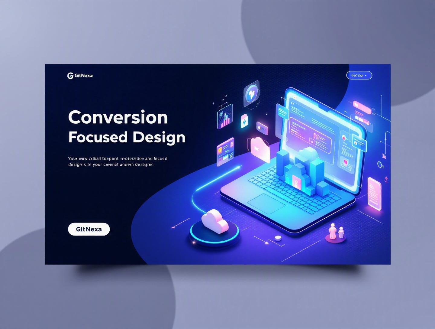
The Ultimate Guide to Conversion-Focused Product Design
Introduction
In 2025, businesses lost an estimated $1.6 trillion globally due to poor user experience and friction in digital products, according to a Forrester Research report. That number isn’t about traffic. It isn’t about ad spend. It’s about users who showed up—but didn’t convert.
That’s where conversion-focused product design changes the game. It shifts the conversation from "Does it look good?" to "Does it drive measurable action?" Whether that action is signing up, subscribing, booking a demo, or completing a checkout, the product must guide users toward outcomes.
Too many startups obsess over features while ignoring behavior. Enterprise teams redesign interfaces without aligning them to KPIs. The result? Beautiful interfaces that underperform.
In this comprehensive guide, we’ll break down what conversion-focused product design actually means, why it matters more than ever in 2026, and how to implement it across web apps, mobile platforms, and SaaS products. You’ll get practical frameworks, architecture considerations, workflow examples, real-world case studies, and actionable steps.
If you're a CTO, founder, product manager, or UX designer who wants measurable growth—not vanity metrics—this guide is for you.
What Is Conversion-Focused Product Design?
Conversion-focused product design is a strategic approach to building digital products where every interface decision, user flow, and interaction is optimized to drive a specific business outcome.
That outcome might be:
- Completing a purchase
- Booking a consultation
- Starting a free trial
- Upgrading a plan
- Filling out a lead form
Unlike traditional UX design, which prioritizes usability and aesthetics, conversion-focused design integrates behavioral psychology, analytics, experimentation, and business goals directly into the product lifecycle.
The Core Definition
At its core, conversion-focused product design combines:
- User-centered design principles
- Behavioral psychology triggers
- Data-driven experimentation (A/B testing, multivariate testing)
- Business KPI alignment
- Continuous optimization loops
It sits at the intersection of product design, growth marketing, and analytics.
Conversion vs. Usability: Not the Same Thing
A product can be usable but not persuasive.
For example:
- A clean SaaS dashboard may be intuitive but lacks onboarding nudges.
- An eCommerce checkout may function smoothly but doesn't reduce cart anxiety.
Usability removes friction. Conversion-focused design guides decisions.
Where It Fits in the Product Lifecycle
Conversion-focused design influences:
- Discovery research
- Wireframing and prototyping
- Frontend architecture
- Backend event tracking
- Analytics instrumentation
- Growth experimentation pipelines
It connects tightly with modern DevOps and CI/CD workflows. (See our related guide on devops automation strategies).
In short, it’s not a design trend. It’s a product philosophy.
Why Conversion-Focused Product Design Matters in 2026
Digital competition is no longer about who builds the most features. It’s about who creates the most efficient path to value.
Rising Customer Acquisition Costs
According to Statista (2025), average customer acquisition costs (CAC) for SaaS companies increased by 60% over the last five years. Paid ads are expensive. Organic growth takes time.
If traffic costs more, conversion efficiency becomes critical.
Improving conversion rates from 2% to 3% increases revenue by 50% without increasing traffic.
AI-Driven Personalization Expectations
Users now expect dynamic, personalized experiences. Amazon attributes up to 35% of revenue to its recommendation engine (McKinsey). Static design won’t cut it.
Products must adapt in real time.
Mobile-First Dominance
Over 60% of global web traffic now comes from mobile devices (Statista, 2025). Conversion-focused design must prioritize thumb zones, performance budgets, and simplified flows.
Learn more in our mobile app development guide.
Product-Led Growth Models
Companies like Slack, Figma, and Notion scaled through product-led growth (PLG). Their interfaces sell the product through onboarding and in-app cues.
The product is the salesperson.
Data Infrastructure Maturity
Tools like Mixpanel, Amplitude, PostHog, and Segment allow granular behavioral tracking. With modern cloud infrastructure (see our cloud-native architecture insights), experimentation is easier than ever.
In 2026, there’s no excuse for guesswork.
The Psychology Behind Conversion-Focused Product Design
Understanding human behavior is foundational.
1. Cognitive Load Reduction
Humans process limited information at once. Hick’s Law states that decision time increases with complexity.
Example:
- Netflix limits homepage choices through curated rows.
- Stripe’s pricing page reduces plan comparisons.
Design takeaway: Reduce choices. Increase clarity.
2. Fogg Behavior Model
Behavior happens when:
B = M × A × P

B = Behavior
M = Motivation
A = Ability
P = Prompt
Your design must:
- Increase motivation (value proposition)
- Increase ability (ease of use)
- Add timely prompts (CTA)
3. Social Proof
Conversion rates can increase by 15–34% when testimonials and real user metrics are visible (Nielsen Norman Group).
Example implementation:
<section class="social-proof">
  <h3>Trusted by 12,000+ Product Teams</h3>
  <img src="/logos/slack.svg" alt="Slack" />
  <img src="/logos/shopify.svg" alt="Shopify" />
</section>
4. Loss Aversion
People fear losing more than they value gaining.
Examples:
- "Only 2 seats left"
- "Your trial expires in 3 days"
Use ethically. Avoid dark patterns.
5. Commitment & Consistency
Micro-conversions lead to macro-conversions.
Examples:
- Progress bars in onboarding
- Multi-step forms instead of single long forms
Conversion-focused product design uses these psychological principles intentionally, not accidentally.
Designing Conversion-Optimized User Journeys
Now let’s move from psychology to execution.
Step 1: Define a Single Core Conversion Goal
Avoid ambiguity.
For example:
- SaaS → "Start Free Trial"
- Marketplace → "Complete Booking"
- B2B → "Request Demo"
Every screen must support this goal.
Step 2: Map the User Flow
Create a conversion funnel:
- Landing page
- Feature overview
- Pricing page
- Sign-up form
- Onboarding
Diagram example:
Landing → Features → Pricing → Signup → Onboarding → Activation
Step 3: Remove Friction Points
Use analytics to identify drop-offs.
Common friction:
- Long forms
- Slow load times
- Confusing CTAs
Google reports that a 1-second delay in page load reduces conversions by up to 20% (source: Google Web.dev).
Performance optimization matters.
Step 4: Design CTAs Strategically
CTA comparison table:
| Weak CTA | Strong CTA |
|---|---|
| Submit | Start My Free Trial |
| Learn More | See Pricing Plans |
| Click Here | Get Instant Access |
Language matters.
Step 5: Instrument Analytics Properly
Example event tracking with Segment:
analytics.track("Signup Started", {
  plan: "Pro",
  source: "Landing Page"
});
Without instrumentation, optimization is blind.
Conversion-Focused UI Patterns That Work
Let’s examine patterns that consistently drive results.
1. Progressive Disclosure
Reveal information gradually.
Example: Airtable’s onboarding only shows essential steps first.
2. Exit-Intent Modals
Used properly, they can recover 5–10% of abandoning users.
3. Sticky CTAs
Especially effective on mobile.
4. Inline Validation in Forms
Example:
if (!email.includes("@")) {
  showError("Enter a valid email address");
}
Reduces frustration and abandonment.
5. Personalized Dashboards
Using AI-driven personalization (see our AI product development insights), platforms tailor experiences.
Comparison table:
| Static Dashboard | Personalized Dashboard |
|---|---|
| Same for all users | Adapts to user behavior |
| Lower engagement | Higher activation rates |
| Generic CTAs | Contextual nudges |
A/B Testing and Continuous Optimization
Conversion-focused product design never stops evolving.
The Experimentation Framework
- Identify drop-off
- Form hypothesis
- Design variant
- Deploy test
- Measure statistically significant results
- Iterate
Example Hypothesis
"Reducing signup form fields from 8 to 4 will increase completion rate by 20%."
Tools for Experimentation
- Google Optimize (legacy reference)
- Optimizely
- VWO
- PostHog
- Amplitude Experiment
Statistical Significance Matters
Don’t stop tests early.
Use power calculations and ensure minimum sample size.
Architecture Consideration
Feature flagging example:
if (featureFlags.newSignupFlow) {
  renderNewForm();
} else {
  renderOldForm();
}
Modern experimentation depends on clean frontend architecture. See our guide on modern frontend frameworks.
Conversion-Focused Product Design for Different Business Models
Not all products convert the same way.
SaaS Platforms
Focus on activation metrics.
Example: Slack defines activation as sending 2,000 messages within a team.
Design tactics:
- Guided onboarding
- In-app tooltips
- Usage milestones
eCommerce
Optimize:
- Product page layout
- Checkout simplicity
- Trust badges
Baymard Institute reports 69.99% average cart abandonment rate (2024).
Marketplaces
Balance supply and demand conversions.
Example: Airbnb optimizes listing creation and booking flows simultaneously.
B2B Enterprise
Conversion often means:
- Demo booking
- Sales call scheduling
Calendly-style embedded scheduling reduces friction.
How GitNexa Approaches Conversion-Focused Product Design
At GitNexa, conversion-focused product design starts before wireframes.
We begin with:
- KPI alignment workshops with stakeholders
- Behavioral analytics audits
- User journey mapping sessions
- Technical feasibility assessments
Our UI/UX team collaborates closely with backend and DevOps engineers. Design decisions aren’t isolated—they’re implemented with scalable architecture, event tracking, and experimentation frameworks built in.
For SaaS and enterprise clients, we integrate:
- Amplitude or Mixpanel tracking
- Feature flags via LaunchDarkly
- Cloud-native infrastructure on AWS or Azure
Our experience across custom web development and enterprise cloud solutions ensures conversion isn’t an afterthought. It’s embedded into the product foundation.
Common Mistakes to Avoid in Conversion-Focused Product Design
1. Designing Without Clear Metrics
If you can’t measure it, you can’t improve it.
2. Overloading Users with Choices
More options ≠ more conversions.
3. Ignoring Mobile Optimization
Mobile-first is mandatory.
4. Running Tests Without Enough Traffic
Small sample sizes produce misleading results.
5. Using Dark Patterns
Short-term gains damage long-term trust.
6. Separating Design from Engineering
Conversion improvements require technical implementation.
7. Focusing Only on Top-of-Funnel
Activation and retention matter just as much.
Best Practices & Pro Tips
- Define one primary conversion per page.
- Use heatmaps (Hotjar, FullStory) to analyze behavior.
- Optimize load time below 2 seconds.
- Use contrast and whitespace intentionally.
- Add progress indicators to multi-step flows.
- Implement behavioral email triggers post-signup.
- Personalize content dynamically.
- Track micro-conversions like button clicks.
- Conduct usability testing monthly.
- Review conversion dashboards weekly.
Future Trends & What to Expect (2026–2027)
AI-Powered Real-Time Interface Adaptation
Interfaces will dynamically adapt based on user intent.
Voice & Conversational Interfaces
Chat-driven conversions will increase.
Predictive UX
Machine learning models will predict churn risk.
Privacy-First Analytics
Cookieless tracking and server-side analytics will dominate.
Hyper-Personalized Onboarding
Every user will see a different first-run experience.
Conversion-focused product design will become predictive, not reactive.
FAQ: Conversion-Focused Product Design
What is conversion-focused product design?
It is a product strategy that optimizes interfaces and user journeys to drive measurable business actions like signups, purchases, or demo bookings.
How is it different from traditional UX design?
Traditional UX emphasizes usability and aesthetics, while conversion-focused design aligns UX decisions directly with business KPIs and measurable outcomes.
What tools are best for conversion optimization?
Amplitude, Mixpanel, Optimizely, Hotjar, and PostHog are widely used tools for tracking and experimentation.
How long does it take to see conversion improvements?
Most teams see measurable improvements within 4–8 weeks after structured testing begins.
Is A/B testing mandatory?
For serious growth-focused products, yes. Data-driven experimentation is essential.
Can small startups implement this approach?
Absolutely. Even simple analytics tracking and user testing can significantly improve conversions.
What metrics should I track?
Conversion rate, activation rate, churn rate, CAC, LTV, and micro-conversion metrics.
Does personalization increase conversions?
Yes. Personalized experiences can improve engagement and conversion rates by 10–30% depending on implementation.
How does performance affect conversion?
Slow load times reduce trust and increase abandonment. Performance optimization directly impacts revenue.
Should design and development teams collaborate on conversion goals?
Yes. Cross-functional alignment ensures design improvements are technically feasible and measurable.
Conclusion
Conversion-focused product design isn’t about making prettier interfaces. It’s about building digital products that drive action, generate revenue, and scale efficiently.
By aligning design with psychology, analytics, experimentation, and business KPIs, companies can dramatically increase conversion rates without increasing acquisition costs.
The teams that win in 2026 and beyond won’t be the ones shipping the most features. They’ll be the ones designing intentional, measurable user journeys.
Ready to build a product that converts better? Talk to our team to discuss your project.
Comments
Loading comments...