Sub Category
Latest Blogs
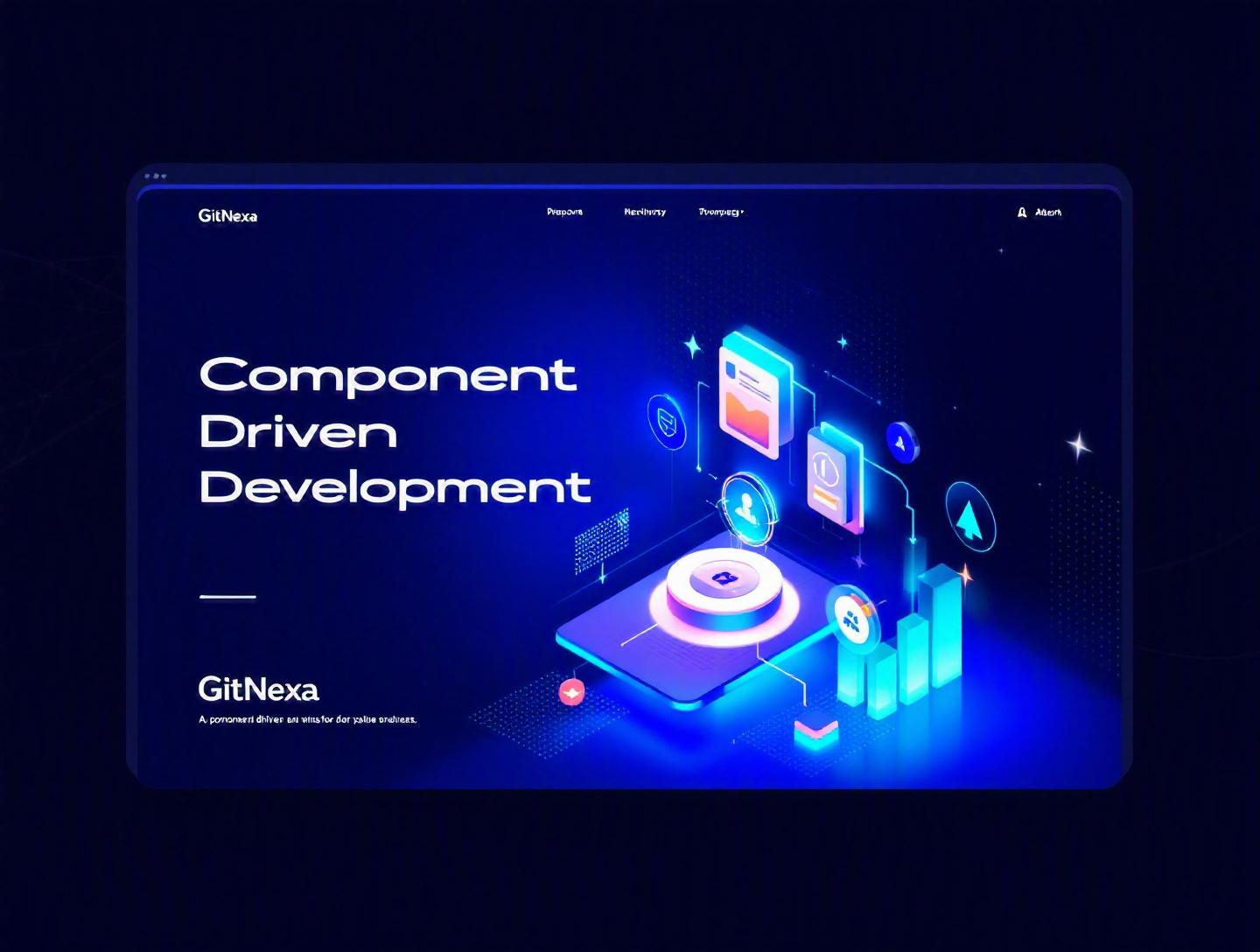
The Ultimate Component-Driven Development Guide
Introduction
In 2025, over 70% of frontend teams reported adopting some form of component-driven development (CDD) in their workflow, according to the State of JavaScript survey. Yet, more than half of those teams still struggle with inconsistent UI systems, duplicated code, and bloated design handoffs. That’s the paradox: everyone talks about reusable components, but very few organizations truly practice component-driven development the right way.
If your product team ships features quickly but your UI feels fragmented… if your React or Vue codebase grows more chaotic with every sprint… or if your designers and developers constantly debate “which button version to use,” then this component-driven development guide is for you.
Component-driven development isn’t just a frontend technique. It’s a product engineering mindset. It changes how teams design, build, test, and scale applications. From atomic design principles to Storybook-driven workflows, from micro-frontends to design tokens—CDD sits at the heart of modern web application architecture.
In this comprehensive guide, you’ll learn:
- What component-driven development really means (beyond buzzwords)
- Why it matters more than ever in 2026
- How to implement it step-by-step in React, Vue, and Angular projects
- How leading companies structure component libraries
- Common mistakes that derail teams
- Best practices to future-proof your UI architecture
Let’s start with the fundamentals.
What Is Component-Driven Development?
Component-driven development (CDD) is a software development methodology where user interfaces are built from independent, reusable, and self-contained components. Instead of designing entire pages first, teams design and develop UI elements—buttons, cards, forms, modals, navigation bars—as isolated building blocks.
Each component:
- Encapsulates its own structure (HTML/JSX), behavior (JavaScript/TypeScript), and styling (CSS/Tailwind/Styled Components)
- Has clearly defined inputs (props) and outputs (events/callbacks)
- Can be tested and documented independently
The Shift From Page-First to Component-First Thinking
Traditionally, frontend development followed a page-based approach:
- Design full page mockups
- Build entire views
- Refactor repeated UI later (if time allowed)
This often led to:
- Duplicate logic
- Inconsistent UI patterns
- Hard-to-maintain CSS
Component-driven development flips the process:
- Design small UI primitives
- Compose them into complex components
- Assemble pages from those components
This aligns closely with Brad Frost’s Atomic Design methodology (https://bradfrost.com/blog/post/atomic-web-design/), which organizes UI into atoms, molecules, organisms, templates, and pages.
A Simple Example (React)
Instead of repeating button styles across your app:
// Button.tsx
import React from "react";

export const Button = ({ variant = "primary", children, onClick }) => {
  const base = "px-4 py-2 rounded font-medium";
  const styles = {
    primary: "bg-blue-600 text-white",
    secondary: "bg-gray-200 text-black",
    danger: "bg-red-600 text-white"
  };

  return (
    <button className={`${base} ${styles[variant]}`} onClick={onClick}>
      {children}
    </button>
  );
};
Now every feature team uses the same <Button /> component instead of reinventing it.
That’s the core idea. Simple concept. Massive impact.
Why Component-Driven Development Matters in 2026
The way we build software has changed dramatically over the last five years.
1. Multi-Platform Expectations
Users expect consistent experiences across:
- Web apps
- Mobile apps
- Progressive Web Apps (PWAs)
- Admin dashboards
- Internal tools
Component libraries make cross-platform consistency achievable.
2. Faster Release Cycles
According to GitHub’s 2024 Octoverse report (https://octoverse.github.com/), deployment frequency has increased by 35% in high-performing teams since 2021. Faster releases require modular architecture.
Component-driven development enables:
- Parallel development
- Isolated testing
- Predictable UI behavior
3. Rise of Design Systems
Companies like Airbnb, Shopify (Polaris), and Atlassian (Atlassian Design System) have proven that mature design systems accelerate product development.
A strong design system is impossible without component-driven thinking.
4. Micro-Frontends & Scalable Architecture
As applications grow, teams adopt micro-frontend architectures. In such setups, independently deployed frontend modules rely heavily on shared component libraries.
Without CDD, micro-frontends become visual chaos.
5. AI-Assisted Development
AI tools generate UI code quickly—but without a component structure, that generated code becomes technical debt overnight. CDD provides the guardrails.
Now let’s get practical.
Core Principles of Component-Driven Development
1. Single Responsibility Principle
Each component should do one thing well.
Bad example:
- A “UserCard” that fetches data, manages global state, and renders UI.
Better:
UserCard(presentation)useUserData(data fetching hook)
2. Reusability Over Convenience
Avoid building components tightly coupled to one page.
Instead of:
<ProductPageButton />
Create:
<Button variant="primary" />
3. Isolation & Testability
Tools like Storybook (https://storybook.js.org/) allow developers to render components in isolation. This improves:
- Visual regression testing
- Accessibility testing
- Documentation
4. Composition Over Inheritance
React and modern frameworks encourage composition.
<Card>
  <Card.Header />
  <Card.Body />
  <Card.Footer />
</Card>
This pattern increases flexibility.
Building a Component Library: Step-by-Step
Step 1: Audit Existing UI
Start by identifying repeated UI patterns:
- Buttons
- Form fields
- Modals
- Tables
Group similar variants.
Step 2: Define Design Tokens
Design tokens include:
- Colors
- Typography
- Spacing
- Border radius
Example:
export const colors = {
  primary: "#2563EB",
  secondary: "#6B7280",
  danger: "#DC2626"
};
Step 3: Start with Atoms
Build:
- Button
- Input
- Label
- Icon
Then move to molecules and organisms.
Step 4: Document with Storybook
Each component should include:
- Variants
- Usage examples
- Accessibility notes
Step 5: Version & Publish
Use:
- npm private registry
- Monorepos (Nx, Turborepo)
Example Architecture
src/
  components/
    atoms/
    molecules/
    organisms/
  hooks/
  tokens/
Component-Driven Development vs Traditional Development
| Aspect | Traditional | Component-Driven Development |
|---|---|---|
| Focus | Pages | Components |
| Reusability | Low | High |
| Testing | Page-level | Component-level |
| Scalability | Limited | Strong |
| Design Consistency | Inconsistent | Standardized |
The difference becomes obvious once the codebase crosses 50,000 lines.
How GitNexa Approaches Component-Driven Development
At GitNexa, component-driven development is central to how we build scalable applications. Whether we’re delivering enterprise dashboards, SaaS platforms, or cross-platform mobile apps, we start with a component-first architecture.
Our process typically includes:
- UI/UX audits aligned with our UI/UX design services
- Monorepo setup with Nx or Turborepo
- Design token integration
- Storybook documentation
- CI pipelines with visual regression testing
When paired with our expertise in modern web development and DevOps automation, teams ship faster with fewer regressions.
We treat components as product assets—not just code snippets.
Common Mistakes to Avoid
-
Over-Abstracting Too Early
Building generic components before understanding real use cases leads to unnecessary complexity. -
Ignoring Accessibility
Components must follow WCAG guidelines from day one. -
No Documentation
Undocumented components become internal black boxes. -
Tight Coupling with Business Logic
UI components should not fetch API data directly. -
Inconsistent Naming Conventions
MixingPrimaryButtonandMainBtncreates confusion. -
Skipping Versioning
Breaking changes without version bumps damage trust. -
Design and Dev Misalignment
Without shared tokens, visual drift happens quickly.
Best Practices & Pro Tips
-
Use TypeScript for Strong Typing
Prevents misuse of props. -
Enforce ESLint & Prettier Rules
Maintain consistency. -
Add Visual Regression Testing (Chromatic, Percy)
Catch UI changes automatically. -
Follow Semantic Versioning
Keep releases predictable. -
Create a Contribution Guide
Standardize how new components are added. -
Integrate with CI/CD
Auto-publish on merge. -
Monitor Bundle Size
Tree-shaking matters in large apps.
Future Trends & What to Expect (2026–2027)
- AI-generated component scaffolding integrated with design systems
- Web Components revival for framework-agnostic libraries
- Deeper integration between Figma and code
- Automated accessibility audits in CI pipelines
- Growth of micro-frontend ecosystems
Component-driven development will move from “frontend best practice” to “organizational standard.”
FAQ
What is component-driven development in simple terms?
It’s a way of building user interfaces using reusable, independent components instead of designing full pages first.
Is component-driven development only for React?
No. It works with Vue, Angular, Svelte, and even Web Components.
How is CDD different from a design system?
CDD is a development methodology. A design system is a structured collection of components, guidelines, and tokens built using that methodology.
Does CDD improve performance?
Indirectly, yes. Reusable components reduce duplication and improve maintainability, which often leads to optimized bundles.
What tools support component-driven workflows?
Storybook, Nx, Turborepo, Bit, Chromatic, and Figma integration tools.
Is CDD suitable for startups?
Absolutely. Startups benefit from faster iteration and consistent UI.
How do you manage shared components across teams?
Use a monorepo or a private npm package with version control.
Can CDD work with micro-frontends?
Yes. It’s almost essential for maintaining visual consistency.
How long does it take to implement?
A small team can establish a basic library in 2–4 weeks.
Conclusion
Component-driven development is more than a frontend trend—it’s the foundation of scalable, maintainable, and consistent digital products. By shifting from page-first thinking to component-first architecture, teams reduce technical debt, accelerate delivery, and improve collaboration between design and engineering.
If your UI feels fragmented or your development cycles keep slowing down as the product grows, it may be time to rethink your approach.
Ready to implement component-driven development in your next project? Talk to our team to discuss your project.
Comments
Loading comments...