Sub Category
Latest Blogs
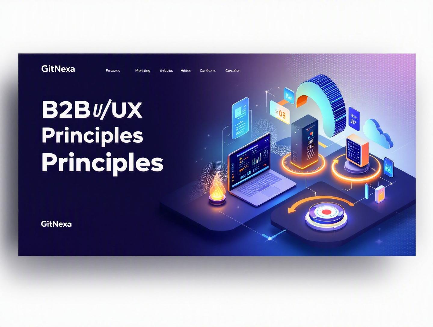
The Ultimate Guide to B2B UI/UX Design Principles
Introduction
In 2025, Forrester reported that every $1 invested in UX returns up to $100 in revenue. Yet most B2B platforms still feel like internal admin panels from 2012—cluttered dashboards, confusing workflows, and forms that test your patience. That’s a problem. Because in B2B, bad UX doesn’t just annoy users—it slows teams down, increases churn, and quietly drains revenue.
B2B UI/UX design principles aren’t about making enterprise software "look pretty." They’re about designing tools that support complex workflows, multiple stakeholders, compliance requirements, and high-stakes decisions. When your users are finance managers approving million-dollar budgets or DevOps engineers deploying production infrastructure, friction becomes expensive.
In this comprehensive guide, we’ll break down what B2B UI/UX design principles really mean, why they matter in 2026, and how to apply them to real-world SaaS platforms, enterprise dashboards, CRMs, ERPs, and internal tools. You’ll see practical examples, design patterns, step-by-step processes, comparison tables, and implementation tips.
Whether you’re a CTO building a SaaS product, a product manager redesigning an enterprise dashboard, or a founder validating a B2B MVP, this guide will give you a structured framework to build software that teams actually enjoy using.
What Is B2B UI/UX Design?
B2B UI/UX design refers to the process of designing user interfaces (UI) and user experiences (UX) for business-to-business software products—tools used by professionals within organizations rather than by individual consumers.
Unlike B2C apps that prioritize emotion and engagement, B2B platforms focus on:
- Efficiency and task completion
- Data clarity and decision support
- Workflow optimization
- Role-based access and permissions
- Integration with enterprise systems
B2B vs B2C UX: The Core Differences
| Factor | B2B UX | B2C UX |
|---|---|---|
| Users | Teams, multiple roles | Individual consumers |
| Buying Decision | Multi-stakeholder | Emotional & personal |
| Complexity | High (data-heavy workflows) | Usually simple |
| Training | Often required | Minimal |
| Usage Frequency | Daily, mission-critical | Occasional or habitual |
A B2B CRM like Salesforce or HubSpot handles sales pipelines, forecasting, integrations, and automation. Compare that to a B2C app like Instagram. The goals are completely different.
The Stakeholder Web
In B2B software, you rarely design for a single "user." You design for:
- End users (operators, analysts, admins)
- Managers reviewing reports
- Executives making strategic decisions
- IT teams managing compliance and security
Each has different goals, mental models, and tolerance for complexity.
Why B2B UI/UX Design Principles Matter in 2026
The B2B SaaS market is projected to surpass $390 billion globally by 2026 (Statista, 2025). Competition is fierce. Switching costs are dropping due to API-first architectures and better data portability.
In 2026, three forces are reshaping B2B UX:
1. Consumerization of Enterprise Software
Professionals expect the same usability standards from tools like Jira, Notion, and Slack that they get from consumer apps. If your platform feels outdated, churn increases.
2. AI-Driven Interfaces
With AI copilots becoming mainstream (see OpenAI, Microsoft Copilot), enterprise tools are shifting from static dashboards to conversational and predictive interfaces.
3. Remote & Distributed Teams
Hybrid work is standard. Collaboration features, real-time updates, and intuitive navigation matter more than ever.
Poor UX now leads to:
- Lower adoption rates
- Increased support costs
- Longer onboarding cycles
- Higher churn
Gartner reported in 2024 that 65% of enterprise software buyers consider UX a primary selection factor. That’s not a design trend—it’s a revenue driver.
Principle #1: Design for Complex Workflows, Not Screens
B2B UI/UX design principles start with workflows, not visuals.
Map the End-to-End Journey
Before opening Figma, map the workflow:
- Trigger event (e.g., new lead created)
- Assignment and qualification
- Follow-up and nurturing
- Reporting and forecasting
A workflow diagram might look like:
Lead Created → Auto Assignment → Sales Review → Follow-up → Proposal → Closed/Won → Report Update
Real-World Example: ERP Dashboard
In an ERP system for manufacturing:
- Procurement team tracks suppliers
- Finance team monitors invoices
- Operations team monitors stock levels
Instead of one bloated dashboard, create role-based entry points.
UX Pattern: Progressive Disclosure
Avoid overwhelming users. Reveal complexity gradually.
Example in React:
{showAdvanced && (
  <AdvancedFilters />
)}
<button onClick={() => setShowAdvanced(!showAdvanced)}>
  Toggle Advanced Filters
</button>
This keeps the default interface clean while supporting power users.
Principle #2: Prioritize Data Clarity Over Decoration
Enterprise applications are data-heavy. Clarity beats creativity.
Use Visual Hierarchy Intentionally
- Large typography for KPIs
- Color only for meaningful states
- Consistent spacing (8px grid system)
Dashboard Comparison
| Poor Dashboard | Effective Dashboard |
|---|---|
| 12 equal-size widgets | 3 primary KPIs + secondary metrics |
| Random colors | Semantic color system |
| No filtering | Contextual filters |
Use Established Data Visualization Standards
Follow guidance from sources like the Nielsen Norman Group and Google Material Design.
Best practices:
- Bar charts for comparison
- Line charts for trends
- Tables for detailed inspection
Avoid pie charts for more than 3–4 segments.
Principle #3: Role-Based Personalization
B2B platforms often serve admins, managers, and operators.
Implement Role-Based Access Control (RBAC)
Example architecture:
User → Role → Permissions → Accessible UI Components
Sample permission config:
{
  "role": "finance_manager",
  "permissions": [
    "view_reports",
    "approve_invoices",
    "export_data"
  ]
}
UI components render based on permissions.
Benefits
- Reduced cognitive load
- Improved security
- Faster onboarding
Principle #4: Design for Efficiency and Speed
Time is money in B2B environments.
Keyboard Shortcuts
Power users expect shortcuts.
Example:
- Ctrl + K → Quick search
- Ctrl + S → Save
Bulk Actions
Instead of editing 50 entries one by one, allow bulk operations.
Performance Benchmarks
Google research shows users perceive systems as fast when responses are under 100ms for direct manipulation.
Optimize:
- Lazy loading
- API pagination
- Caching (Redis, CDN)
Principle #5: Trust, Security, and Compliance by Design
Enterprise buyers care about SOC 2, GDPR, and ISO 27001.
UX Signals of Trust
- Clear permission explanations
- Audit logs
- Transparent data policies
Example audit log table:
| Date | User | Action | Resource |
|---|---|---|---|
| 12 Jan 2026 | jsmith | Updated | Invoice #445 |
Designing these features visibly builds confidence.
How GitNexa Approaches B2B UI/UX Design Principles
At GitNexa, we start every B2B UI/UX project with discovery workshops involving stakeholders across departments. We align product goals with measurable business outcomes—adoption rate, task completion time, churn reduction.
Our process combines:
- User research and stakeholder interviews
- Workflow mapping
- Wireframing and rapid prototyping
- Design systems in Figma
- Frontend implementation in React, Next.js, or Angular
We often integrate insights from our work in enterprise web development, SaaS application architecture, and cloud-native development strategies.
The result? Scalable enterprise platforms that balance usability, performance, and compliance.
Common Mistakes to Avoid
- Designing only for admins and ignoring daily operators.
- Overloading dashboards with vanity metrics.
- Skipping usability testing with real enterprise users.
- Ignoring performance optimization.
- Using inconsistent design systems.
- Hiding critical features behind confusing navigation.
- Underestimating onboarding flows.
Best Practices & Pro Tips
- Start with workflow mapping before UI mockups.
- Create a scalable design system early.
- Test with at least 5–7 real users per role.
- Implement analytics (Mixpanel, Amplitude).
- Optimize for keyboard and accessibility (WCAG 2.2).
- Document design decisions.
- Continuously iterate based on user feedback.
Future Trends & What to Expect (2026–2027)
- AI copilots embedded in dashboards
- Voice-enabled enterprise interfaces
- Hyper-personalized UI layouts
- Zero-UI workflows (automation-first systems)
- Increased adoption of design tokens and component libraries
Expect enterprise UX to become predictive rather than reactive.
FAQ
What makes B2B UI/UX different from B2C?
B2B focuses on efficiency, workflows, and multi-user roles, while B2C emphasizes emotional engagement and simplicity.
Why is UX critical for SaaS platforms?
Better UX increases adoption, reduces churn, and shortens onboarding time.
How many users should be involved in testing?
At least 5–7 per role to uncover most usability issues.
Should B2B software be minimalist?
Minimal where possible, but clarity and completeness matter more than aesthetics.
What tools are best for B2B UI design?
Figma, Adobe XD, Storybook, React, and Material UI are common.
How do you measure UX success?
Track task completion rate, NPS, churn rate, and feature adoption.
Is accessibility important in B2B?
Yes. Many enterprises require WCAG compliance.
How long does a B2B UX redesign take?
Typically 3–6 months depending on scope.
Conclusion
B2B UI/UX design principles aren’t about decoration—they’re about clarity, efficiency, trust, and scalability. In 2026, enterprise buyers expect intuitive interfaces, fast performance, and AI-enhanced workflows. Companies that prioritize UX will see higher adoption, lower churn, and stronger competitive positioning.
Design for workflows. Prioritize data clarity. Personalize by role. Optimize for speed. Build trust.
Ready to improve your B2B platform’s user experience? Talk to our team to discuss your project.
Comments
Loading comments...