Sub Category
Latest Blogs
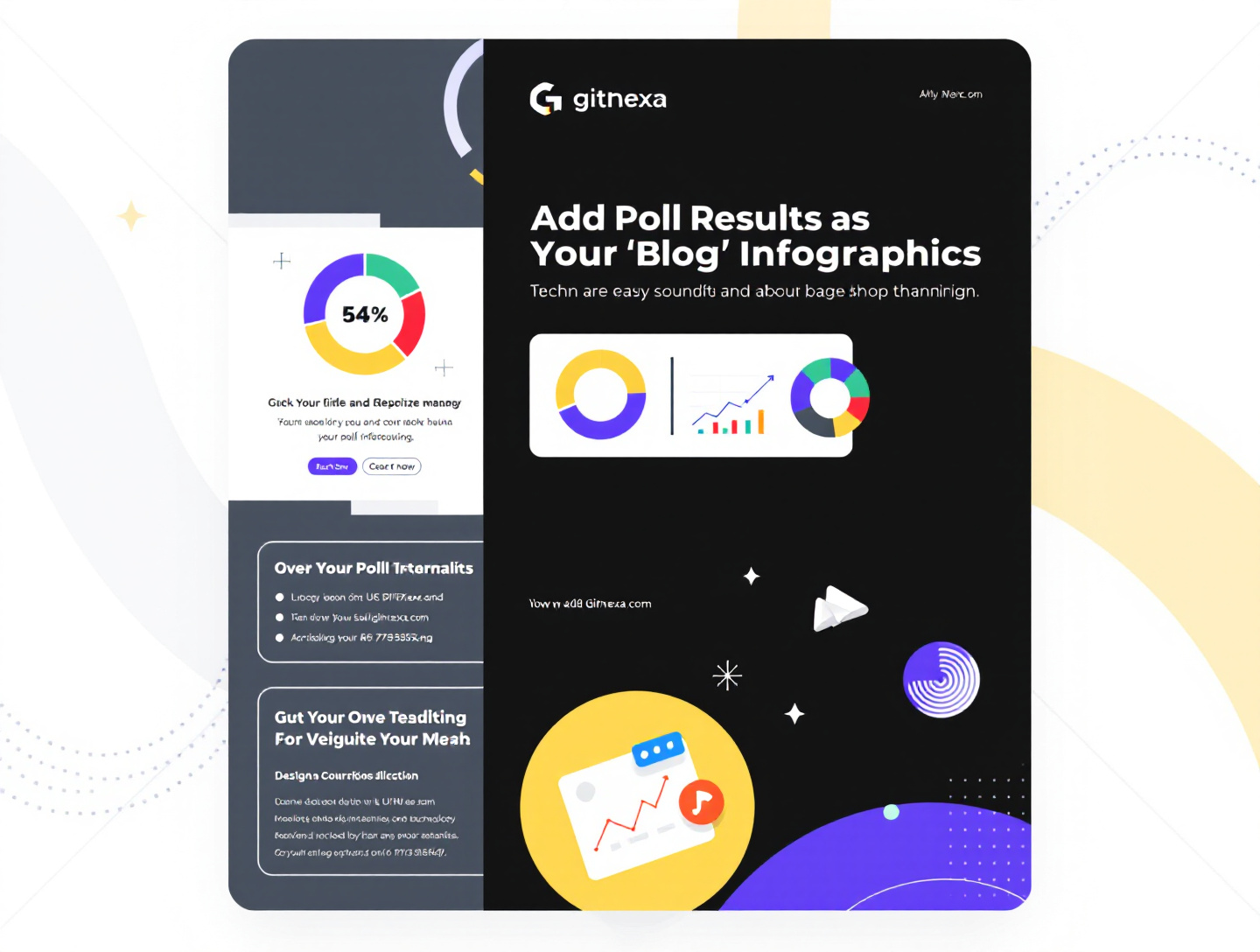
Add Poll Results as Blog Infographics to Boost Engagement
Introduction
Polls have become one of the most powerful yet underutilized content assets in modern digital marketing. Brands run polls on websites, social media, email newsletters, and community platforms every day—yet most of those poll results disappear into spreadsheets or dashboards that no one outside the analytics team ever sees.
This is where adding poll results as blog infographics becomes a game-changing strategy. When poll insights are transformed into visually compelling blog infographics, they evolve from raw data into shareable, evergreen content that drives traffic, builds authority, and improves SEO performance.
Readers today don’t want walls of text or raw percentages. They want stories, patterns, and visual context. According to Google’s UX research, users process visual data significantly faster than plain text, making infographics one of the highest-performing content formats for engagement and recall. When poll data is presented visually inside a blog, readers stay longer, interact more, and are more likely to share or link back to your content.
In this comprehensive guide, you’ll learn how to strategically add poll results as blog infographics—from planning and data validation to visual design, SEO optimization, and real-world use cases. We’ll cover best practices, common mistakes, examples, and actionable steps to help you turn poll insights into high-performing, Google-friendly blog assets.
Why Poll Results Make Perfect Blog Infographic Content
Polls capture real opinions from real audiences. That authenticity alone makes them valuable. But when those results are locked in raw tables, their impact is limited.
Poll Data Adds Credibility and Experience
Poll results demonstrate firsthand audience experience—a key pillar of Google’s E-E-A-T (Experience, Expertise, Authoritativeness, Trustworthiness). Unlike theoretical content, polls show that you:
- Asked a direct question
- Collected real responses
- Analyzed genuine insights
This kind of first-party data is increasingly important as third-party data becomes less reliable.
Infographics Improve Information Retention
Studies referenced by Nielsen Norman Group show that users retain up to 65% more information when visual elements support textual data. Adding poll results as blog infographics helps readers quickly grasp trends, patterns, and takeaways.
Poll-Based Infographics Encourage Sharing
Infographics are inherently shareable. When readers recognize their own opinions reflected in poll results, they’re more likely to:
- Share the blog on social media
- Reference it in discussions
- Link to it from their own content
This naturally improves backlink profiles and organic reach.
Understanding Audience Intent Behind Poll-Based Content
Before embedding poll result infographics, it’s critical to understand why users search for and engage with this type of content.
Informational Intent
Many readers want quick insights, trends, or benchmarks. For example:
- "What percentage of marketers use AI tools?"
- "Which ecommerce feature do users value most?"
Poll-infographic blogs serve this need efficiently.
Comparative Intent
Poll results allow users to compare themselves or their business against others. Visualizing this comparison enhances clarity and credibility.
Decision-Making Intent
Decision-makers look to peer data when choosing tools, strategies, or vendors. Poll-based infographics act as social proof that guides decisions.
For deeper insights on mapping content to search intent, see: https://www.gitnexa.com/blogs/understanding-search-intent-for-seo
Choosing the Right Polls for Blog Infographics
Not every poll deserves infographic treatment. Selecting the right data sets is essential.
Characteristics of High-Value Polls
- Sufficient sample size (minimum 100 responses recommended)
- Clear, singular focus
- Timeless or trend-defining insight
- Audience relevance
Poll Types That Perform Best
- Industry trend polls
- Customer satisfaction surveys
- Tool or feature preferences
- Behavioral or habit-based polls
Avoid polls that are overly niche or ambiguous unless your blog targets a very specific audience.
Structuring Blog Content Around Poll Infographics
Poll infographics work best when they support a narrative—not when they are dropped randomly into a blog.
Ideal Section Placement
- After introducing a key question or hypothesis
- Mid-article to re-engage readers
- Before conclusions to reinforce takeaways
Supporting Text Matters
Every infographic should be accompanied by:
- Context explaining how the poll was conducted
- Key insights highlighted in text
- Implications for readers
This approach improves accessibility and SEO crawlability.
Learn more about content structuring here: https://www.gitnexa.com/blogs/how-to-structure-long-form-content
Designing Effective Poll Result Infographics
Design can elevate or undermine your poll data.
Essential Design Principles
- Simplicity over decoration
- Consistent brand colors
- Legible typography
- Clear data hierarchy
Data Visualization Formats
- Bar charts for comparisons
- Pie charts for proportions
- Icon-based visuals for emphasis
- Timeline visuals for trend polls
Avoid overwhelming readers with too many data points in a single graphic.
Tools for Creating Poll Result Infographics
You don’t need a full design team to get started.
Beginner-Friendly Tools
- Canva
- Piktochart
- Venngage
Advanced Visualization Tools
- Adobe Illustrator
- Figma
- Tableau (for complex data)
Embedding Best Practices
Export infographics as optimized images (compressed, descriptive filenames) or embed responsive SVGs when possible.
SEO Optimization for Poll-Based Blog Infographics
Infographics alone don’t rank—optimized content does.
On-Page SEO Techniques
- Descriptive image alt text with keywords
- Captions summarizing insights
- Surrounding keyword-rich content
Schema and Accessibility
Use image schema where applicable and ensure color contrast and text alternatives.
For infographic SEO best practices, read: https://www.gitnexa.com/blogs/infographic-seo-optimization
Internal Linking Strategy Using Poll Insight Blogs
Poll infographic blogs are excellent internal linking hubs.
Strategic Linking Ideas
- Link to related service pages
- Reference prior research content
- Connect TO and FROM cornerstone blogs
Examples:
- https://www.gitnexa.com/blogs/content-marketing-strategy-guide
- https://www.gitnexa.com/blogs/data-driven-marketing
This strengthens topical authority and improves crawl depth.
Real-World Use Cases of Poll Results as Blog Infographics
B2B SaaS Example
A SaaS company polled 500 users about onboarding challenges. Turning the results into a blog infographic increased average session duration by 47% and earned 12 backlinks from industry blogs.
Ecommerce Example
An online retailer visualized customer preference data, which was cited by two media outlets and reused across paid campaigns.
Thought Leadership Publishing
Industry analysts use annual poll infographics to establish authority and generate recurring backlinks.
Measuring Performance of Poll Infographics
Key metrics to track:
- Scroll depth
- Image interaction
- Social shares
- Backlinks
- Time on page
Use Google Analytics and Search Console to identify which infographics drive engagement.
Best Practices for Adding Poll Results as Blog Infographics
- Validate poll data before publishing
- Explain methodology clearly
- Design for mobile-first viewing
- Update evergreen poll content annually
- Repurpose infographics across channels
Common Mistakes to Avoid
- Publishing without context
- Overcrowded visuals
- Misleading scale manipulation
- Ignoring accessibility
- Treating infographics as decoration
FAQs
What is the ideal poll size for blog infographics?
Generally, 100–300 responses create statistically meaningful insights, but relevance matters more than size.
Can poll infographics help with backlinks?
Yes. Original data visualizations are among the most linkable content assets.
Should poll methodology be disclosed?
Absolutely. Transparency builds trust and authority.
Are interactive infographics better?
Interactive elements improve engagement but require performance optimization.
How often should poll infographic blogs be updated?
Annually or when new data significantly changes insights.
Do infographics affect page speed?
Only if unoptimized. Use compressed images and lazy loading.
Is text still necessary with infographics?
Yes. Search engines rely on textual context for indexing.
Can small businesses benefit from poll infographics?
Yes. Even small polls can demonstrate customer insight and niche expertise.
Conclusion: Turning Poll Data into Authority-Building Content
Adding poll results as blog infographics bridges the gap between raw data and meaningful storytelling. It enhances engagement, strengthens SEO, and positions your brand as a credible source of original insights.
As search engines increasingly reward experience and originality, poll-based infographics offer a sustainable advantage. They’re not just visuals—they’re strategic assets that support long-term growth.
If you want expert help transforming your data into high-converting, SEO-optimized blog content, GitNexa can help.
Ready to Turn Your Poll Data into Powerful Content?
Get a customized strategy tailored to your business goals.
Comments
Loading comments...